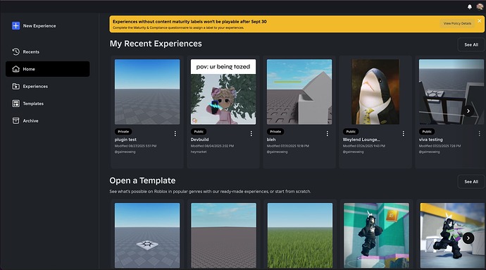
The “View Policy Details” button has poor color contrast, and also has its font too thin.
The close button should also be black, for consistency and also because white is hard to see on a bright yellow background.
Expected behavior
I would expect these buttons to not have visibility issues.
