i am making a unique survival game that happens on mars, but i feel like the vitals ui is kinda trash. (The one with colours)

They’re not trash they’re actually pretty good.
Here are some ideas:
- Make a little ToolTip When you hover over it as some people might not understand H is health.
- Make it so when you hover over it, it makes the background transparency 0.9.
That’s all i can think of right now.
Good luck on your game ![]()
its in first person so tooltips wont be useful
i see what you mean.
Maybe just set the background transparency to 0.9 then
i have an idea.

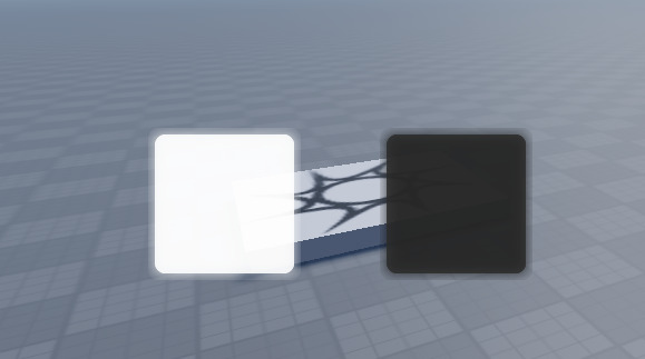
This is a quick example UI i made. I tried to give it a blur effect, i think it looks cool.
example.rbxm (9.3 KB)
^^^ look at that if you want to try it
note: you change the image labels to the main colour, and the frames to a lighter colour
How would players be able to move their cursors when they are in first person?
But anyway, you can add UICorner to the outline frames, so it doesn’t look like a plain outline. Maybe do a 0,3 value?
i wanted it as a first person survival game, ill try the uicorner later
