Recently I just finished my horror game but I need some feedback help the game is called Hunting Shadows and I made some images a wallpaper and an logo for the game do you think they look catchy or they need more work
THIS IS THE LOGO
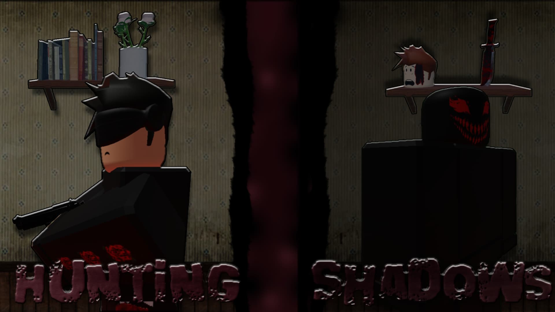
AND THIS IS THE WALLPAPER
5 Likes
The design choice is good but the color needs improvements.
Firstly, the outlines don’t look good. Secondly, both images lack in contrast. And finally, the icon has a blue shade to everything like the background is just an image and is not part of the scene.