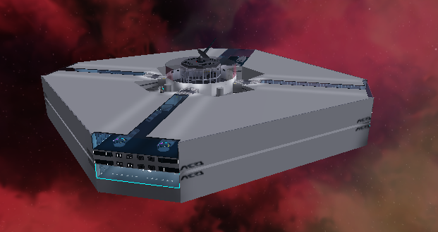
I didn’t play the game as I can’t right now but I’ve noticed a few things, first in the 3rd image you a few using too much Neon, but waaay too much, for the last image I think the lister are too powerful, maybe turn their power a little down
Thanks for your feedback Dede_4242! I will keep you updated and change those lights around!
I apologise for what will follow this sentence, but the gameplay does not appear to be as highly as it was sold.
The station looks horrible, I thought my game was still loading. The elevators were confusing and I didn’t recognise that the random crates around the station were snack boxes.
The flight system is also poorly created. The click to rotate method is cheap and doesn’t work well. Use keyboard controls instead of the mouse.
UI design is just as bad, it doesn’t exactly fit the colour theme of everything else, and when purchasing a ship, I didn’t even know if it went through.
For advice on this, make the purchase button show a notice that it was successful, and switch to the “Owned Ships” tab. When the spawn button is clicked, close the GUI.
As for colour theme, just use a dark gray background with white text.
I understand that you are working on this as a proof of concept, but that would result in expectations of a better experience. I have a huge feeling this was rushed to be released for feedback, but that can help early on, as large features can impact the outcome of the final product.
I’d like you to take light inspiration from games like Innovation Inc’s Arctic Base as an internal design for your station.
Thank you so much for your feedback! As I said before it is only a proof of concept and is hardly in a launch position yet. We have someone working on improving the GUI right now, and the ship controls are under construction. The elevators are also being improved as well as the buying/spawning system. I was interested in getting the communities opinion before too much work had been done so that I could include wanted features. Thank you again for your honest opinion and constructive criticism! If there is anything that you want to see included in the game, feel free to tell me!
Also what exactly is “Horrible” about the station? Could you elaborate so that we can improve it?
Like I said earlier, it looked like my game wasn’t finished loading. I would add more external and internal structure (more walls) to the station, use less Neon and Diamond Plate, and brighten up the colour theme a little.
Ok cool! I will have someone work on that asap! Thanks for your advice!
That looks much better! Maybe add some beams along the walls to decorate those too.
Great idea! Btw Icarus Station V2 is in the works…

…Is anyone out there?
Old Icarus station will become a wreck for players to explore.
i don’t know man. in my opinion the station lacks detail and i don’t like that it’s so blocky. Maybe try making it look more like a spaceship
Ok cool, good idea. Only the inside is finished and the outside is still under construction; Here is a concept we are working on:
The Alpha launch is nearing completion!


