The games GUI is getting an update!
Before:

After:
It looks way better, I suggest you add some transparent light-blue parts so it looks more like a hologram
Ok great idea! I will try it out!
GUI is updating!
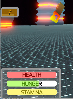
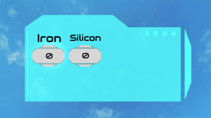
Old GUI:
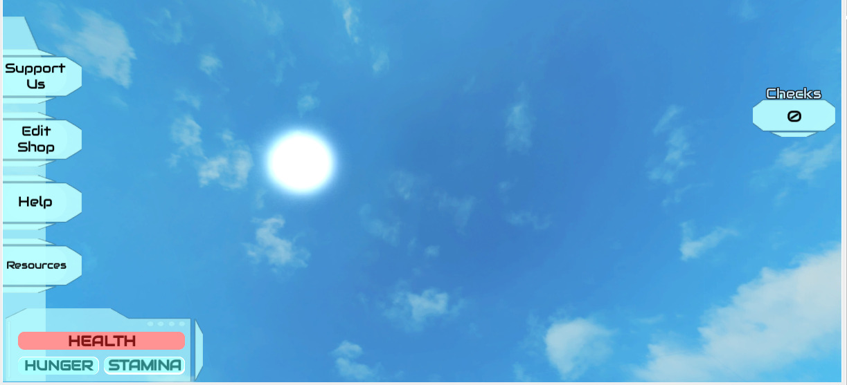
New GUI:
Somethings coming — and its not happy…

I think this would be way better if you added more transparent parts, if you don’t get what I mean, look at Mass Effect’s GUI
Can you send an example please? Would love to try out your idea!
If you give me a few minutes I can find a few good images of them
I was able to find one example:

As you can see, the main colour is blue, which is very cliche in Sci-Fi Games, but it’s good, now a few things to point out are:
It’s very ‘blocky’, which is something that makes it good
There are places where there’s transparent parts, and where there aren’t, but as you can see, all parts except the highlighted ones have a transparency of less than 0.5 (at least, it seems) except for a few decorations
Now, let’s look at yours:
Ok! Thank you for all of your incredible suggestions! One thing I want to point out is that on the GUI you provided, I think that it covers your entire screen. What I mean is that the player’s screen is fully covered by the GUI. In mine, I need it to be less transparent for it to be easily seen over the background. Overall, incredible suggestions! I will overhaul the GUI and ask what you think!
Yea, it was an inventory GUI
Yes, only things are:
The buttons(?) are covered
And the main part’s gradient looks like metal, which doesn’t fit too well
Other than that very good job!
(I also noticed the buttons don’t look too much out-of-context now, so you can keep them like that)
Thanks! What buttons are you talking about? An how should I change the gradient. Or should I remove it completely?
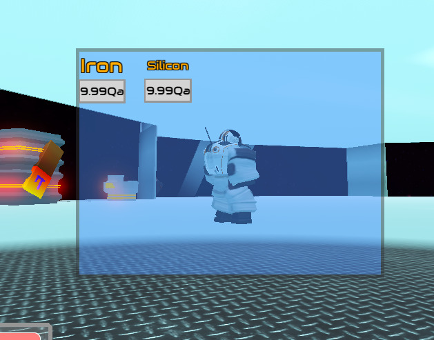
The iron/silicon ones, the ones that show the amount, they seem like buttons to me
Also the gradient I think should be less visible, like less change
Ok cool. I will work on that now. And also, the amount indicators are not buttons, just decoration to make the numbers more distinct from the background.
I like it, it looks very good now!
Only 2 things:
The 4 blue things on the background are behind the main thing, not sure if it’s intended or not
And change the colours a bit as it now looks too similar, the colour is almost always the same, or it seems the same, making it strange
Fix this up and it will be very good!
Ok cool! I will work on this more tomorrow!
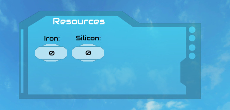
Ok I redesigned the GUI template. I added a border and made it so that the circles dont overlap.
And I am pretty happy with the final product @Dede_4242! What do you think?
And with more transparency:
To add to what @Dede_4242 said, try using textures on the lamps and light beams to give off the same effect without it being too intensive to the eye.
What do you mean? Are you talking about the lamps on the creature above? Or on the space station? Thanks for your feedback!