Which game icon do you like best?



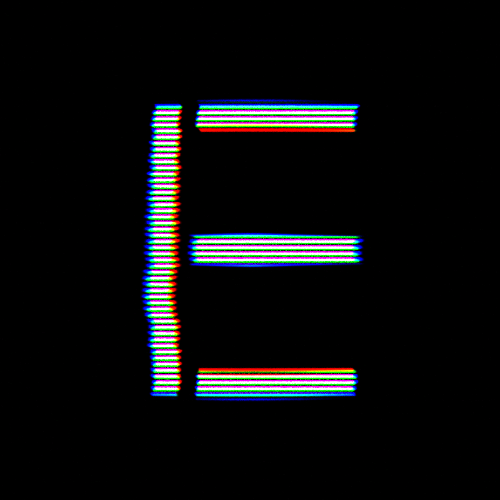
- game icon 1
- game icon 2
- game icon 3
- game icon 4
0 voters
Which game icon do you like best?


0 voters
If we are solely talking about the letter (and it’s effects), then hands down it’s icon 3 for me. However, if we are considering the background as well; I’d have to go with icon 2. It looks the most polished and professional, and is quite elegant.
Edit: for notes, I’d say that icon 1 is too basic and lacks originality, and I’d say that icon 4 is a bit too retro and niche unless that’s the look you are going for. Neither of those two catch my interest or attention.
If I were you id try and change the backgrounds for icon 3 and 4 because I like the E in those ones but in icon 2 the background is what makes it eye grabbing so maybe try moving things around a bit, but if I had to choose between these it has to be icon 3.
@TestAccount563344 I was thinking the same thing
if i were you, i wouild try combining the background of icon 2 with the letter on icon 3, i think that would look really cool
Combination of icon 2 like background and icon 3 text.

Game Icon 4 seems a lot more professional, and looks the cleanest in my opinion.