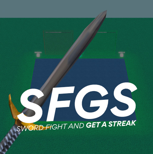
I’m making the icon for a game and I need feedback on which icon people like better. If you have any suggestions or feedback that would be appreciated too.
ICON 1
ICON 2
ICON 3

ICON 4

- Icon 1
- Icon 2
- Icon 3
- Icon 4
0 voters
I’m making the icon for a game and I need feedback on which icon people like better. If you have any suggestions or feedback that would be appreciated too.
ICON 1
ICON 2
ICON 3

ICON 4

0 voters
Personally, I think the second one looks better. The first one’s sword is a bit out of place, and the position is a bit odd. ![]()
id say the second one because in the others the sword is kinda just awkwardly standing there
I agree. You should definitely put it behind the text or somewhere.
4
the first one should’ve been good if you showed the hilt of it
The quality of the sword is very low, that’s why it’s bad. It would have been better in the back.