
2.
I’m not a fan of either of them. I’d go with the first one but none of these are displaying the same menu… They’re different themes on different menus so you can’t really compare.
1 Like
This is hard to judge because you are comparing 2 different UI’s for different aspects of your game. If you were to make 2 different set samples of the same themed UI, it would be better to judge. 
1 Like
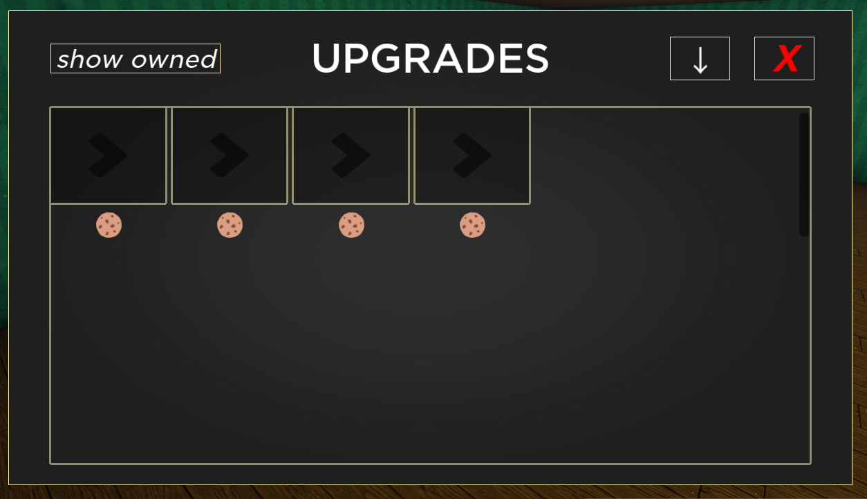
Yo I’m the one who made the 1st one, and I’m wondering, which parts should I improve on for the gui, I rarely touch ui’s and my sense of design is trash.
gradient,font is trash pls improve
improve font,ui,add shadows,need good vectors,outlines little sux but this is the better ui compared
1 Like