
I’ve been working on my game, and I’ve gotten the gameplay down easily. But I struggle mainly on colors and gui. What do you think is wrong with it? I’m looking at it and i think it looks horrible. but I don’t know what to do in order to fix it. Any feedback is appreciated.
Maybe it’s because they don’t flow correctly because of padding errors or minor inconsistencies with the UIStroke’s px size?
This is actually a good starting point compared to what horrors beyond comprehension I’ve seen before lol.
The things the OCD part of me notices are:
- The off-center X button
- Texts not being padded
- Inconsistencies with the UIPadding px size
I think adjusting those can make it look better.
- Needs more gradiant and color variation
- White outline is almost always a bad idea, try black
- Black text color is always bad if there is uistroke
- Try to size down the text in the buttons more, like 60% on Y axis

I mean white outline period, you only changed the button outlines. Change it all
Sometimes it is good to have some white outline some places but very very rarely and usually inside of something, like rarely you can get away with it in text (not in this case)
If you shrink the text in the buttons a lot and add top-down gradient, (whitish on the top) then it COULD work. To do that you would have to make the text Press Start 2P (or make it bold/bolder) and 0,0,0 TextColor3
stop using scale for UI
1 Like
At first glance a lot of people will probably write off this solution, but I completely agree. I hardly use scale at all unless it’s for positioning UI. You can get offset-based UI easily that looks identical on all screens.
A single UIScale Instance inside of a ScreenGui is all you need. @FeuzziDeice, look into detecting when the camera’s viewport size changes and scaling the UIScale appropriately. You’ll also want to make sure all of your UI is designed at a consistent resolution so it looks the same regardless of platform. I use the device emulator and design on 1280x720.
3 Likes
I agree but for this I don’t see any difference on any devices. Here’s 1920x1080

then 1280x720

and just for good measure here’s mobile and console

The only difference I see is on console
Also i made a script that autoscales ui strokes so it doesn’t look weird

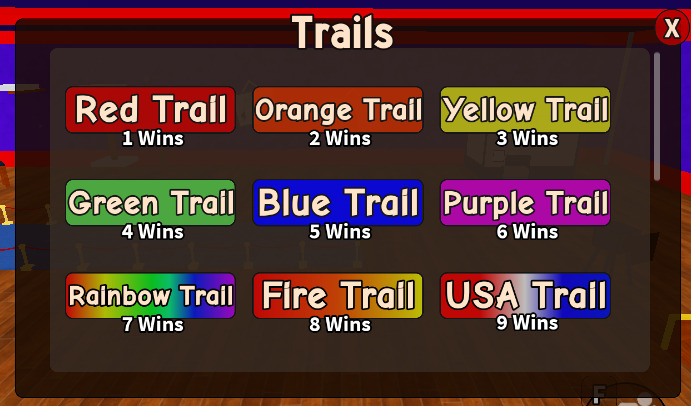
Is this better?

I changed the colors, the strokes now auto scale when in game and, each corner of the x is now alligned with the walls of the ui
3 Likes
Not a ui expert but i do know one thing from UX design.
When making rounded corners make sure that if you have an inner box (in your game, that’s the container holding all of the buttons.) that the outer radius is equal to the inner radius + padding
Also try to make the padding (distance from outter box to inner box) more equal around the frame (but it might already be but i can’t really see that right now?)
Hope it helped!
1 Like
It’s going to look the same across all devices because you’re using Scale.
What I was trying to say is that a lot of people disregard Offset as a valid tool. Offset can do everything Scale does, but better. You can get exact, consistent text sizes and padding across your entire UI.
Scale is a great tool, but it also has its drawbacks. Scale lacks the consistency that Offset has. Having an easy way to create nice, equal padding or button sizes really goes a long way.
Aside from Scale vs. Offset, the rest of your UI is pretty solid. It’s immediately clear what I’m looking at, and there’s no confusion in what anything does. I recommend just picking a more complementary color scheme. Try to avoid sharp, bright colors that don’t mix well with the background or other buttons around them.
I’d also work on trying to make the text inside of the buttons equal in size. There should also be more padding on the edges to give it room and to increase readability. You can fake padding using 0.5,0.5 anchor points and just shrinking the text label on the X axis.
That is completely false. You want it to be exactly the same on every device.
You have to use anchor point and uiaspectratio if you want consistency
I agree! It does what the name suggests. Scalar values are great for getting a consistent percent of pixels covered, while offset just adds an offset to the amount of pixels that needed coverage.
You do not want to use scale in padding scenarios, it’ll create an undesirable stretching effect.
Here’s an example of me using offsets.


As you can see; the top, left, and bottom frame stays at a consistent size throughout resizing. If I were to use scale, it would look stretched, making it bad in my opinion.
Also, the examples show what things could look like when you use consistent UIStroke px sizes and UIPadding on TextLabels.
It’s coming together pretty nicely. Just needs some minor adjustments that you like.
Honestly just find some good looking UI and copy its style until you are good enough to create something from scratch
Using anchor points and UIAspectRatioConstraints effectively are something I just consider to be good UI designing habits. I didn’t think to mention it originally because of that. It didn’t occur to me as something inherently required with Offset.
I will agree that you need to use them in tandem with offset, and that a single UIScale will not be enough. Aside from that, my point still stands that you can get UI that features mostly Offset to look identical across all devices.