NOTICE
This tutorial is for advanced users, who know how to use Adobe Illustrator or a similar program. This tutorial will not go into great detail with mechanics, as users following along should be familiar with the program already. If you’re interested in a beginner tutorial which allows you to get acquainted with Illustrator and create a simple logo, check out this post.
Introduction
Welcome! In this tutorial, I’ll go over some steps and tips to create a traditional cartoon-style logo, with a sleek and unique design. I suggest going over my previous tutorial, which can be found here, before this one if you’re a beginner.
Here’s the final product that I made during this tutorial:

Tutorial
Creating the Base Text
To start, create a text box and write the words that’ll end up in the logo. Use the spacing and sizing options to create a design that you’re satisfied with. If you need help with this, or help with something like selecting a font, visit the tutorial mentioned in my introduction.
Here’s the text that I’ll be starting out with:

Once your text is properly aligned and laid out, select it and create outlines by either right clicking, or using the quick actions menu. Then, ungroup the result. You’ll now be left with individual letters, each its own shape. Use this time to move them around, scale them, rotate them, or anything else you desire.
Since this tutorial is about more advanced techniques, I’m going to be creating an overlapping effect. If you want to learn how to replicate this, click below.
Click here to see how it's done!
A good first step is to individually color the letters that will be overlapping, as done here:

Next, you’ll want to move the letters close to each other, and make one side transition from higher levels. My technique is to select all the letters, and bring them to the front (right click, arrange, bring to front), then deselect the letter furthest to the right, and repeat until the letters are stacked. Here I’ve done it so that each letter is higher than the letter to the right of it.

Remember to keep everything arranged properly, like so:

The next step is to select each letter that will be part of this effect - normal words, such as my topmost line, are left out of this step. Add a thin stroke (outline) to the selected letters, and color it a unique color:

Then, while this is still selected, go to the object menu at the top of your screen, and click expand. Make sure “fill” and “stroke” are checked. Ungroup everything.
This step is a bit more involved. At this point, you have letters, and a border that’s its own shape. You’ll want to select the border, and the letter that it’s overlapping. Go to pathfinder, and click minus front.

Repeat for all letters. If the text is still colored from the beginning of this step, make sure to recolor it to your liking.
I’ve created a short video to showcase this step only since I was worried I overcomplicated it. There may be a simpler way to do this, but this results in clean, sharp text.
Video
My apologies for the poor quality, but it should showcase this step well enough.
At this point, this is what the text looks like. Don’t worry if you skipped the last step! Going forward, this will be the same as normal text.

Since this tutorial is for an advanced cartoon/simulator logo, I’m going to add a warped effect. I chose negative bulge for this. If you want to recreate this, open the effects tab at the top of your screen, go to warp, select bulge, and set the bend to -15%. The negative symbol will make it curve inwards, reversing the traditional effect.
Here’s our final product (for this step)!

To finalize it, select your text, go to the object menu, and select expand appearance.
Adding Vectors
Now that you have your text, it’s time to begin adding effects. The first effect I’m going to add is a vector. A vector is a scalable image made up of lines and points. For this tutorial, I’m going to make a simple sparkle particle. Click below if you want to learn how to do this!
Sparkle Vector
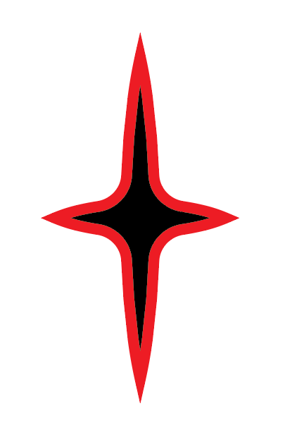
First, create two lines using the line tool. Make them intersect in a cross, with the vertical one being longer. Set the stroke to a thick value, then set the variable width profile to width profile 1.

You should now have something that looks like this:

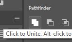
Select both lines, go to the object menu, and select expand appearance. Then, go to the pathfinder, and unite the shapes:
![]()
Switch to direct selection, and select the innermost corners:

Drag any circle near a corner outwards, as far as it can go. You’ll now have something like this:

I want to add this to the text, in the same overlapping style, so I’m going to set a stroke with a distinctive color:
Then, go to the objects tab, and click expand, keeping the default settings. Duplicate this wherever you want it on your logo:

Select each colored part and the part it’s overlapping (don’t select the actual star, just the outline - you may need to ungroup), and use the click to minus front option in the pathfinder menu. Select everything and group it together, then move on!
After adding the sparkle vectors, as detailed above, this is what our logo looks like:

Adding a Background
Now that we’re finished with this, we’re going to add a background. The background for this logo will be a cloud shape that matches most simulator logos.
Select your logo, then go to the object menu, select path, then offset path. Mess around with the value, until you end up with something that you like. Before unselecting it, unite it in the pathfinder menu:
Then, move it to the back (right click, arrange, send to back), and recolor it. You should end up with something like this:

Coloring and Final Touches
Now that we’ve set the foundation of the logo, it’s time to be display your artistic touch!
First, ungroup your logo - we want to be able to color individual parts. Since this is an advanced tutorial, we’re going to use gradients for the majority of the coloring. Click the gradient tool, then an object:

Double click on a point along the gradient line to change colors, or add/remove a new point. You’re welcome to use solid colors, but gradients can give it a nice touch without taking away too much attention.
I want to use one gradient across all of my letters, so I’m going to select all letters, then go to the object menu, then make a compound path. This will make all of the text one shape, so the gradient won’t be restricted to individual letters.
Next, I’m going to select my background, and offset it (object, path, offset path) to create a border. You can use a stroke instead, but offsetting it into a new shape allows for gradients. I’ll repeat this step, recoloring the outermost border to match the center using the eyedrop tool:

Finally, I’m going to add stars. I created a series of small circles, then used the transform each feature to randomize their position. To replicate this, select all dots, right click, go to transform, and select transform each. Make sure to check the box that says random, then mess around with the size and position modifiers to see what works for your design. Then, select the background, duplicate it, and put it over the pattern. Select the pattern and overlay shape, right click, and select make clipping mask. This will make the pattern form to the shape you want, so it doesn’t go outside the logo.
With all of these finishing touches added, here’s the final product!

Closing Note
Well, that’s all I have for this tutorial. I really hope you learned something from this, and will be able to go forward with new ideas and skills. I’d also like to note that this is only my second Illustrator tutorial, so please let me know what I can do to improve, via replies or DMs. You’re welcome to reach out to me with questions, or reply to this topic with requests for other tutorials. I know that there are others with much more skill and experience, but I’m eager to share my knowledge and hope that I can inspire and inform with these tutorials. Thanks again for reading!