Introduction
Thanks for checking out this tutorial! I’ll get right to the point - this tutorial will go over the steps to recreate a traditional cartoon simulator-type logo in Adobe Illustrator. This is meant for beginners to the program, who want to learn how to create simple logos in this style. Don’t want to pay for a program like this? No problem! A quick search can yield similar programs that can achieve the same result.
Following these steps will result in the image below, so remember to make your own changes if you want something else!
Note: if you don’t see the windows being used here, go to the “Window” tab at the top of your screen, and make sure you have the necessary ones selected.

Tutorial Steps
Creating the Base Text
The first step is to create the text that’ll serve as the base for the logo. To start, create a text box:
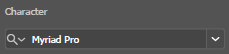
Write out the text and determine alignment, sizing, and font. The font for this type of logo should be bold and simple. To find a good font, it’s best to filter fonts by heavy weight to find a heavily bold font. Since we want a generic simulator-style logo, we’ll use the Arial Rounded MT Bold font.
![]()

Use the following options to mess around with the font size and spacing, until you find what works best for you:

Here’s the text that we’ll be using for this tutorial:

The next step is to select the text, and create outlines, which will convert each letter into an editable object. To do this, select the text, right click, and click “Create Outlines”.
Ungroup the outlined object by right clicking it and selecting “Ungroup”. You’ll notice now that each letter is a shape. You can move them around as you see fit, or use the Direct Selection tool to edit the shape. Use this time to color your text. If you want to wait until the end, that’s fine, but this is the best time to do it if you’re using more than one text color. Once finished, select all your text by dragging your cursor, and group it all together again. Here’s what I’ve chosen to do with the text coloring:

Many simulator logos have arched text, or text with some sort of warped effect, and this tutorial is no exception. Select effects, then warp - you can mess around with these effects to get some amazing designs, but for the purpose of this tutorial we’ll be doing a simple arch with a 15% bend.

Finally, to finalize it, open the object menu at the top of your screen, and select “Expand Appearance”.
Adding Basic Effects
We now have our base for the logo, which if you followed this tutorial, looks like this:

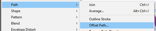
To add a cloud-like background, we’re going to select it, open the objects menu at the top of the screen, and offset the path. For this tutorial, my offset value will be 25.
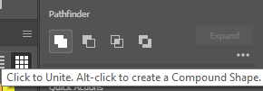
You’ll now have something weird, like this, but don’t worry, it’s intentional! Without deselecting it, go to the pathfinder menu in the properties window, and unite the objects.

You’ll now have one large single-color object, with a letter or two overlapping. Color it to whichever color you want, then send it to the back. Do this by right clicking it, opening the arrange menu, and sending it to the very back:

Now that you have that cloud background, you can offset the path again, but by a smaller amount to achieve the classic simulator look. Here, I’ve offset it, then offset the offset, and so on until I have a rainbow surrounding it. Next, I select the text only, and add a small white offset. This is one of countless effects you could do.

*If at any point you experience issues selecting individual parts, you can ungroup everything and regroup at the end.
Finishing Touches and Completion
Use this time to make any changes you want to colors or effects, then when you’re satisfied, open the file menu and export it.
Final Note
I’d like to note that this tutorial is among my first Roblox tutorial, and that I am by no means an expert on this - there may be better ways to achieve what I’ve achieved, and there are certainly better designs you can achieve with these methods. This was to give an introduction to Illustrator and how to make a logo like this, so please understand that there is so much potential for better designs if time is put into it. As a designer, I’ve utilized these steps countless times to create these types of logos - if you want to see more examples of this method, check out my portfolio.

