The Upcoming Changes:
ROBLOX just gave a sneak peak on the upcoming changes for avatars at RDC. You can view the stream here and skip to 3:14:20 for the beginning of the avatar demo. If you’d prefer not to watch it, here are a few screenshots of the proposed changes:


The good:
As Sorcus mentioned in his presentation, continued iteration on the avatars is necessary. R15 isn’t fully complete, and its design needs to be fully fleshed out before the UGC we’re all waiting for can begin, as otherwise we as developers would have to continually update our accessories/etc whenever the avatar changed. Some of you may not agree with the direction it’s headed, but the avatars do need to be finalized.
The bad:
It is necessary to establish what this section will not cover. There are a number of outstanding issues with R15, so some would argue that this kind of change should have been less prioritized. For instance, R15 is used by 75% of players on the site because it looks great, but is only supported by 25% of top games because there are so many in-game issues. While this is definitely important, ROBLOX made the right call prioritizing this change, regardless of whether the direction they took it was great or not. These problems depend on the design of the avatar, so these issues may not even exist when the design changes.
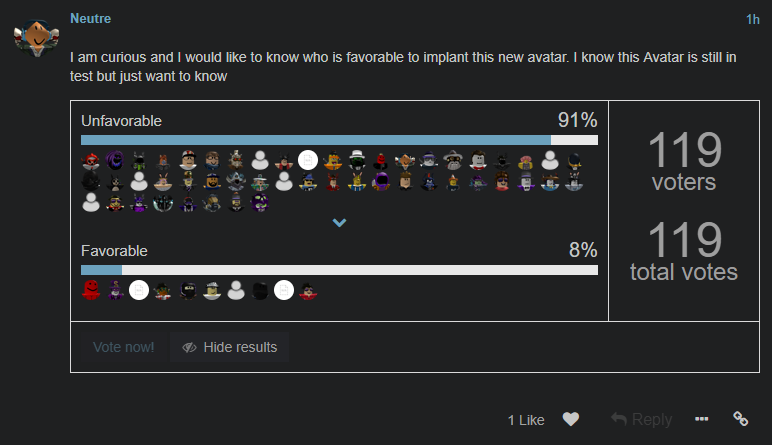
The direction ROBLOX took this change in, however, is disappointing. Instead of an instant round of applause, the announcement of these changes elicited doubt from RDC’s attendees and everyone watching the stream. I can’t help that notice the proposed avatars look eerily similar (except slightly older) to the Avatar 2.0 which elicited such negative criticism that R15 was built from the ground up:


There’s nothing wrong with the proportions or the fact that it’s anthropomorphic (which is great), but that the aesthetic of the character is creepy. It’s unfortunate that we’re coming full circle to what we worked so hard to improve into R15. This is just a single package, but other packages would need to aesthetically fit with this one to prevent immersion from breaking – this is not an aesthetic that would work well with ROBLOX games. Even some of the developers this is targeted at like StyLisS studios have mentioned that they would never want to use this in their games.
I could go into elaborate detail on the upcoming avatar, but as I mentioned earlier, this has already come full-circle, and there’s no need to repeat what has already been discussed to great length in the Avatar 2.0 thread.
Where should we go?
I understand anthropomorphic proportions are extremely difficult to fit into a setting such as ROBLOX, and applaud the ROBLOX staff for all of their hard work so far. This topic was not created with the intention of whining, and I would not have brought it up if I was not willing to shoulder some of that burden as well. I, and I imagine the rest of the forum, are more than happy to put in a ton of effort and work with the ROBLOX staff to improve the vision of the avatar, so don’t be shy to ask us.
What would I suggest ROBLOX do with its avatars? As @glurbman pointed out earlier, @Yourius has been developing some amazing anthropomorphic characters for Q-Clash which could serve as inspiration for the future ROBLOX avatar. They have realistic proportions but do not fall into the uncanny valley at all. Better yet, they fit the ROBLOX aesthetic perfectly because they’re designed for a ROBLOX game:


