Custom Studio Interface (Themes and Icons)

As a Roblox developer, it is currently too hard to fully select what my theme and studio icons are going to be across the entire of the studio interface. Not every person likes the current set of icons for studio as we can see here and there is debate on even using icons like Vanilla by @Elttob as not all users like it. So let’s give both the choice.

If Roblox is able to address this issue, it would improve my development experience because it allowed developers to customise their interface including their icons for their needs as developers and allows developers to introduce custom themes and icons which can provide a market for developers.

For example, some developers may want their interface to look something like this image and they find they work better with a design language like that.


Source: https://twitter.com/Elttob_/status/1426329837355024389

70 Likes

This would be so easy to add (atleast the colours and icons anyway) because they’re controlled by a JSON file inside the internal qtr folder. Just make it also source from an external directory, ie Roblox/Themes/

10 Likes

Funny you mention this, for the past few days I’ve been attempting to patch the json file, I’ve had SOME success but… it’s complicated, I’d love for Roblox to support an official feature that allows me to load my own JSON theme.

4 Likes

I’ve made a tutorial to help with this.

9 Likes

Our designers are working on icon iteration in line with feedback received.
In the meantime, here is how to create custom icon packs with new studio channel, this will later turn into its own devforum announcement.

How To create a custom Icon Pack:

This will guide you on how to specifically override the insertable object icons (any object icon you see in the explorer).
I will provide a brief overview, the detailed specs we use can be found here
https://specifications.freedesktop.org/icon-theme-spec/icon-theme-spec-latest.html

Step 1:

  • Create a folder on your computer named RobloxCustom

Step 2:

  • Populate this folder with pngs of all the icons you want to override. All explorer icons are 16x16 pixels, however since Studio is now dpi aware, you may wish to provide additional sizes for your icon pack. We will select the icons you provide closest in size to the ones requested, but this may result in blurry icons.
    Example of windows scalings and desired explorer icon sizes:
    100% scaling : 16x16 px
    150% scaling : 24x 24 px
    200% scaling: 32x32 px.
  • All Overridden icons should have the exact same name, as how the object appears in the explorer (Case Sensitive).
  • For each size of icon provided, put all icons of that size in its own subfolder of RobloxCustom.
  • Inside the RobloxCustom folder create a file named index.theme . This file is an ini file in line with specifications linked above. It MUST INCLUDE the Inherits=Roblox line, or else we will not render any icons except your custom icons. It also has a name and comment which can be anything. And then the [name] of each subfolder in RobloxCustom and the size and scale of icons found in that folder (you can use scale=1 for all your icons subfolders for now)
  • It should look something like this:

[Icon Theme]

Name=CoolerIcons

Comment=My custom icon pack

Inherits=Roblox

[standard]

Size=16

scale=1

[scaled150]

Size=24

scale=1

And would have a corresponding directory structure looking like
RobloxCustom
----standard
--------Workspace.png
--------Camera.png
--------Part.png
----scaled150
--------Workspace.png
--------Camera.png
--------Part.png

Step3
In Studio Settings set CustomIconDir to the PARENT FOLDER of RobloxCustom. Observe your icons should now be visible in Studio.

Note: Certain Explorer icons also are used in the ribbon. For example if you override the RigidConstraintIcon, this also appears in the ribbon Constraints menu as a base 32x32 icon. Your new icon will also be used here, and may be blurry if you do not provide appropriate sizes.

FAQ:

  • Can I override only some of the explorer icons?
    • Yes.
  • Can I have themes for light and dark in one icon pack?
    • Not at this time
  • Can I override icons outside of the insertable object icons?
    • The ribbon icons can also be overridden in the same manner, but I am unsure if this will be a fully supported feature going forward, so will not be providing specific instructions for this at the moment.
  • Will roblox delete my RobloxCustom directory whenever I update Studio?
    • No, as long as you do not store it in the roblox executable directory
55 Likes

This is very much a first draft of allowing custom user theming, so please let us know what features are most essential to your workflow. Do you switch between light/dark theme and would really value allowing multiple icon themes in one pack, do you really want to override particular widge tor ribbon icons?

12 Likes

Is there an already exist .zip or folder you can share with all of the icons we can use as a base (example being a base texture pack for Minecraft?)

6 Likes

This is amazing, thank you for the writeup and extended thanks for the work on this feature.

One thing I would really appreciate is for topbar icons to be fully supported. This would allow for total consistency in theme packs for Studio, which is not only important aesthetically, but also useful for users with colorblindness or users who are sight impaired in other ways, and may have trouble with fine details on certain icons (e.g. play mode buttons, thin lines on white theme, etc).

For example, Elttob has designed complete icon concepts and redesigns for Studio that include the topbar, and I’m sure a lot of users are itching to have that consistency throughout the interface. It would be rather incomplete not to support the topbar.

6 Likes

Thanks for the feedback. Current approach does support topbar, but the names for overriding each individual icon are not as obvious as the explorer icons. We are still deciding the best way to expose all these names to users.

6 Likes

That’s good to hear. :slight_smile:

For this I might suggest a little window in File > Advanced that opens some kind of Studio developer reference. It could be a nice home for things like StudioStyleGuideColors (e.g. viewer plugin) and icon names and previews at their various sizes. It might be more convenient to do it this way than on a documentation website because it could pull content directly from the current version of Studio, but I don’t know how the pipeline for publishing docs works.

3 Likes

EDIT: I solved my original problem, however a new problem has arisen.

Old post (not necessary anymore)

I would like to be able to tweak what icons each class type are associated with.

Specifically, for my Vanilla v3 icon pack, I have defined a ton of extra icons which Roblox doesn’t provide by default, for example for hidden services or to disambiguate instances which currently have the same icon.

To give some context for how many icons I’m dealing with (these are not final):

I have mapped every single instance class to an icon already.

How would I go about updating the icon associations so that I can map each instance icon to its corresponding PNG file? If this is not possible, then I would request this be fast tracked, as Vanilla is currently the biggest use case for this icon customisation tech and the newest version is built heavily around being able to tweak these associations.

I have managed to load in my own icon pack successfully:

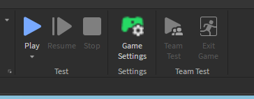
However I am concerned about namespace collisions. I have intentionally only provided icons for instances, however I am seeing icons appear for things such as the Game Settings ribbon icon. I want to use different icons for these in the future.

image

Will these namespace collisions be resolved?

9 Likes

It sounds like one thing you could do here (for the time being) is to specify the larger additional sizes and provide the different topbar icons only in the higher resolution. This probably won’t work in all cases because the topbar can resize icons to accommodate resolution IIRC, but maybe a good holdover for now? Definitely think topbar icons should be completely separated from the class icons shown in the explorer.

3 Likes

While I like this, can we have the ability to change the bindings of each QAction icon one by one, right now, it feels awfully restrictive and as @Elttob noticed, has clashes with explorer icons.

1 Like

I’ve been thinking on what a good solution for this would look like considering Roblox’s icon format.

Right now, Roblox drops all of their icons in one central directory, and refers to them directly by name. Explorer instances draw from the icons with the same name as their class, while ribbon icons and other icons from around the UI use hardcoded names:

This is fantastic… if you’re Roblox. For modders, this is an unmitigated nightmare. We don’t actually have the power to change any icons, we can only push pixels over our problems. I can make it look like the ribbon uses different icons, but only because I’m hackily specifying different icons to show up at different resolutions. I don’t need to explain how that’s fragile, especially considering that Studio is moving to a more responsive design where resolutions aren’t guaranteed to stay constant.


What should really be implemented is a layer of indirection. Every unique usage of an icon should be given a unique identifier. At this level, we should not be thinking about what icon we intend to show there - we are explicitly deferring this decision.

Once we have a list of unique usages, we can then map icon names onto those usages. This list should be part of the icon pack, not hardcoded into Studio. This means if an icon modder has a different idea about how icons should be associated, we can change the association ourselves.


For a living, breathing example of how much better this system would make icon modding, I refer you to the View tab, where we can discover how Roblox’s icon format has locked us into a deeply unsatisfying situation:

image

Both of those buttons draw from the same icon, ShowGrid.png. That’s hardcoded behaviour, and as an icon modder I am completely powerless to change that.

I already have two separate icons designed specifically for those buttons. They’re 100% ready to go - I have them right here:

But because Roblox has hardcoded those icons, too bad! Looks like I’m stuck with Roblox’s design decision in my icon pack now:

image

This sucks. And it’s far from the only occurrence of problems like this. There are icons left, right and centre where I want to do more than just change the pixels. I want to change the associations. That’s pretty table stakes for a good icon pack format, so it should be possible.

41 Likes

What about custom themes? I’d love to be able to make themes.

2 Likes

I love how your example theme looks. It looks clean, new, and update like it seems Roblox was going for but still has that visual clarity with good use of colors. I would much rather have it than what they’ve made.

1 Like

May I ask why this is only on the new studio? Update after update I dont have it, and I really want to replace them myself. At this rate I’m going to be the last person to get them.

HKEY_LOCAL_USER/Software/Roblox Corporation/Environments/RobloxStudio/Channel

Change (Default) to

zqtitanstudiorelease or zqtitanstudioreleasehighdpi

Reinstall Studio once set. (I dont know if this actually works but I’m pretty sure it does)

3 Likes

Roblox just doesn’t want to give it to me at this point. I completely removed it once changing the key and I got nowhere.

2 Likes