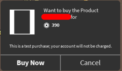
Issue Type: Display
Impact: Moderate
Frequency: Constantly
Date First Experienced: 2021-03-07 00:03:00 (-07:00)
Date Last Experienced: 2021-05-06 00:05:00 (-06:00)
Reproduction Steps:
See: Developer Product Icon is Scaled Wrong (I reposted this as a bug report since the OP seems to be in the wrong category)
Create any square image and set it as the image for a developer product. It will be inset and squished when it is displayed to the user.
For example, this, a 256x256 blank image

will become this

Expected Behavior:
I would expect all dev product images to fit the whole square rather than being squished into this weird aspect ratio with an ugly white background.
Actual Behavior:
Any square dev product icon will be squished
Workaround:
If you upload an image that has a 3:2 aspect ratio instead of a 1:1 aspect ratio, it will be squished to a normal size. For example:

ᵃˡˢᵒ ᶦᵗ ʷᵒᵘˡᵈ ᵇᵉ ⁿᶦᶜᵉ ᶦᶠ ᵗʰᵉ ʷʰᶦᵗᵉ ᵇᵃᶜᵏᵍʳᵒᵘⁿᵈ ʷᵉʳᵉ ᶜᵒᵐᵖˡᵉᵗᵉˡʸ ʳᵉᵐᵒᵛᵉᵈ ᶠʳᵒᵐ ᵃˡᵖʰᵃ ᶜʰᵃⁿⁿᵉˡ⁻ᶜᵒⁿᵗᵃᶦⁿᶦⁿᵍ ᵖʳᵒᵈᵘᶜᵗ ᶦᶜᵒⁿˢ