Do not use embedded React component styling in UIBlox and/or add HTML element classes, IDs, and metadata

As a Roblox developer, it is currently completely impossible to add user tweaks to websites like the Talent Hub and the Creator Dashboard due to the way UIBlox and these websites are built and styled.

I refer specifically to user tweaks such as making additions to the webpage (e.g. embedding asset IDs) through extensions, and custom CSS styling (to adjust padding, information density, colors, contrast, etc. for accessibility purposes). This however is a very short list of all the possibilities, and does not encompass needs that may yet become apparent.

Developers do not have time to wait months or years for Roblox to add small UX improvements. These websites still do not have a light theme for example, and some people literally need black text on white to be able to read. Supporting third-party page modifications is important for a platform like Roblox because Roblox cannot anticipate everyone’s workflow needs, and cannot immediately satisfy them when they come up.

UIBlox is currently using some React library that allows you to embed CSS styling directly on components, which is then dynamically compiled out when building the webapp.

This approach is anti-user (and in my opinion, a plague on the open Internet), because this completely destroys the user’s ability to do the above adjustments on affected webpages to support their accessibility needs and to support niche workflow needs. Webapps using this technology need to manually include classes and IDs on HTML elements to enable third-party developers to extend them.

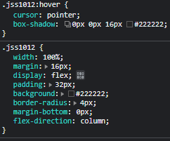
See below; this is the DOM and styling for a job card on the Talent Hub. This is completely meaningless, unnavigable, and fragile to third-party developers.
image

And this is the DOM for a line from the Animation assets page on the Creator Dashboard. Notice that the asset ID is nowhere to be found so third party developers can use it for page extensions. And even if it was in the DOM, this element is not reliably navigable via a CSS selector.

Roblox needs to include classes, IDs, and metadata on HTML elements.

It would also be beneficial if Roblox stopped embedding various constants directly in the generated stylesheets, and instead used a global sheet of CSS vars, which can be overridden by third-party stylesheets.

57 Likes

Vouch! Everyone has different preferences for their workflow, and on this site, extension developers can’t implement changes. I hope that this can get changed soon.

7 Likes

That’s the least of your worries. The framework should be trashed in its entirety for an entire deluge of reasons in addition to the thread’s topic.

Firefox:
[oops, Discourse fails to generate markup for uploads, link to the uploaded video]
Pale Moon (indefinitely):

It seems that it’s doing something clever to reduce time-to-first-render to nearly nothing, but then squandering it all by making everything pop in and out and sliding elements around for several seconds.
(Note that this looks as goofy as it does due to Firefox cleverly hiding the poor performance and the screen recorder being quite intensive)

It doesn’t do that when I click on a link. In fact, it appears to do nothing for many seconds — with no feedback other than a dotted blue outline and the cursor being suspended in the hand cursor — before finally navigating quite gracefully, actually.

That’s fine, right? No! Opening a link in a new tab forces the page to load from the start. I open pages in a new tab significantly more often than I simply left-click a link. Browsers support tabs now and have done so for decades.

Clicking one of the heading links, which should ordinarily just scroll to a heading, freezes the page for a second. Why does it take an entire second to do that?

It also cannot be viewed at all with JavaScript disabled. This is understandable with the more app-like sites, but unthinkable for Creator Documentation.

What happened to webpages being documents, not complicated client-side applications? Do the web developers yearn for Flash?

6 Likes

I gave up on this last month. Is this a sign of hope, perhaps!?

All Roblox has to do is set disableGlobal to false in the jss settings :roll_eyes:

1 Like

Support.

If Roblox refuses to make a light mode (which is essential), then at least they should allow us to make one.

1 Like

At this point they should just use a Jekyll MD for the Documentation because it’s clear they don’t even remotely care about the state their website and framework are in.

Documentation is supposed to be static, responsive and straightforward because that’s the point of it. To be rendered and easily read by the user. I don’t care about the fun little animations that make the button pop and go unresponsive for a second, that just makes my life miserable.

I think the Luau site is a good model for what the DocSite should be. Quick and small animations that makes it go instantly to where I clicked.

4 Likes

This API and config is interesting. If they are actually using the legacy styling system for MUI, I’m not sure why Roblox would have enabled this other than for very specific benefits with the way the webapp is bundled and served.

However, on the creator dashboard and talent hub, CSS is embedded like this in a giant avalanche, and many of these HTML elements are just … empty, so I’m not really sure what benefit Roblox is getting from doing this.

Wonder if it’s possible for them to use the deterministic mode for this and prefix the classname with the component name or something similar. Anything unique and at least partially deterministic would be ideal; CSS selectors can partially match IIRC, but performance isn’t that great. Perfectly deterministic and unchanging would be better.

2 Likes

Seems to be related to this issue

Hi, thanks for the feedback! It is definitely not our intention to make these pages inextensible by the community.

There are few steps we are taking here to address the above.

  1. We are actively working on making component class names deterministic in an upcoming release. Minimally classnames (or a similar DOM selector) should be stable per release basis.
  2. We are improving performance across all of our pages starting with some of our most high traffic areas within Creator Dashboard and DocSite.

It would be really helpful to us to learn more about the usecases you find particularly troubling and are trying to build on top of yourself. Are there other similar use-cases such as the animation asset id example?

17 Likes

Sorry for the delay, that’s awesome to hear. Hoping these changes unlock a lot of options.

Other use cases for myself haven’t really come up yet, but the audio page on creator dashboard has the same problem as the animation page; impossible to obtain the asset ID without extra clicks. Other small UX details are probably achievable through third-party page extensions such as always showing specific game tiles first despite sorting, showing more things on screen at once, highlighting certain quick links, etc.

In any case, things like Roblox+ and BTRoblox emerge iteratively. A lot faster than Roblox can make changes to these websites. Opening room to enable extension means that worthwhile changes will show themselves.

2 Likes

One additional thought I had about this: I wish I could use the creator dashboard as my default Roblox browser tab, but it feels too blind; I want to include more details from roblox.com on the creator dashboard, such as a quick glance at my group walls, my robux balance, quick links to the catalog, games page, etc. Right now the creator dashboard feels rather claustrophobic and limiting and I don’t really want to leave my browser focused on it because it’s too difficult to quickly see many player-facing things I regularly check on. It’s easier to leave my browser parked on my group page since that gives me faster access to group wall comments, shouts, etc. and my game details page for player count, server count, and the join button. These are things I would try to embed/extend/quicklink to on the creator dashboard with third party extensions where possible.

1 Like

Hello, where did this land? It seems like these steps didn’t go further than this, at least not visibly in the past months.

2 Likes