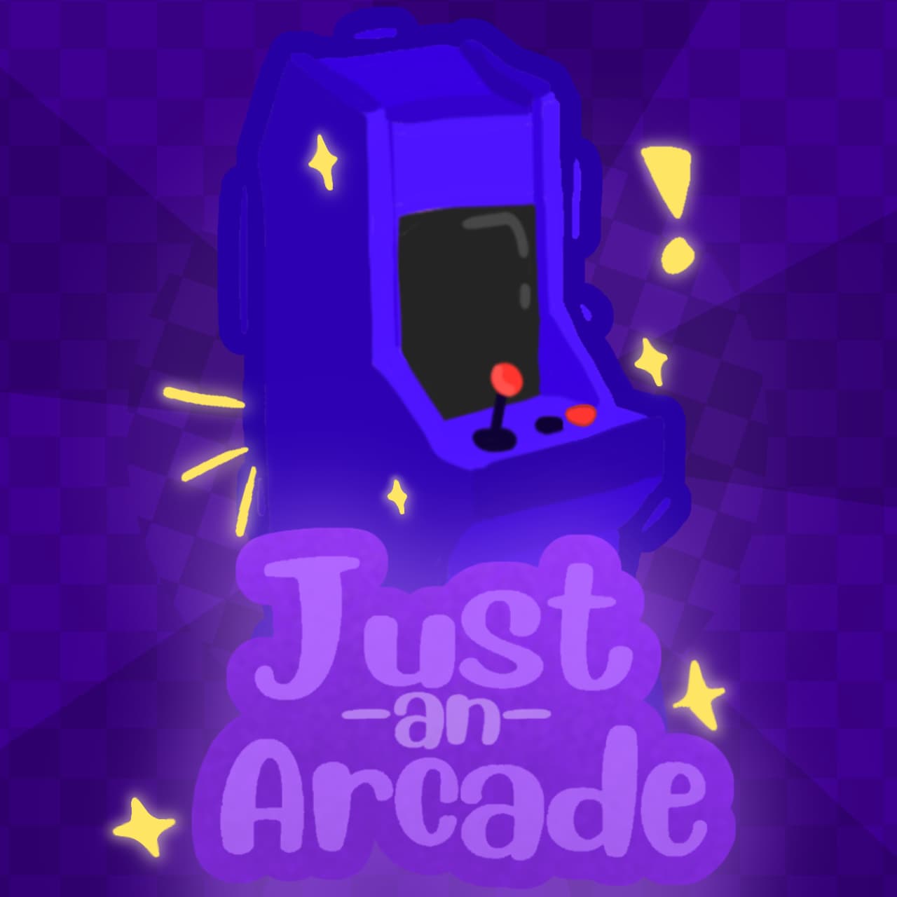
Heya! A few months back, I made a post about an icon I created for a game I’m making. Since then, I’ve changed it quite a bit.
The game is an arcade with a purple aesthetic. What are some suggestions to make it more appealing and pop out more?
Also, which background color is better? What should the text color be? Here’s the icon
I like it ! I like the font and the cabinet, but I suggest adding a color to break up all the purples to make it pop, especially on the text so it’s easily readable, and maybe a ring would look nice around where the checker pattern breaks up. Big improvement over your last one for sure !
I like the first one better, I think it contrats well.
Other than that, there are a few little pockets around the screen of the arcade machine where I believe it shows a background color?