All buttons are in the top bar and I have made a tablet with apps some old menu,s will be an app you can always use the old menu,s by the 3 dots and there you find buttons for apps on the tablet
theme
You can on the tablet chose your theme you can use different themes you can change the theme from the buttons and the menu,s the default theme will be light blue background maybe in the future with ui gradient and orange ui stroke the title will be on sn image and it will be default red the top bar can you change the color and invisiblety the color from the tablet sall you can change
theme obbies
By the obbies can you enable change atomaticaly the theme for the theme from the obby maybe too for the color from the tablet
more information
For more information and any updates about the new GUI system
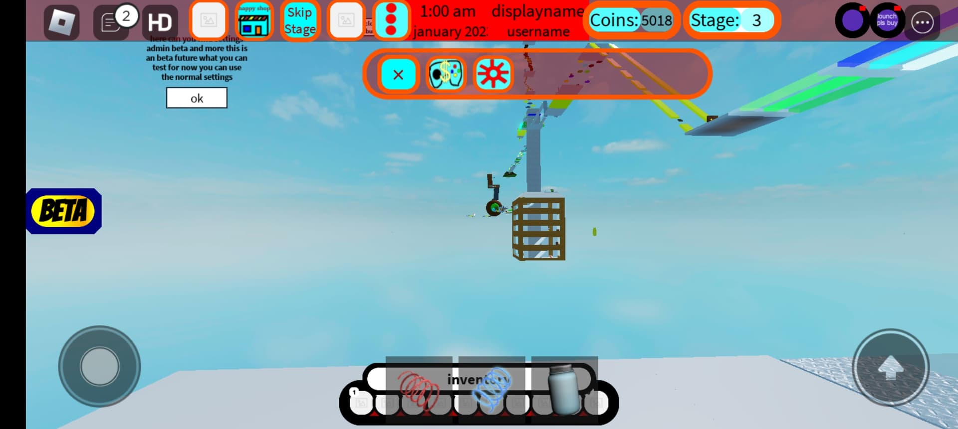
First of all why is there a topbar background, try removing that
why is the UIStroke so high and it’s color out of contrast make it white or atleast something in contrast.
And keep a constant color scheme that isn’t too expressive.
Do not use source sans as a font and use TextScaled on small UI.
the ui is so cluttered! Remove the time and username that is not needed.
This Topbar could use some work. Not everyone is perfect but still, I would recommend using Topbar+ that will fix a lot of these problems and clean up the UI, also about the Inventory
Why is the UI Stroke so thick?
and maybe adding some shadows or something will help but that is a bit harder.
I would recommend reading some UI and UX tutorials on the devforum like this is one I made, or this which is really helpful for UX, and there are way more.
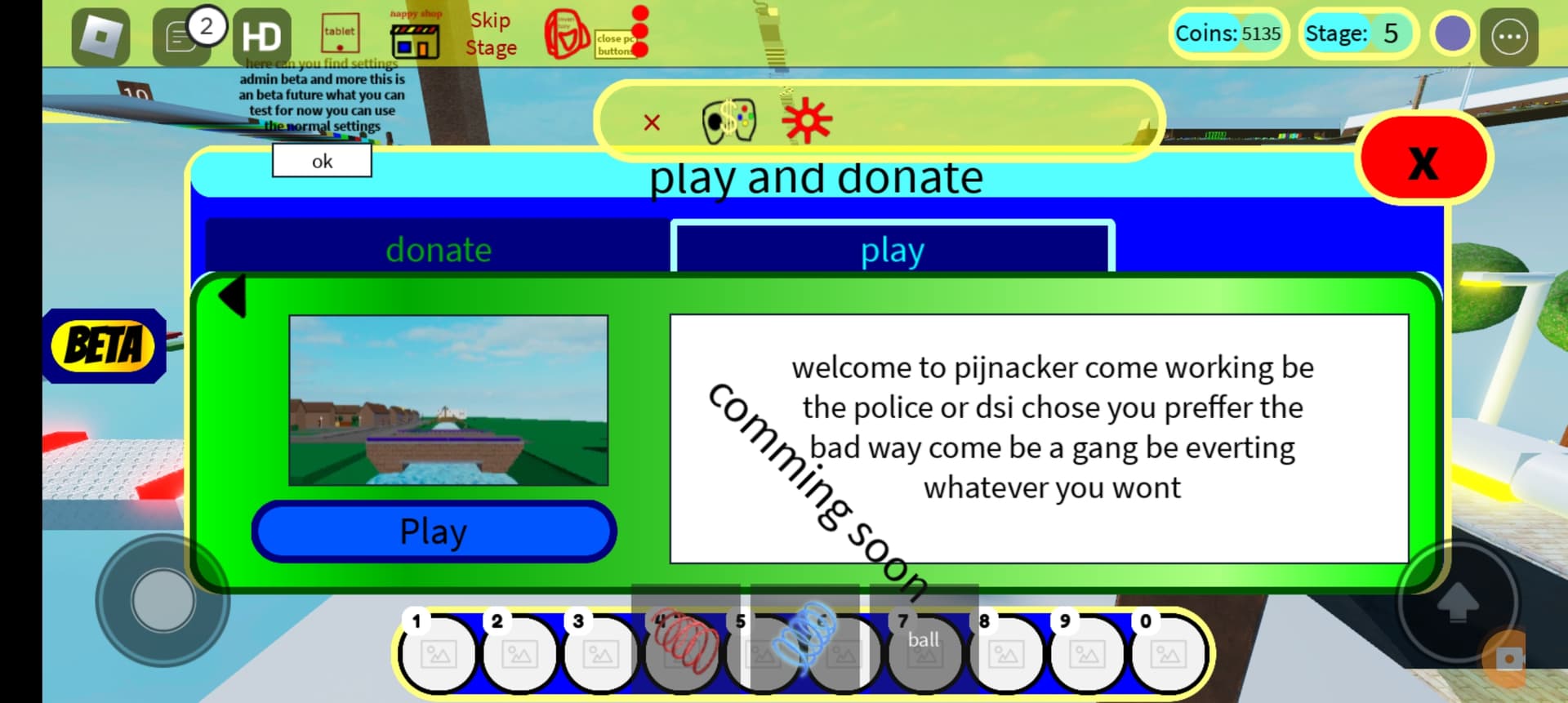
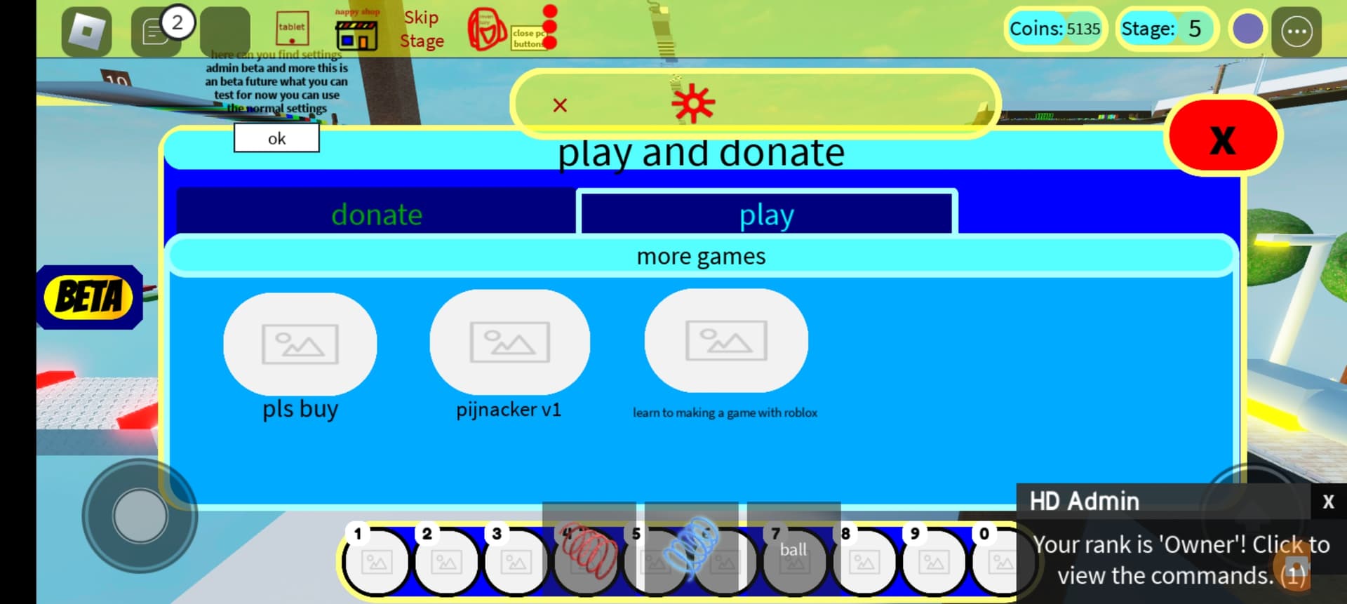
I have tried top bar plus but it’s dificulter to use Because idk how to ad items to the top bar so I has copy from core GUI while play the top bar and change it to add all ui items in the game to it
If you are trying to attract kids then this would be the perfect ui, if your not, maybe try changing it to a single color and make it less cluttered and use a different font possibly.
For my new ui I will remove the background from icons and use red as color and for borders orange and maybe an background but I must look for collors and what as I do Bleu and light yelow as collors and then different Bleu
I have one theme Bleu and yelow a summer theme in the future the theme match the season the icoons have an transparant background and in the future as your mouse over the button go then the border Will be visible
where do i start… This doesnt look like some sort of studio made game… Im sorry but its so unwell built it hurts to look at. Change up the font to something good. make the text stand out more (blue and black doesnt match but blue and white text do) And i hate how things overlap the inventory and remove the yellow ish background. The erm second hotbar doesnt need that thick of a border. Remove the beta button on the left and switch it out for a text at the top to say its version, Dont have black text without background, the donate images should be reworked to something erm better ish and istg stop having the ui overlap each other it looks horrendous… Im sorry if this sounds rude… But you need to step up your game(s) Because ui is important in every game, having a good game but with a bad ui wont do it…