Free Cartoon themed GUIs

~ Free Cartoony GUIs ~


Hello! I’m XQII46, this time I will give you cartoon themed GUIs!
I hope you like it!:slightly_smiling_face:


:tada: Sample Screenshots

Main Buttons

image

Main Frames

Achievement Gui

Shop Gui

Inventory Gui

Settings gui
image

Trading Gui
image

Error Gui
image

:sparkles: Features

  • Clean design gradient UI
  • Fully customizing
  • Smooth Tweening
  • Cool tooltip
  • Open-Sourced

:file_folder: Download: Here
:computer: Uncopylocked Game: Here
You can change the GUI appearance with your own game theme.


:pushpin: Notes/Credit :pushpin:

I just wrote a script on Tweening and design the Gui!

Icons Sources:


Support me! Here


That’s all the message I can convey, I’m sorry if there are any wrong words.

Thanks for Reading!
Have a great day!

45 Likes

Cartoon isn’t really my style but I really love your GUIs! Good job!

2 Likes

I was browsing Community Resources to find a “Tween Library” and came across this lol. Gui looks awesome, especially the buttons!

3 Likes

I never realized how nice the Back tween style looks! Great job!

One issue; when hovering over achievements, or, any button for that matter, the text clips a little. You can fix this by turning off clipdescendants.

2 Likes

This gui is better than average UI pack on DevForum, but it could be improved.

  1. Why doesn’t ScrollingFrames use AutomaticCanvasSize? This leads to unnecessary scrolling space and makes the size of canvas limited.
    изображение
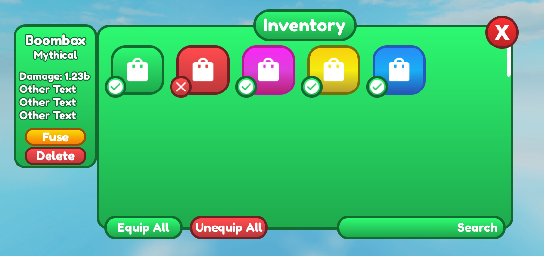
  2. The circle on switch doesn’t look really good as it doesn’t fit the style of UI.
    изображение
  3. The stats box could be moved a bit from the inventory frame so the strokes wouldn’t join together.
    изображение
  4. The tick icon should not have a background, just like the cross icon.
    изображение
  5. I suggest removing the gradient on text input fields and changing background color to white and the text color to gray as it looks like a button.
    изображение
  6. It looks like this icon is stretched.
    изображение
  7. Gamepasses could be moved down a bit from the title.
    изображение
    Same thing with close buttons
    изображение
  8. Corner radius of all frames should be the same.
    изображение
    изображение
  9. This text could be rotated a bit less and the stroke thickness could be increased.
    изображение
  10. Big difference in thickness of strokes.
    изображение
  11. Stroke thickness here could be increased.
    изображение

These are main issues with your gui excluding color choices. Also I suggest staying with 1 style and not making everything different (just like player list and trading gui).

4 Likes

Brilliant work! I’m going to use these for my game. Thanks!

2 Likes

I got to say, this has got to be the best Cartoony UI Pack I have personally seen in the DevForum as of right now. I will definetly use it for my upcoming games ( with credit that is )

2 Likes

not gonna lie at first i thought this was yet another ui resource in my last reply but… dang this looks good

3 Likes

Is there any way to create these in studio? I don’t really need them I just wonder if I can make the circle button 1/1 in studio without images, or I have to make something magic in an art program.

2 Likes

Just make a TextButton or ImageButton, add an UICorner inside and set the Radius to {1,0}. Add a UIStroke, customize it (Thickness, Color, …) and done.

i guess, thats how he did it
3 Likes

The text on some of the frames need to be smaller and some padding is needed for a few buttons. But other than that, looks quite decent actually.

1 Like