This post is published in response to my old tutorial post.
 : Introduction
Hi hi, everyone! I hope that this tutorial will help you to apply the things that you’ll learn from this to your own UIs. I will also address some wrong practices in UI Designing.
 : Resources

Fluency Icon Library offers over 2,000 set of different styles of icons that will help us!

Here’s the model link for you to try, see, play around.
 : Let’s Start!
Today we’re going to make a settings panel. This UI style corresponds to the style I used in  ·
· 

I will also teach you simple animation for the UIs like hovering.
 : Commission
Just a little segue, I can accept commissions through DevForum DMs. I accept Robux (+30% addition in response to the 30% cut[Group Payouts excluded]), PayPal.
 : Table of Contents
- Tutorial

- Hovering Animation

- Final Script for Hovering Animation

- Why Offset and not Scale?

- Tips

- Wrapping Up

: Tutorial
- Add a ScreenGui to StarterGui
IgnoreGuiInset = true ResetOnSpawn = false
Above are the little property configurations will make the ScreenGui perfect to play around with.
[details = “Explanation”]
IgnoreGuiInset = true will make the ScreenGui expands into the area of the Roblox’ top bar area.
ResetOnSpawn = false will make the ScreenGui untouched even the player has died. This will just not reset the ScreenGui after dying.
[/details]
- Add an ImageButton to the ScreenGui
Image = rbxassetid://14407899530 ImageTransparency = .2 BackgroundColor3 = Color3.fromRGB(0, 0, 0) BackgroundTransparency = 1 AnchorPoint = Vector2.new(.5, .5)
Size = UDim2.new(1, 0, 1, 0) Position = UDim2.new (.5, 0, .5, 0)
The image is displays a subtle radial fading black. This will be the background image, it’s much better than the normal solid color as it gives vignette look.
The BackgroundTransparency is the resort to adjust the intensity of the transparency. Since the Image already displays translucency which is not customizable.
[details = “Explanation”]
We use the ImageButton as a layer to block any inputs from reaching behind and this can be use as a Modal Background by using the MouseButton1Click
[/details]
- Add a Frame to the ScreenGui

Make the AnchorPoint, Size, Position, &BackgroundTransparency the same as the background.
[details = “Explanation”]
This Frame will be our container and this is the object where we store all of our elements and essentials.
[/details]
- Add UIPadding to the Frame

Make the PaddingTop = UDim.new(0, 50) this will create a 50 pixels of padding area to your frame.
This object is not really been utilized very well despite it being very useful.
This UI tool will add margins to the UI element where you place it.
[details = “Tip ”]
I do recommend when using UIPadding, remain utilizing the Offset. Take this as just a suggestion as your situation will be various.
If you want to know more with UIPadding. Check this out!
[/details]
- Add TextLabel

Make the BackgroundTransparency = 1AnchorPoint = Vector2.new(.5, 0)Position = UDim2.new(.5, 0, 0, 0)Size = UDim2.new(1, 0, 0, 60)FontFace = Gotham MediumTextSize = 30TextTransparency = .1
This TextLabel would be our header! Your UI should be looking like this now;

[details = “Tips ”]
Using TextScaled for compatibility might seem common, but it’s not always the best. Using Offset for Size and Position to your UI Elements will make the TextSize work even better; we’ll get on this later. Test your TextLabel in different screen sizes, except for unsupported devices like iPhone 4s.
[/details]
- We’re going to add Close Button!
Add ImageButton, and add ImageLabel inside

Make the ImageButton’s BackgroundTransparency = 1Position = UDim2.new(0, 20, 0, -30)Size = UDim2.new(0, 50, 0, 50)Image = empty
Make the ImageLabel’s AnchorPoint = Vector2.new(.5, .5)BackgroundTransparency = 1Position = UDim2.new(.5, 0, .5, 0)Size = UDim2.new(.5, 0, .5, 0)Image = rbxassetid://11293981586
[details = “Explanation”]
I contained the icon to a bigger button so the hitbox will be big enough without the icon being huge.
[/details]
- Add a ScrollingFrame into the Frame

Make the AnchorPoint = Vector2.new(.5, 0)BackgroundTransparency = 1Position = UDim2.new(.5, 0, 0, 100)Size = UDim2.new(1, -20, 1, -110)AutomaticCanvasSize = YCanvasSize = UDim2.new(0, 0, 0, 0)ScrollBarImageTransparency
= .5ScrollBarThickness = 2ScrollingDirection =
Y
[details = “Explanation”]
AutomaticCanvasSize = Y will make the scrolling frame expand its canvas once it fills the visible part of the canvas with UI Elements.
[/details]
- Add these UI Tools in the ScrollingFrame; UIListLayout and UIPadding.

Make the List’s Padding = UDim.new(0, 10)HorizontalAlignment = Center
Make the Padding’s PaddingTop, Bottom, Left, Right = UDim.new(0, 5)
[details = “Explanation”]
UI Elements with UIStroke in them will be placed in the ScrollingFrame so if the CanvasSize is a bit narrow UIStroke won’t be able to make themselves visible due to ClipDescendants = true but we do not want to make it false as it will show all of the UI Elements inside.
With UIPadding this will fix the problem by adding 5 pixels space between the edge of the ScrollingFrame and the edge of the UI Elements.
[/details]
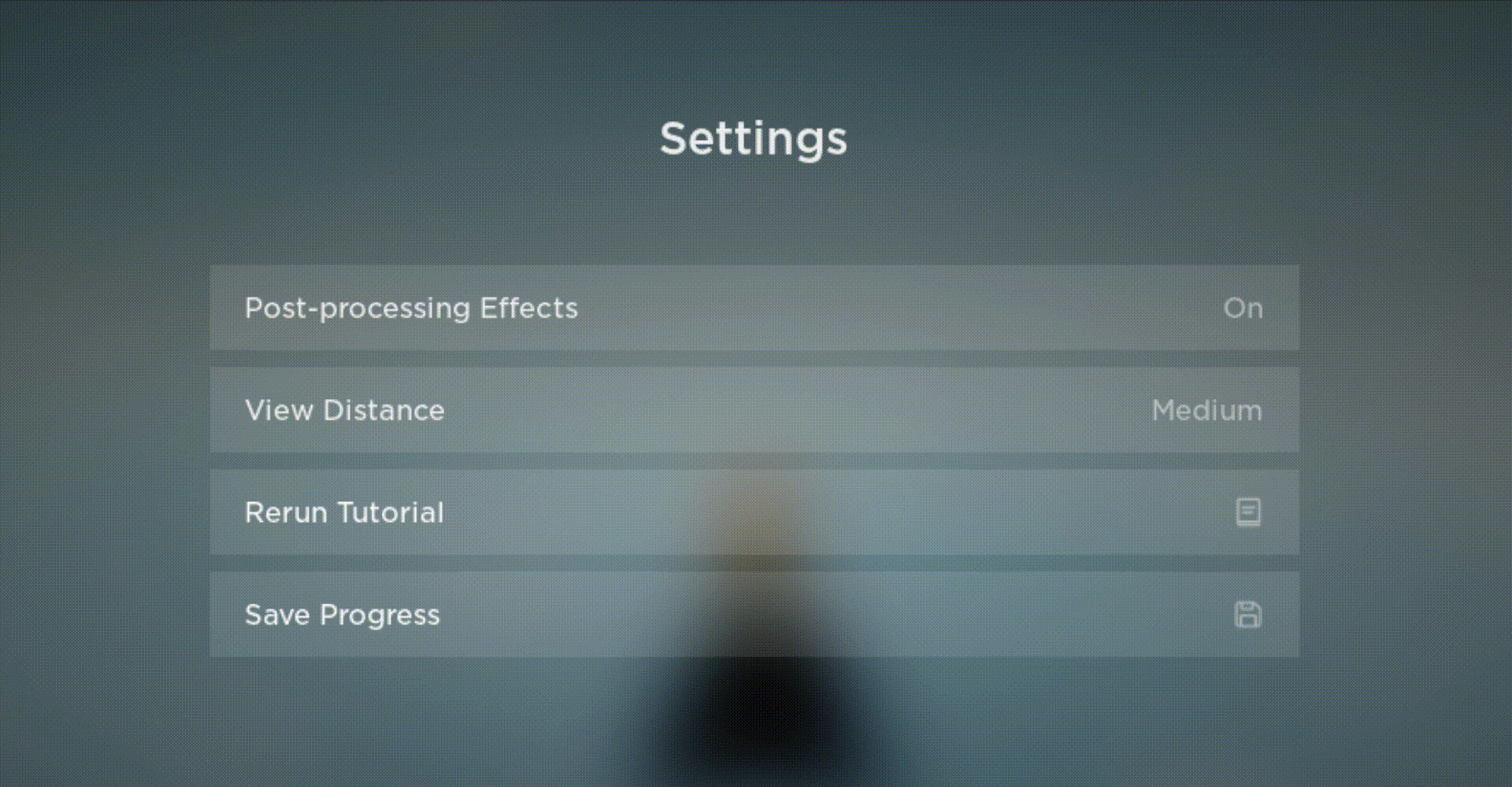
- Add an ImageButton in the ScrollingFrame. This will be one of your settings which I decided to make it ‘Post-processing Effects’

You can name your setting whatever you want.
Make the BackgroundTransparency = .9Size = UDim2.new(.2, 420, 0, 50)Image = empty
[details = “Explanation & Compatibility Check  ”]
”]
The Size property may look weird but here’s what it does. The 420 on Offset-X axis will be the same size in different screen sizes but the extra .2 on Scale-X axis is the one who’s in charge of scaling in different screen sizes.
So, while the ImageButton will resize, it won’t be as pronounced as it would be with a standalone Scale method.
Here’s a reference;
Samsung Galaxy S7:

iPad 2:

VGA:

1080p:

You’ll see it is slightly resizing to fit all of the screen devices. Also this is also a checkpoint! Does your current progress looks like from the photos above? If so you’re in the right track!
[/details]
- Add these UI Tools in the ImageButton; UIPadding and UIStroke!

Make UIPadding’s PaddingTop, Bottom = UDim.new(0, 10)PaddingLeft, Right = UDim.new(0, 10)
Make UIList’s Color = Color3.fromRGB(255, 255, 255)LineJoinMode = MiterThickness = 0Transparency = .8
[details = “Explanation”]
LineJoinMode = Miter will make the stroke have pointy edges!
[/details]
- Add TextLabel in the ImageButton

Make the AnchorPoint = Vector2.new(0, .5)BackgroundTransparency = 1Position = UDim2.new(0, 0, .5, 0)Size = UDim2.new(.5, 0, 1, 0)FontFace = Gotham BookText = your setting nameTextColor3 = Color.fromRGB(255, 255, 255)TextSize = 18TextTransparency = .1TextXAlignment= Left
This will be the name of your setting.

- Duplicate the TextLabel you just added.

Same properties but make the AnchorPoint = Vector2.new(1, .5)Position = UDim2.new(1, 0, .5, 0)TextTransparency = .5TextXAlignment= Right
This will be the value of the setting.
- We can create another type instead of TextLabel showing us the value we can use ImageLabels.

Make the ImageLabel’s AnchorPoint = Vector2.new(1, .5)BackgroundTransparency = 1Position = UDim2.new(1, 0, .5, 0)Size= UDim2.new(0, 20, 0, 20)Image = rbxassetid://12967618029ImageTransparency = .5
Now you can duplicate and script the function of the settings. I’ll show you how to animate a simple hovering animation, that’s why we put UIStrokes on the ImageButtons.
You can use the property LayoutOrder to customize the order of your settings.

This is what I have I added View Distance, Rerun Tutorial, and Save Progress setting and here’s some other Screen Sizes:
[details = "Appearance in other Screen Sizes]
iPhone 5:

Samsung Galaxy A51:

iPad Pro 3rd Gen:

Amazon Fire HD 10:

720p:

XBox One:

[/details]
You may notice upon looking in the screen sizes, Small Screen players can navigate by using Scroll Bar as the ScrollingFrame toggles Scroll Bar when the UI Elements inside the canvas does not fit.
I’m not going to cover the closing, opening animations for this although, I suggest utilizing BlurEffect.
: Hovering Animation
- Add a LocalScript in the ScrollingFrame

- In the script, create a variable for
TweenServiceandTweenInfo
local tween_service = game:GetService("TweenService")
local info = TweenInfo.new(.2, Enum.EasingStyle.Exponential, Enum.EasingDirection.Out)
- Create a variable for the ScrollingFrame
local tween_service = game:GetService("TweenService")
local info = TweenInfo.new(.2, Enum.EasingStyle.Exponential, Enum.EasingDirection.Out)

local frame = script.Parent --// location of the ScrollingFrame
- Create a function named run, you can call this
functionfor ScrollingFrame:ChildAdded() if you have something that will be added later on.
local tween_service = game:GetService("TweenService")
local info = TweenInfo.new(.2, Enum.EasingStyle.Exponential, Enum.EasingDirection.Out)

local frame = script.Parent --// location of the ScrollingFrame

function run()
end
- Add a loop that will find child that is ImageButton
local tween_service = game:GetService("TweenService")
local info = TweenInfo.new(.2, Enum.EasingStyle.Exponential, Enum.EasingDirection.Out)

local frame = script.Parent

function run()
	for i, buttons in pairs(frame:GetChildren()) do
		if buttons:IsA("ImageButton") then
		end
	end
end
-
Lastly, Tween UIStroke and
BackgroundTransparencywhen a player fired MouseEnter, MouseButton1Down, & InputEnded.I use InputEnded instead of MouseLeave cause it’s just more effective and will work most of the time.
In the end of the script call the function!
Final Script:
local tween_service = game:GetService("TweenService")
local info = TweenInfo.new(.2, Enum.EasingStyle.Exponential, Enum.EasingDirection.Out)

local frame = script.Parent

function run()
	for i, buttons in pairs(frame:GetChildren()) do
		if buttons:IsA("ImageButton") then

			buttons.MouseEnter:Connect(function()
				tween_service:Create(buttons, info, {BackgroundTransparency = .95}):Play() --// makes the button quite transparent
				tween_service:Create(buttons.stroke, info, {Thickness = 2}):Play() --// makes the thickness of the stroke to 2 pixels
			end)

			buttons.MouseButton1Down:Connect(function()
				tween_service:Create(buttons, info, {BackgroundTransparency = .7}):Play() --// makes the button slightly opaque
				tween_service:Create(buttons.stroke, info, {Thickness = 3}):Play() --// makes the thickness of the stroke to 3 pixels
			end)

			buttons.InputEnded:Connect(function()
				tween_service:Create(buttons, info, {BackgroundTransparency = .9}):Play() --// reset the button to default transparency
				tween_service:Create(buttons.stroke, info, {Thickness = 0}):Play() --// makes the UIStroke invisible
			end)

		end
	end
end

run() --// calls the function!
If you playtest the game you should be able to see the animations in the different settings!
Here’s what the animations should look like; (slowed due to gif conversion)
: Why Offset and not Scale?
There’s no problem using Scale in some aspects like I did. The Close button icon is sized in Scale method but I don’t really recommend it into bigger frames like main frames. (Except for Full Screen UIs)
I also used Scale back then however when I try to playtest my game in different sizes cause I had that perspective about Scale (Scale = Compatibility) I mean it do work, it fits all of the screen sizes but…
On my phone the UIs are so small, when I’m on my computer it feels alright but on console it feels so so big.
When I use Offset there’s no small UIs, too big UIs everything is exactly the same the way I set it up on my computer.
Adopt Me, Welcome to Bloxburg, Murder Mystery 2 and Roblox themselves use Offset. Murder Mystery 2 is interesting and neat cause they have 3 different UI Sets to match your Device.
: Tips
-
Utilize Roblox’s built in UI Tools, they’re a 100% useful. Like; UILayouts, UIPadding, UISizeConstraint, UIAspectRatioConstraint, UIScale, UIStroke, UIGradient, UITextSizeConstraint, & UICorner
-
Once you knew how they work and how will you benefit them you’re gonna find them useful when making UIs.
-
Try to utilize Offset more than Scale, I know it takes a lot of hardwork to get things right from offset, it may require you scripts to really make it compatible. (e.g. Frame will be on fullscreen if screen size is too small)
-
Blend and mix Offset and Scale to make your UI slightly resize.
-
iPhone 4s is not supported by Roblox anymore so if you have that UI not fitting with that device don’t fret.
-
Make the UI responsive by just simply animating its properties.
-
Use TweenService rather than the UI:Tween() as you have more control in the TweenService; you have more control in
TweenInfoandpropertiesof the UI. -
When making UIs think of a theme that’ll fit to your game and stick to it.
: Wrapping Up!

Wooh! That’s a lot, but I hope you have something gained and learnt from this tutorial.
If you have questions, feedback, suggestions I’m all ears to hear and respond to those!
Anyways, it’s time to go now! Bye bye! >.<
made with  , toast


