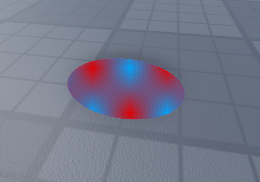
For some reason when im in studio the highlight looks really bad
This is without

This is with

Any ideas why?
For some reason when im in studio the highlight looks really bad
This is without

This is with

Any ideas why?
This looks like a bug. Perhaps it is the neon material? Try messaging @Bug-Support with the normal structure of a bug report, found in this post.
You need to show the properties of the Highlight, so we can help further figure out the issue.
Depending on your device, it renders differently.