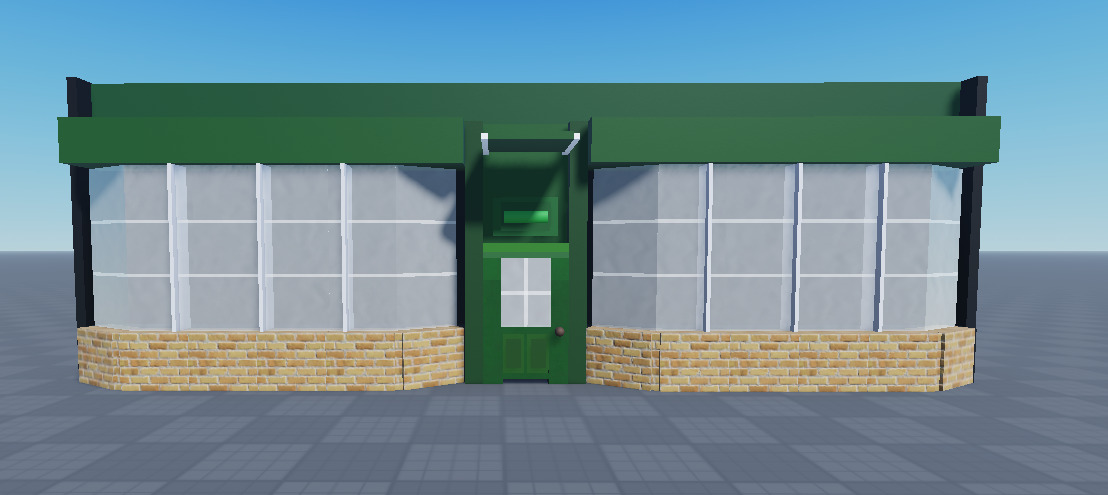
I’m creating the second room in my pscyhological horror-puzzle game, and I’d like your feedback on it. You can’t enter the store, so its just the exterior that you can see.
Reference Image (from Diagon Alley in Harry Potter):
The theme of my game that is relevant to this build is Memory. Hence why you can’t see the name of the store or what’s beyond the glass, its all hazy and foggy.
Note that there will be other buildings alongside this one - its meant to be a street of sorts.
I’m an amateur builder and I have a long way to go, so I would appreciate it if you could provide me with harsh but constructive criticism. I used some of the feedback from my previous build (How can I improve my door model?), such as a consistent stud increment (0.1 mostly), as well as using the F3X building tools plugin to align parts easier.
Also, I’ve noticed something that’s quite annoying. From certain angles, the horizontal white lines (which are formed by overlapping the glass blocks) will disappear as shown below:
Try adding frames to the windows, also making those white lines between the glass stick out.
And not sure if the bricks are supposed to be having edges? but, maybe smooth that out?
I relaised that this probably wasn’t the best place to put it so I moved it to #help-and-feedback:creations-feedback, but here’s what it looks like now. Any suggestions or changes?
Hi! This exterior looks pretty good, well done! However, there is lots of room for improvement…
In the image below, I’ve highlighted a few areas which don’t look too appealing. You should connect the window to the wall, and the brick part should have a pointy edge instead of a little dip inside of it, as I think that would be more suitable (I’ve illustrated this in my mockup below).
I did a quick mockup of this build using your build and the actual building as a reference. For buildings that you cannot enter, I think it is a good idea to decide whether you want them to be high-detail or low-detail. This is dependent on how many filler buildings you will have. If you have lots of these types of filler buildings, then lower detail exteriors will be better, not only for optimisation but also so the player does not get confused on where they need to go. In my mockup I left room in the windows for props to be placed if more detail is wanted and I also added a few details from the original building reference to separate it a bit from any other filler buildings that may potentially have the same design.
I used lots of different methods to create this model. If you haven’t already, learn how to use the union and negate tools, they really help make well-measured edges and prevent Z-fighting with different parts. I’d also recommend altering the move tool (pictured below - says scale tool, but I meant move tool) as you build, so that you can be more precise with your measurements.
I’d also make sure to decide on what material style you’re going for. For low-poly designs, smooth-plastic tends to work best. However, I usually use a mix of wood concrete and bricks for buildings, with the fabric material for carpets and flooring, as I’m not a fan of the low-poly look.