Introduction
I believe UI design is one of the most important things when it comes to game development, yet it often receives insufficient attention in tutorials. I’ve decided to make this tutorial to hopefully make a change in the community and make game design more accessible to everyone.
This tutorial will be divided into multiple sections. The primary focus will be on creating the UI that players will interact with when entering a game. My preferred method for designing UI is to utilize pre-made icons, making the game production process more efficient and smoother.
Examples of my work using these techniques


Requirements
- Adobe Photoshop
- Basic Knowledge about Roblox UI
- Basic Photoshop knowledge (Creating files & Shapes)
Even though I’m using Photoshop for this tutorial, you may use any other software that is for graphics design as most softwares will have the same features as Photoshop.
Don’t worry if you’re unfamiliar with the requirements listed for this tutorial, as I’ll provide brief explanations of each. However, I strongly recommend that you give yourself the time to study more about
Photoshop and Roblox UI to enhance the quality of your work.
Let's start with the boring stuff first
Start by opening Photoshop and create a new file. I like to start with bigger files because if you start with a size too small, the quality will drop to a level that it is all pixelated. I will make my file 2300x1400 pixels.

Once your file is open, press G to select the paint bucket tool. Double click on the color picker at the bottom of the tool bar to change the color that will paint your background. I like to start with a grey to black color as it makes it easier to see and organize UI.

You might want to lock the background in place so it doesn’t get annoying later on. You can lock layers by clicking on the layer and then click the ![]() icon.
icon.

Now the fun stuff begins! (hopefully)
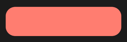
Press U to select the shape tool. We will start by using a rectangle. If you don’t have the rectangle pre selected, press and hold the shapes icon to open a panel and select rectangle.

Now click and drag on your workspace to make a shape that looks like a rectangle and then release the mouse. You might not see the shape at first, this is because the shape will likely be the same color as your background.

Important: Properties Tab
The properties tab is very important to designing our basic shapes because it allows you to customize your shapes even more. The most important settings we will use are:
-
Fill: This setting changes the color of the shape. (You may only change this setting if you are not able to see your shape. Changing it to a color you want for final design will be useless because we will be changing the color of everything later.) -
Stroke: This setting changes the border around the shape. Below the first option, there will be a pixels setting, you always want that to be 0px to make the border invisible. -
Corner Radius: This setting allows you to select the roundness around your shape’s corners. We will use this setting frequently.
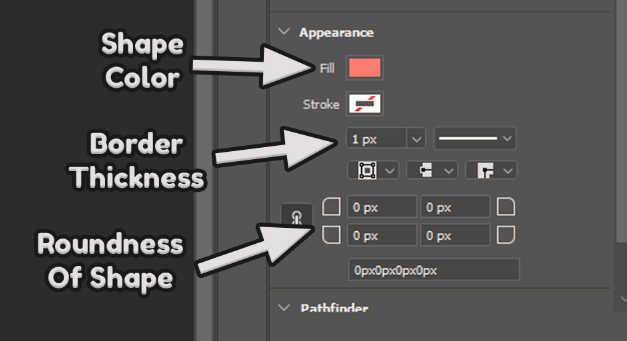
Let’s start by changing the roundness of our shape. You may click on any of the 4 spaces the setting has as long as you have the link option ![]() turned on. I will set my shape to
turned on. I will set my shape to 50px but keep in mind that if your workspace is not the same size as mine, setting the roundness to 50px will make it too hard or soft on the edges.
Selection of Icon & Attribution
Before deciding on what colors and effects to use, you need to select what icon will be next to the shape (This only applies if you are doing a Frame that will be accompanied by an icon). Make sure your pre-made icons are under a license of free use with attribution to the designer. My favorite website to use is Flaticon. When downloading an icon, make sure you save the link to later use it to attribute the designer.
How Should I Attribute The Designer?
Most licenses just require you to add the link to the icon under a credits section of the game, but make sure you read the terms of the license you are using to make sure you are complying with its rules.
The way I like to add attribution is how Adopt Me! does, which is a post here on Developer Forum to credit all attributions by making a list with each link and designer name.
For this tutorial, I will use Crunch Cake by Freepik. I inserted it into my workspace and positioned next to my shape.

Now we are going to style the shape. Click on the layer you want to style and go to the layers tab. Go all the way to the bottom and click on the ![]() to open the layer styles. The styles you want to apply are Stroke, Inner Shadow & Color Overlay.
to open the layer styles. The styles you want to apply are Stroke, Inner Shadow & Color Overlay.
-
Stroke: Adds a border to the layer. -
Inner Shadow: Adds a shadow inside the layer. This can be used to give depth to the layer. -
Color Overlay: Changes the color of the layer.

Color Overlay: Changing the layer color
When coloring a layer, you should do something in between of strong and soft.

Stroke: Adding borders to the layer
Start by adding size to the border. I like to give borders the size between 6 and 15, depending on what you are trying to accomplish. Make sure that the Position property always is set on Outside. Then for a color of the layer, you want to set a color that has a good contrast between the main color you selected on Color Overlay. Having good contrast between styles is good to be able to differentiate between layers. Keep in mind that not all screens have the same color resolution as you, and also not all people have the same vision as you. The good use of contrast to facilitate it for different screens and people with impairments is called accessibility.

Inner Shadow: Adding depth to layers
To have a good nice depth, set your properties just like the picture shows. To make a softer depth, make the color closer to the main color you selected. To make it harder, make it close to a black color.

Styling: Final Result
After finishing styling each layer, you should end up with something similar to this. I suggest you practice doing more of the same & making more complex Frames by combining shapes.

If you apply the same techniques to more shapes, you can make more complex frames like this one

Importing Into Roblox Studio
When you are exporting to Roblox, you have to keep in mind that if you plan on animating or using frames as buttons, you have to export them individually like shown in the image below.

Unintentional White Border
You might notice that when you try importing an image to Roblox Studio, it might have a really ugly white border like shown below. This can be easily fixed by passing all the images through this app.
Before using the app

After using the app

Final Step: Scaling To Fit All Screens
UI objects have 2 properties inside Size & Position, those are Scale & Offset. Scale is what you want to use to make sure your UI looks good in all screen sizes. This can be accomplished by automated plugins like the one I made for this tutorial, Turbyne UI.
Turbyne UI allows you set settings set as soon as a UI object is spawned, making your workflow faster and easier. It also allows you to move the position of a frame in a more precise way by using the arrow keys.

Turbyne UI is a completely free plugin and you can download it here.
I would appreciate any feedback on this tutorial. Let me know if you guys would like to see more posts about game development explained in more detail.
Thank you for reading!