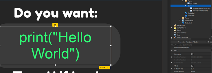
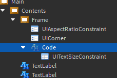
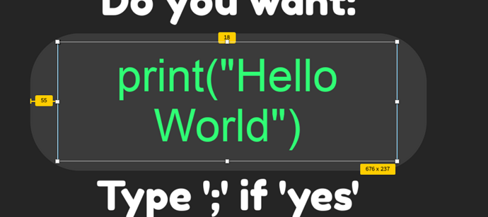
It should resize it without making it how you don’t want it to look like.
Ah okay thanks.
Do you remember roughly anything about them?
I have previously bought a UI Tools plugin yet it doesn’t seem to have anything that could help.
Sure one second I’m searching it right now.
AutoScale Lite. It has an official Forum Topic
I’ve just installed it yet I don’t see where it can help, I’ve tried adding a constraint but it doesn’t help as all that would do is just limit it scaling, which I don’t want, I just don’t want it to wrap.

First thing first, you need to set the anchor point to 0,0. After that, the UI component will move a few studs. Put in in its original area and after that use the button. That should do the trick 
The Red button is the most important. The blue one will make a few settings to the UI component so it remains the same on all platforms.
a1q0,0??
What do you mean? 1,0?
0,0 my bad I’m on phone right now and my corrector is very annoying
Ah okay,
why is it change the anchor point? The anchor point currently is what’s keeping my Label in the center.
From all the tutorials I’ve seen, it does the trick but I think it’s because when you use the phone/tablet the system will try to resize it and move it but changing the anchor point to 0,0 it will not allow it to move/scale randomly.
You could try to see on the Forum Page. It should give you more detailed info than what I described to you. Sorry if i made you too confused.
But try to use the phone view option
That’s how you test if everything is good
This should help, if you want you can mark it as a solution!
Yea that’s the one. Thanks for helping me find it!
Found a solution:


