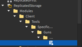
So apparently this new update caused this weird truncation issue in the explorer.

As I understand it the truncation is there because of the new icons.
A simple solution to this would be to only truncate only if the icons are present on an instance and only the space the icons take up. I understand that this bug would go unnoticed in testing because of screen size but some people just still don’t have so many pixels to work with. I hope this gets fixed soon.
Please fix the truncation issue. It is severely disruptive.
They should add a sidebar, or remove this truncating it’s horrible
![]()

Last I checked the package state icons are 1:1 in size and do not need to take up the rest of the space in the explorer
If these icons are not user interactable then they should NOT be removing valuable information from the explorer, there is no need for this to happen and will actually teach people to NOT use this feature because how much of a PITA it is to use it on anything other than a 32 inch monitor.
Edit: Jesus christ I don’t have a single package in my game and this is still enforced???
Thanks so much for this fix, this works perfectly.
This truncation is too fat for some reason, and i hate it.
There’s one thing holding me back from implementing packages into my projects, and it’s that every single copy of a package has to be identical. Now this is useful for models that are used repetitively, such as trees in a forest, but they can’t be used for models that are similar but vary slightly. One example would be varying sizes of trees with varying shades of colour.
At the moment changing the name, position, rotation, and enabled properties (along with welds) don’t count as modifications. It would be nice if we could define what properties are and aren’t considered modifications for each packages. For the models below, the default excluded properties would apply, along with Color to allow different colours of the same model:

I am able to work great…!.. not…
Revert this. This is not “improved visibility”, but “reduced visibility”. Either there was a typo in the title or I have no idea.

Why do the icons need SO MUCH space?
Social distancing
Maybe its because they messed up the proportions?
Anyways:

Red: current border (wrong)
Green: intended border location
Blue: just make the icons’s background transparent lol.
my improved visibility:

Until we get the ability to immediately publish all places in a universe with the most up-to-date version of published packages, I will not get much out of any of these changes. I am so tired of having to go through and manually publish all 20+ places in my game’s universe to roll out a single updated package.
Congratulations, Package team. You’ve made the Explorer twice as frustrating to navigate by introducing a crap-ton of whitespace for packages to SOMETIMES use. IN A GAME THAT DOESN’T USE PACKAGES.
Please revert this.
if i come across as angry, that’s because i am
this update is CRAZILY INFURIATING, as I can’t even DO ANYTHING regarding the explorer, because the entire thing is getting truncated! i’m not at ALL sure how, if this IS a mistake, got past testing and is STILL A THING, DAYS AFTER THE LAST UPDATE
and the worst part is that i don’t even SEE these link buttons
these MANDATORY little wednesday updates are sometimes cool, but most of the time i either never use it/dont care/never even see it, or it’s broken like this absolute mess of UI design!
there’s also another bug that i won’t get into that is ALSO VERY FRUSTRATING, but i won’t get into that here
this is the only exception where an update needs to roll out before next wednesday
This update is rea…
especiall…
…
I am not sure what their rationale was, but to slightly increase the visibility of a comparatively uncommon tool by handicapping the most core aspect of the Roblox Studio interface is just asinine.
Revert the change, move the package icon to the left side of the dropdown arrow if it’s that crucial, otherwise leave it as it was. Usability of the explorer is far more important than an increase in package state visibility.
Hi Creators,
We have rolled back the changes to address an issue where Explorer reserves space on the right, truncating instance names. We will update this post once the issue is fixed and the feature is available again. Thank you for your patience and understanding.
thank you so much, now i can actually work aga…
Could you please say why another staff member said that your team stated this was “intentional design”, and that you now only say that this is an issue?
because “Our packages feature is perfect and there could not possibly be anything wrong!”… until they actually looked at one of the hundreds of images sent about the truncation
Hi Creators,
Starting today, we are rolling out this feature again, after fixing the issue where Explorer reserved space on the right and truncated instance names.
We will gradually roll out the feature over the next two weeks, and all Studio users will see the changes by late August. Thanks for your patience!


