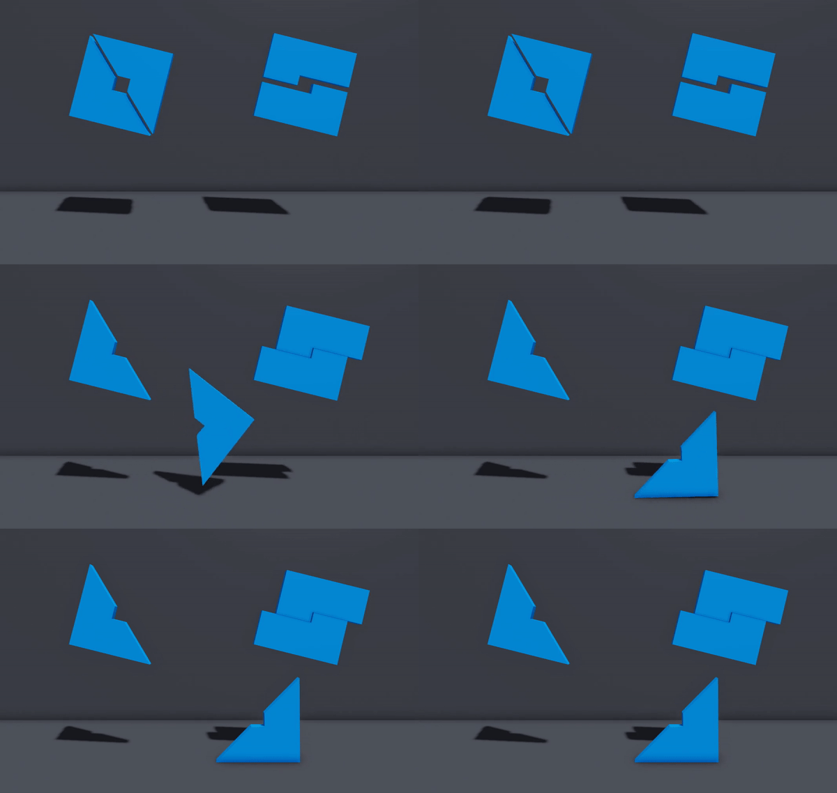
I don’t know about the rest of you, but I don’t like this new logo. There was no reason for them to change it in the first place. Its not even that different from the current logo. At least its not as bad as the Player logo.
Will definitely take time to get used to, but great to see an update! The logo needed to get a refresh for a long time and finally! It’s here!
The problem is that the details are barely noticable on a taskbar, and it looks too large on the startup screen.
I like the shape, but in my opinion, the flat style is better, I’m not a big fan of this gradient.
I will have to agree. I don’t necessarily like the gradient. I say maybe lower the gradient down a tad.
I don’t think they will.
I’ve seen games have the old logo before
Yes, I just tested it, it works great 

I can’t help but notice that its not changed on the DevHub.
Also if you could remove the gradients it would look a lot better
as Top_Crundee123 said
I love this change. The idealogy and symbolism behind the new logo provide a new perception of the goal and mission of Roblox. The drop shadow and bevel of the new logo also look good, and it feels great to have a non-flat design for the first time in quite a while. The gradient and difference of the blues throughout the logo seemed a bit strange at first, but now they feel like they fit this design well.
The logo change had felt odd to me at first, but after hearing the reasoning and symbolism behind it, I have found much more enjoyment and enthusiasm in it. Things like this logo change helps keep things new and innovative and I’m here for it.
The gradient kinda bugs me. It also doesn’t look super good as a small icon because of it. Other than that, the new shape is cool!
No, they did THIS redesign to fit that grey Roblox Player
The gradient should be more subtle, something like the new Windows 10 icons. I feel like this one’s just a little too noticable.
It’s alright, tho I feel if you dropped the gradient effect it would look nicer both in and outside of studio (In being in the app itself, Out being on your task bar).
Hard reset your browser to see the new one
Everybody says that they prefer the old logo instead of the new one because the old one was flat and simple, but I actually liked the new one. The new logo looks very modern, aesthetic, and very stylish. (The Roblox App logo has a gradient as well, so the new gradient on the studio logo looks cool)
But most people are talking about how the gradient is too noticeable. And studio just looks like a 2014 windows 7 application
Some Developer Crowns were recently uploaded to the Avatar Shop that have the old Developer logo. Will these be updated? I’m aware that they haven’t been officially announced yet.
I like the design, but the gradient makes it look washed out as a logo. The gradient should only be kept in renders such as the one in this topic.
I’m a little underwhelmed. To be honest, I expected better, every time I open up studio I want to bleach my eyes for the 5 seconds when I have to endure the loading screen with it on.
The gradient makes it look a little yucky,
The resemblance of the S is not seen at all, for me and it generally doesn’t look too good.
I respect those who designed it, but I expected a little better.
I much prefer the old logo, I’m not sure why.
Edit: I agree with other people, that the gradient and 3D affect spoil it slightly.
I actually really like this new icon because I’m kind of a fan of minimalistic icons.
Edit: I forgot to add that the gradient makes it look much better, and also I don’t know why but the icon reminds me of something that I can’t really explain.
