We are excited to announce a lot of new content and changes for the Documentation on Creator Hub that will make your creation experience more enjoyable.
First, we reorganized the entire information architecture of the site to make it easier to browse for the information you need. You’ll notice clear ways to navigate to Engine and Cloud docs, 3D art guides and tutorials, and game design content.
We heard from a lot of creators who are just starting out that it’s sometimes hard to understand how the platform works, so we wrote a lot of overview docs that give new creators a better tour of the platform. On a related note, we also reorganized the Engine guides to align more with how the Roblox data model and API work.
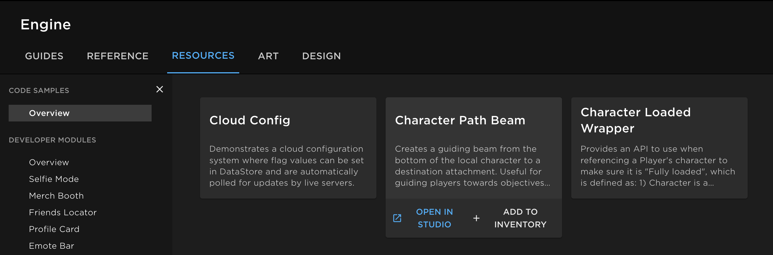
For those who are already deep in creating, we worked hard on a delivery pipeline to make our code samples more maintainable and high-quality. In addition, you can import and run these samples in Studio, directly from Creator Hub. We plan on adding search and filtering to the page and shipping a lot more code samples throughout the year.
As we announced last year at RDC, we’re excited to localize and open source our docs to all of you in the coming months. In addition, keep a lookout for a new set of tutorials with helpful resources for 3D art, building, and scripting. Lastly, we’re investigating improvements to our reference documentation, search and discovery, and in-Studio doc experiences.
Let us know what you want to see and happy creating!
After looking through some of the code samples, I think they are great! I believe they will really help people who are new the the great big roblox studio. Keep it up!
The code sample resources are great, people who are beginning programming in LuaU would much benefit from this. The ability to pull these samples into a place in Roblox Studio serves as a way for beginners to better understand why the code does what it does and functions in that way.
I love to see documentation getting more attention; sometimes while I am looking at the API my eyes drift off-screen out of disinterest or frustration. Keep it short and easy to understand, great job!
I’d like to be able to hide this, it takes way too much space of the screen with barely any use. I use the documentation screen maximized since there are already too many frames that clamp the text and now this new frame doesn’t help with ease of use.
I’ve tried resizing the page and it works great! But again, I’d like to be able to hide it while in fullscreen/maximized.
The documentation improvements, including to some transparency regarding the platform’s structuring and costs, is well appreciated. Even with over a decade of experience with Roblox, I am still an avid reader of the docs and ready to contribute through opening posts in docs categories or preparing for open source documentation so I can write or fix pieces in a better capacity.
I’ve checked through a lot of the code samples especially, that is a super welcome addition to the Creator Hub. There is something I noticed though and that has to do with the time formatting sample. I’m curious on the code owner’s decision to create a DateTime object instead of just solving it with pure math and then using zero padding with string formatting at the end.
Opinion, code review and updated sample on time formatting
It’s my opinion that, while the DateTime object is certainly available with its format strings, it’s a misuse of DateTime and bad to create a new object just to get an analog time formatting. The code owner should consider using pure math to derive each value and determine at the end how to present the number - not just this, but most use cases for formatting time need the zeroed placements to stay. It’s also good for teaching developers how they might be able to apply mathematics here.
Based on the existing code alone, along with some reviews:
(Please don’t change the existing sample with this, as it has comments directed towards the code owners and not developers. This is my take on that code, and asking why it wasn’t solved with math and instead created a DateTime object. A new object to format time is out of scope and frankly seems like bad practice. Don’t do it even out of convenience.)
--!strict

--[[
	Formats a number of seconds into a pretty string of hours, minutes and seconds.
	If hours or minutes are 0, they are not shown in the final string.
	The first number in the final formatted string does not have leading zeroes.

	Examples:

	local HOUR_1 = 60 * 60
	local HOUR_23 = 23 * HOUR_1
	local MINUTE_1 = 60
	local MINUTE_59 = 59 * MINUTE_1

	-- Removed additions of 0 from examples
	formatTime(HOUR_1) -- 1:00:00
	formatTime(HOUR_23 + MINUTE_59 + 59) -- 23:59:59
	formatTime(MINUTE_59 + 59) -- 59:59
	formatTime(MINUTE_1) -- 1:00
	formatTime(59) -- 59
	formatTime(1) -- 1
	formatTime(0) -- 0
]]

local MAX_SUPPORTED_SECONDS = 86400

-- The original sample does not define this as a local function.
local function formatTime(totalSeconds: number)
	local clampedSeconds = math.clamp(totalSeconds, 0, MAX_SUPPORTED_SECONDS)

	if clampedSeconds ~= totalSeconds then
		-- We have string interpolation now. It just means a bigger column size.
		warn(`Seconds ({totalSeconds}) is outside supported range [0, {MAX_SUPPORTED_SECONDS}]. Using {clampedSeconds} instead.`)
	end

	-- 3600 seconds in an hour.
	local hours = math.floor(clampedSeconds / 3600)
	-- After hours are found, we need to calculate how many minutes the leftover
	-- time is worth. Convert both into minutes then subtract the hours' worth.
	local minutes = math.floor(clampedSeconds / 60 - hours * 60)
	-- After hours and minutes are found, convert the other two into seconds and
	-- remove them to find out the remaining seconds.
	local seconds = math.floor(clampedSeconds - hours * 3600 - minutes * 60)

	local formattedTime
	if hours > 0 then
		formattedTime = string.format("%d:%02d:%02d", hours, minutes, seconds)
	elseif minutes > 0 then
		formattedTime = string.format("%d:%02d", minutes, seconds)
	else
		formattedTime = tostring(seconds)
	end

	return formattedTime
end

return formatTime
These recent upgrades to the documentation is all very exciting! Even in the previous design, I had a lots of fun browsing through the docs and sometimes stumbling upon a new api or a tutorial of different professions (something other than programming), which allowed me to gain a brief understanding of it and even try them out. (layered clothing was fun). With the even more organized docs, I can imagine more people being able to discover the different faces of the engine we use from day to day
Although, as others have said, it would be nice if the thickness of the topbars were reduced, or made transparent after scrolling, because it does take away a good chunk of top half of my screen, making it harder to read without constantly having to scroll and track where I was reading.
I’m glad that more is being added to the documentation.
However, I’ve found the new docs site unclear and it does not properly seperate different elements. Horizontally offsetting the titles and adding a box around them would significantly help. The slight change in text size is not very clear.
Also, adding collapsable headers would make it much clearer where each element starts and ends. It feels very information heavy with no way to hide any of it. Only showing the selected element would significantly help with this. Also ading the ability to hide code snippets since they take up a lot of space and I’m often looking for the API rather than examples.
This is similar to how the old docs page did it which made it much easier to navigate. Personally, I prefer the old page so I would like to see the things it did right continued in the current design.
After this update, it’s impossible to open some pages of documentation via search. One of them is “string” and anything related to it.
Edit: Looks like it search will break if you will try to open smth from diffirent category. For example, if you currently have “classes” page opened, and you’ll try open “libraries”, it’ll use /classes/ in URL, and not /libraries/