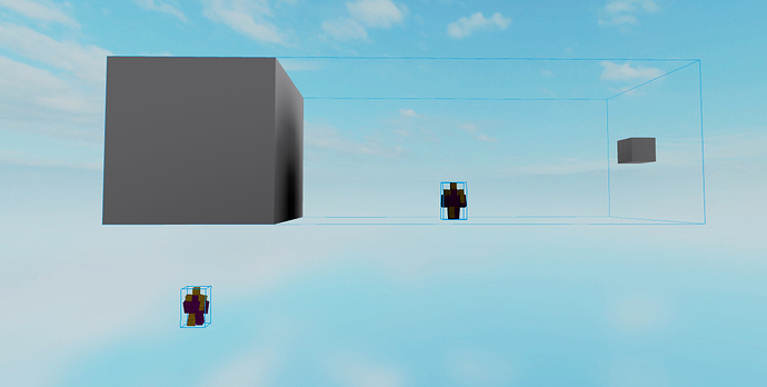
Does anyone have any tips for avoiding making meshes that cause huge circular shadows? It’s been really bothersome. I set the collision fidelity to box which got rid of the shadow completely but it also looks way too flat and ruins the aesthetic of the scene.
Hmm this is really strange behaviour. Before I jump to conclusions for the answer I have a few questions:
- Can you show us the collision geometry of the mesh?
- Are you using Legacy or Voxel lighting?
- How big is the MeshPart itself?
It does look like a really big MeshPart, which might be the issue since Studio doesn’t really like big objects in general, but I’m not sure.
If you’re having this issue with other meshes as well, I wonder if this is a Voxel lighting bug - if so it might be worth reporting it.
For solutions, I’ve heard of people cutting up meshes into smaller objects but I don’t know if that’s a real solution or just rumours, and I welcome anyone to prove/disprove that.
To add onto that, I noticed it happens when the mesh of the object is too small compared to the “air” inside the bounding box. Basically, a good air:mesh proportion is probably around 1:3 or 1:2. If the proportions swap, so the “air” is bigger than the mesh, or they’re about the same, you may encounter such shadows. Having the bounding box rotated instead of it being aligned to the mesh also increases the amount of “air” inside.
Just some observations I had, haven’t tested it extensively or anything.
I am using hull, voxel lighting, and the mesh part is pretty big but I need it to be. For a temporary solution I decided to turn it to box and turn off collision. I have had this issue before w/o voxel so there is no difference there.
Thanks for the additional info. I’m going to try to repro what’s going on and get back to you if I find a solution.
It’s unfortunate you have to use that work around but that might be what you’re stuck with until whatever is causing it is fixed
Here’s some context into what I think happens:
Much like what Veldaren found, it seems like shadows are calculated from the center of the bounding box, not where the mass of the object is greatest. The modifiers or shading don’t affect it.
As you can see, the object here has the shadows affecting the scale model at the object’s center more than the scale model underneath the bulk of the object.
So your solutions here, unfortunately, are that you can make your mesh smaller (smaller sizes cast less shadows) or cut up your meshes as I did with the cone.
Neither of those solutions are Great  , but at least you know that there’s a way to avoid it until this bug is actually fixed properly.
Thanks for your help!
Alternatively, another solution is to use an “obj to physical parts” plugin like https://www.roblox.com/library/267728602/Physical-Obj-Importer
But that comes with the cost of not being able to texture it, and stretching the object becomes annoying.
Although the other solution of cutting the mesh up would also make it annoying to texture ):
@Aotrou gave me an idea.
What if you’d lower the center of the bounding box? ![]()
Basically, make the mesh twice the height of the tree (or more). Theoretically, it would redirect the shadow under the tree or at the base of the tree.
To my knowledge, you can’t change how the bounding box is generated, scaling the mesh differently wouldn’t change the location of the bounding box’s center.
Unless you know something I don’t, then please share because I’m definitely interested in figuring out more ![]()
Extending the mesh itself would do it ![]()
So you have your main mesh on top, and some “waste” mesh below it. MeshPart will read both as one object, with one bounding box.

I think you can simply use a SpecialMesh object to negate this issue? Of course this isn’t an ideal solution if the object needs to have accurate geometry, but if it’s purely cosmetic this should fix the issue.
Bare in mind SpecialMeshes are also less optimised.
If you change the collision of the mesh to square then it negates most of the shadow issues.
Btw, it’s not “square” but “Box”. Default, Hull, Box. ![]()


