Hello developers, I’m ZenMa1n, a principal software engineer at Roblox. We’ve recently made a ton of improvements to the MicroProfiler, so this article shows off some new features that you might not be familiar with.
- For a quick summary of the new features, see the
 announcement post.
 - If you’re just getting started with the MicroProfiler, check out the documentation for an overview.
Overview

The MicroProfiler is designed for CPU profiling, and previously, we overlooked the detailed picture of memory allocation/deallocation operations (only general counters for memory operations were available, categorized by subsystems). Now, this information is accessible for individual call stacks within specific frames and threads. We aimed to keep the interface simple, so we decided to display allocation intensity as an overlay using shades of gray, hence the name X-Ray mode.
Additionally, in detailed mode, it’s not always immediately clear what the overall CPU or memory usage looks like, especially in cases where a particular task consumes few resources but is called very frequently, subtly affecting the entire frame. For these situations, we created a mode that aggregates all individual call stacks into one large graph, which can be viewed both as a whole and in parts – this is the Summary FlameGraph.
Besides, when we make changes to the experience, it’s nice to understand whether they lead to performance improvements or degradations without squinting at numbers, right? For this, we’ve introduced Diff FlameGraphs.
Quick Refresher
Now, a brief detour to remind you of the basics of working with the MicroProfiler. It can be enabled in the settings by navigating to any experience and clicking Main Menu → Settings → Micro Profiler → On (for Windows/Mac, you can also use the hotkey Ctrl+F6 / Cmd+F6). It has two modes of operation. In the first, it displays over the Roblox Player or Studio window, where you can view data in real-time, as well as pause the data update to examine everything closely. If you need an introduction, see this video.

In the second mode, a dump (a capture/snapshot) of data is made for NN frames (from 32 to 512), and this dump opens in the browser. If you’re on Windows/Mac, you can press the tiny Dump → NN frames button in the MicroProfiler UI to save it as an HTML file in the same folder as the logs (on Windows, it’s C:\Users\<Username>\AppData\Local\Roblox\logs), and you can then open it in your browser).
If you’re using a mobile client (i.e. Android or iOS), when you enable the MicroProfiler in settings, you’ll see a window with the IP address and port for connecting to your device over the local network. On your computer/laptop, enter this IP:port (for example, 192.168.1.1:1338) in your browser, and at that moment, a snapshot will be taken on the device and opened immediately in the browser. You can specify the number of frames to save in the snapshot using a slash, i.e., IP:port/number_of_frames (for example, 192.168.1.1:1338/64 for 64 frames). There are also server dumps.
All the features described relate to opening captures in the browser.
Table of Contents
1. X-Ray Mode for Memory Profiling
2. Summary FlameGraph - CPU
3. Summary FlameGraph - Memory
4. Diff FlameGraphs
5. Re-Capture and Save to File Buttons
6. Frame Time Bottleneck Cause
7. Ctrl+F (Cmd+F)
8. Reference Frame Time Adjustment
9. What’s Next?
1. X-Ray Mode for Memory Profiling
If you open a recent MicroProfiler (MP) dump in the browser, you’ll see that it looks generally the same as before, but now there are two gray bars at the top. The upper bar indicates the intensity of memory allocations within frames (the brighter, the more allocations in that frame overall), while the lower bar highlights areas with intense allocations within a specific frame (again, the brighter, the more allocations in that particular section of the frame).


This allows you to spot areas with excessive memory allocation, even if you were profiling CPU rather than memory. If you notice such areas in a frame, you can switch to X-Ray mode by pressing the X key on your keyboard or by selecting X-Ray → Main View from the top menu. CPU scopes will turn grayscale, and if you scroll up and down through the threads in the frame, you’ll see which scopes are experiencing the most allocations (yes, the scopes with more allocations will be brighter than the others).

Inside the scopes, there will also be labels showing the number of allocations by default. You can view the total size of these allocations by pressing the C key or switching to Mode: ∑Sum in the top menu under X-Ray → Mode: #Count.

Additionally, the automatic sensitivity adjustment for X-Ray (i.e., the brightness of highlighted scopes/blocks/bars) doesn’t always work perfectly, so you can manually fine-tune it for scopes or the upper preview bars by hovering over them and scrolling the wheel up and down with the Shift key held down. Alternatively, you can change the values from 0 to 99 in the top menu under X-Ray → Thresholds to find what looks best for you.

By default, only the number/size of allocations is displayed, while deallocations/frees are not counted. In the top menu under X-Ray → Events, you can choose to display only deallocations or both allocations and deallocations at the same time. The preview bar will indicate what is currently being counted.

We have ideas for using X-Ray not just for memory but also for displaying disk or network operations in the future.
2. Summary FlameGraph - CPU
In the Export tab of the top menu, there are now more options. Let’s take a look at Export → CPU Flamegraph and Memory Flamegraph. When you click on one of them, a new browser tab will open. If the browser blocks this action, you’ll be prompted to download the result as a file. Sometimes the download starts automatically, while at other times, you need to allow it manually. You can also opt to skip opening a new tab and receive the result directly as a file by enabling the option Export → Save Result as File.

The CPU Flamegraph looks like this. It’s a single large call stack that combines all individual stacks from all threads across all frames. When you hover over a scope, detailed information about it will be displayed at the bottom, including total CPU time (i.e., if the MP dump had 10 frames, this will be the sum of the times for all 10 frames), the percentage of that time relative to the value of the root scope, and the average time spent in this scope upon entering it (sometimes we can enter a scope multiple times in one frame, while at other times we might only enter it once over 10 frames).

Next to the scope’s name, we display its numerical index (Timer Index) and the group it belongs to (e.g. Render or Physics). The main pattern is to visually assess which parts of the plot take up a lot of space, check information about them, and click on them to zoom in and explore the lower-level scopes within. You can then press the Reset Zoom button (located at the top).
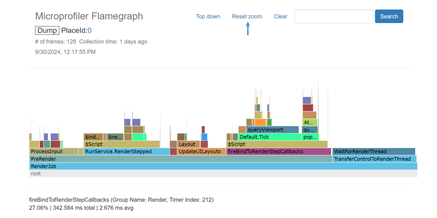
The color of the scope corresponds to its color in the detailed view of the MP dump. Here’s a list of the most significant scopes and recommendations on how to reduce their CPU time: Scope Tag Reference.
At the top of the page, you’ll see the Place ID from which the dump was taken, the capture time, the number of frames within the dump, and if you hover over the word Dump, more information about the original dump will be displayed, including the filename.

In the upper-right corner, there’s a search bar to find a specific scope by its name. If there are scopes whose names contain the entered string, they will be highlighted in red after you click Search. Clicking Clear will reset the highlighting.

There’s also a toggle button at the top for Top Down ↔ Bottom Up, which, yes, literally flips the view upside down. ![]()
The idea is that in some situations, we may have a function MyFunc1 that is called from several different places, for example, Foo → MyFunc1 and Bar → MyFunc1. In this case, we wouldn’t see the total CPU time for MyFunc1 because there would be two leaf nodes with that name. In Bottom Up mode, there will only be one MyFunc1 node, and we will see its total CPU time. In this mode, leaf nodes become the primary focus, and we base our assessment on them. Meanwhile, the calling function (e.g., Foo) may still consume CPU time unrelated to executing MyFunc1 (we refer to this as Exclusive time) — this will be displayed as “Foo (Excl)”.

3. Summary FlameGraph - Memory
Memory Flamegraph looks almost the same, but instead of CPU time, we display the number of memory allocations or their total size in bytes (a toggle for this will appear in the upper right corner).


The rest of the interface elements and analysis strategy remain the same. I want to emphasize that we display the actual number of memory allocation operations (and the total size of allocated areas), not the overall number of memory regions currently “owned” by that scope.
It’s important to note that in FlameGraphs (both for CPU and Memory), the statistics are shown only for the frames and the period of time included in the MP dump/capture, and not for the entire duration since the start of the experience or application!
4. Diff FlameGraphs
We’ve reached the point where working with MP in the browser can be a more powerful tool than working in the Roblox client. Since we save dumps to disk, we can track progress in improving our Experience’s performance over time (over weeks, months, or from version to version). Now, doing this is a breeze because we can automatically compare dumps simply by drag-and-dropping one onto the other!
Open one dump and drag the second dump (HTML file) directly into the browser window — a window will pop up where you can drop the second dump (you can also access this window from the top menu by clicking Export → Diff / Combine).


In the Left section (marked in ![]() green), the name of the currently opened dump will appear automatically, while you drop the second dump in the Right section (marked in
green), the name of the currently opened dump will appear automatically, while you drop the second dump in the Right section (marked in ![]() blue). Click
blue). Click Combine & Compare, and in a new tab (or as a downloaded file), you’ll get a comparison like this.

The visual representation resembles the Flamegraphs we’ve already studied, except the color of the scopes here depends on which dump (Left ![]() green or Right
green or Right ![]() blue) consumes more CPU/Memory resources. The brighter the color, the greater the difference between the compared dumps.
blue) consumes more CPU/Memory resources. The brighter the color, the greater the difference between the compared dumps.
For instance, we might have two simple Flamegraphs from an old and a new version of our Experience, and we see that some parts are wider in the first, while others are wider in the second, but it can be hard to immediately discern what has become faster or slower. The Diff Flamegraph highlights these areas right away.

Returning to the interface: if you hover over a scope, a detailed comparison of the dumps will be displayed at the bottom — you’ll see familiar fields like percent/total/average (see above), now shown for both the green/left and blue/right dumps, indicating which value is greater and by how much. It may also happen that a scope exists only in the left dump and is absent in the right — this will be noted as well. Keep in mind that the displayed values are averaged per frame (it will say per 1 frame at the bottom). This is because the dumps being compared can contain a different number of frames (for example, 32 and 128), and we still want to compare them, so we calculate the values for one averaged frame from both sides before comparing.

We can zoom in by clicking on a scope and then reset zoom by clicking the button at the top. There’s also a search bar at the top, along with the place ID of both dumps, the capture times, and the number of original dumps on the left and right (currently we are comparing one dump from each side, so it will say “1+1”). If you hover over the highlighted labels Left and Right, more information about the original dumps, including filenames, will be displayed.
In the upper right corner, you’ll find a toggle for CPU time / Memory allocations count / Memory allocations size — choose the parameter you want to explore. Additionally, there’s a toggle for Comparison: relative / absolute. Here, it’s important to pay attention to the large bar above the main plot — this sets the sensitivity for the comparison. It features two sliders. In Relative comparison mode, they define a range in percentages, for example, from 5% to 70% — this will be displayed in text at the bottom when you hover over the bar. If we compare two scopes and the difference in their total values is less than the left sensitivity threshold (for example, less than 5%), the scope will be highlighted in gray. If the difference exceeds the right threshold (greater than 70%), the color will be a bright green or bright blue. In Absolute comparison mode, we set the range directly in milliseconds (for CPU Time), bytes (for Memory allocation sizes), or counts (for memory allocation counts). So, you can highlight gray areas of the Flamegraph where the difference is less than 0.5 ms (or 500 bytes) and maximally highlight areas where the difference is greater than 7 ms (or 7000 bytes).

Now, back to the window where we dragged and dropped the dumps. You can perform a few more tricks there. First, you can remove dumps by hovering over them and clicking the red cross. This allows you to delete the current dump, which is automatically added to the left/green side, and drop a different dump from disk in its place.

You can also drag multiple .html dumps to each side at once or one by one.

After that, you can click Combine & Compare, and the dumps on the left/green side will be combined, while those on the right/blue side will also be combined, and then the sides will be compared, resulting in the familiar Diff Flamegraph. Note that it makes sense to place dumps taken from the same experience on one side. The other side can contain dumps from the same experience or a different one. The key is that different experiences should not be mixed on one side — technically, this isn’t forbidden, but in this case, the place ID will be marked as mixed.

This serves as a signal that you’re likely comparing something you didn’t intend to.
In general, a good idea would be to compare, for example, three dumps taken under similar conditions from an old version of the Experience with three dumps taken from a new version. Or two dumps recorded when nothing is lagging with two dumps taken during specific, identical lags.
The number of dumps for comparison on the left and right can differ, for example, three and four, and everything will work fine since, as a reminder, we average their metrics to values per frame during the comparison.
By the way, you can compare dumps made approximately since July 2024, so you might even be able to compare some of those already on your disk, provided they’re not too old (but of course, it’s better to take new ones).
In the window with multiple dumps, you can click the green Left side button (yes, it’s also a button; hovering over it will show a tooltip Click to combine) or the blue Right side, and then you’ll get a Combo Flamegraph. This is no longer a Diff; it’s closer to a regular Flamegraph, but now it’s built from multiple dumps, and the values are averaged for one frame.


5. Re-capture and Save To File Buttons
When opening a capture via HTTP (directly from a mobile device), you will see two new buttons in the top menu. The first button, Re-capture, allows you to take a new capture without issues related to the browser cache (pressing F5 may sometimes show the old page from the cache instead of the new dump). The second button, Save to File, lets you save the open capture as an HTML file while preserving its full name, including the timestamp, without worrying about the browser distorting the original page upon saving. Note that when saving through Ctrl+S or Save As…, the default filename will be slightly different, but it now also includes a timestamp (in this case, make sure to select “Save as type: Webpage, HTML Only" in the browser window).

6. Frame Time Bottleneck Cause
Some time ago, we introduced color-coded highlighting for frames in the top part of the Profiler to indicate their performance characteristics. However, it wasn’t always clear how these colors were determined. The purpose is to distinguish frames categorized as CPU-heavy ![]() (orange), GPU-heavy
(orange), GPU-heavy ![]() (red), or Render-heavy
(red), or Render-heavy ![]() (blue).
(blue).

Keep in mind that the CPU and GPU operate in parallel, meaning the CPU processes frame T, and the GPU renders frame T-1 simultaneously. However, at the end of each frame, the CPU waits for the GPU to complete its rendering. Additionally, multiple threads are active on the CPU concurrently, with the Simulation and Render threads typically running in parallel.
When you hover over a frame, a tooltip is displayed. We have added detailed timing information to these tooltips to clarify how a frame is categorized. The value that most significantly contributes to the frame’s classification is highlighted in red.
For GPU time, we provide two values:
- mp (MicroProfiler): This GPU time includes the time waiting for vertical synchronization.
- dev (Device): This is the time the GPU driver reports, generally excluding vertical synchronization waiting.
Note that these timings may be imprecise or unavailable on specific platforms due to the limitations of different graphics APIs.
Additionally, here are some key timing fields:
- Render Wall Time: The time spent executing all rendering tasks (such as culling, generating render commands, updating lighting, etc.).
- GPU Wait Time: The amount of CPU time spent waiting for the GPU to finish its current workload (completing the rendering).
- Jobs Wall Time: The total time taken to execute all non-rendering jobs within the frame (such as physics calculations, animations, etc.).
If a frame is marked as CPU-heavy ![]() , optimizing frame time can be achieved by focusing on script execution, physics calculations, and reducing the number of objects in the scene.
, optimizing frame time can be achieved by focusing on script execution, physics calculations, and reducing the number of objects in the scene.
If a frame is marked as GPU-heavy ![]() , pay attention to the complexity of rendered objects, texture sizes, applied visual effects (like light sources and particles), and the number of objects being rendered.
, pay attention to the complexity of rendered objects, texture sizes, applied visual effects (like light sources and particles), and the number of objects being rendered.
As for Render-heavy ![]() frames, check how often you move objects or change the properties of light sources, and the number of objects being rendered matters a lot, too.
frames, check how often you move objects or change the properties of light sources, and the number of objects being rendered matters a lot, too.
7. Ctrl+F (Cmd+F)
We now have the ability to search for scopes by name using a more familiar hotkey. When you press Ctrl+F on Windows (or Cmd+F on Mac), a search box will appear in the lower-left corner. Type the name of the scope there (the cursor will already be in the Timer/Thread field), press Enter, and you’ll be taken to the instance of the scope that takes up the most time in that dump. The left/right arrow keys allow you to navigate between instances of the found scope (but only within a single thread). F3 (or Cmd+G on Mac) also works as Find Next. To hide the search box, simply press Ctrl+F (or Cmd+F) again or hit Esc.

8. Reference Frame Time Adjustment
When profiling a game on a slow device, the vertical bars representing frame times at the top of the page can sometimes shoot up, making it unclear which frame is faster and which is slower (since technically they’re all slow). Now, if you hover over these bars and scroll your mouse wheel, you can adjust the upper limit of frame time so that all values fit on the screen without being cut off at the top. This is a faster method than navigating through the top menu and selecting Reference → 50 ms (100 ms, etc.).

9. What’s Next?
We’re exploring which features could be implemented in the future — perhaps including extra data in captures (such as CPU core frequencies), saving screenshots in the dump, or creating a Live Update Mode to reduce the need for frequent browser page refreshes.
If you have any ideas for further additions, please let us know!
Thanks to everyone involved in developing these features and for helping to publish this article.
Thank you from me and the Engine Performance team for using MicroProfiler and caring about performance!
Happy building!
ZenMa1n
