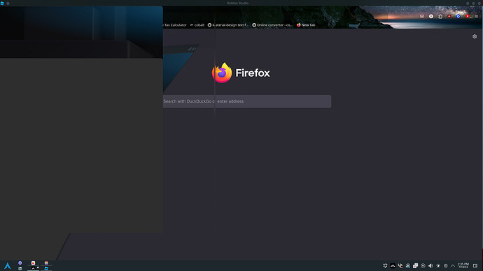
i really hoping the docking of uis be fixed now!?
not getting that

I love this update personally. Roblox has always been lacking UI-wise next to engines like Unreal or Unity, this update makes roblox seem that bit more professional, and overall I think the UI Looks amazing. I’m really interested to hear why people DONT like this, because I don’t see what there is not to like. Thanks Paul!
- Like it
- Dislike it
- Not sure
0 voters
Early 2025 maybe, so you’ll have time to get used to it
I’d like to try it BUT… it always crashes, even in a simple baseplate place.
I open it, it loads, studio closes.
Modern gaming PC can’t handle the new pretty studio…
Love this new look. Feels super clean, simple and modernized. Can’t wait for the full release!
FOR ANYONE HAVING CRASHING ISSUES
I figured out that many plugins are causing this. I disabled and uninstalled quite a few that I don’t use, and I no longer experience the crashing issues. I don’t know what ones cause it, but it is worth a shot. Hope this helps!
Nice to know that when I try to open a place, Studio immediately crashes with this turned on.
same thing i tried to reinstall the studio and restarted computer. The new UI still crashes my studio
no i will not be getting used to it. i am NOT using this.
thank you that actually helps alot
Would you mind giving me the list of plugins you disabled - even with them enabled it still shouldn’t be crashing!
Same for anyone who fixes their crashes by disabling plugins, please let me know which plugins you are using!
Plugin icons are way too small in my opinion

and this happens if the plugin name is too long:

Was excited when I seen this post. Tried it out straight away and immediately it feels like another half baked Roblox feature that didn’t get the resources it needs to be properly developed. The style differs from all the other UI in studio, even relatively new UI like the toolbox and terrain editor. Why can there not be a dedicated studio UI team?
I am not against a new UI being released, but are there any plans on keeping the old UI as well and having a toggable option to switch between the two?
Redesigning what is essentially an entire workplace for lots of people around the world could affect their efficiency and not a lot of people may be fans of it. I think it would be a good time to pause & think whether or not replacing is a good idea.
I can see this becoming the new default and being the preferred way of using studio for many people, but I believe we should have the option to choose between the two.
still not sure why people keep asking this, theres no “Use windows 7 UI” toggle on windows 10
this would be the equivalent.
Understandably, studio needed a small overhaul, however, I’m not a big fan of overhaulings and icon changes and stuff, because of how much they mess up with my muscle memory of doing a certain task, and the fact that my eyes got used to certain things being a certain color (parts being gray not purple for example).
I don’t have much to say about this, since it’s a very justifiable change that many might hate just because of muscle memory, but one thing i would really like to see, is being able to change whenever we want this tab to be in the middle or no:
I really think it should be a personalization option if we want to have the tabs on the left, right, or the middle, because having it in the middle might become very inconvenient for me and many other people that take a while to adapt to newer changes.
I’m proud of the team coming up with a new design, and I hope it won’t take much to get used to, however the tabs on top really need some changes… some personalization of where we want to put them, to be exact!
BECAUSE WE HAVE OPINIONS??? WE HAVE TASTES???


