Greetings, DevForum! Even after lurking for what seems like ages, I haven’t yet found a solid tutorial for designing clothing. Knowledge is power, and the amount of people who want to create but don’t know how bothers me immensely. The goal of this tutorial is to be as open as possible. As a standard of mine, questions can always be asked in PMs or as a comment. I will reply as soon as possible. I will be structuring this tutorial like a textbook. At the end, I will include a short glossary for beginners to learn the lingo. Feedback is appreciated!
This tutorial will be split into 3 main sections:
CHAPTER ONE: PaintNet Basics
In this chapter, we will cover the basic tools, layering, and blending modes that will help you make your first piece of clothing!
CHAPTER TWO: Design Philosophy
Fancy title, I know. In this chapter, we will cover different styles of clothing and the communities that revolve around them. We’ll also talk about the design process.
CHAPTER THREE: Making Clothing
You get the gist just by the title. In this chapter, we will go step-by-step in the process of creating clothes. You can follow along or do your own design!
You can skip any chapter you wish, but it’s recommended that starters read all of them.
DISCLAIMER
This tutorial will be using third-party software. To be on the safe side, I will not provide any links to the software; you’ll have to get it on your own. In certain cases, you don’t even need the software. This tutorial is designed for the software in question (PaintNet), but it can apply to others (Photoshop, Paint Tool SAI, Pixlr, etc.).
CHAPTER ONE
When designing anything (2D GFX, Clothing, whatever) the most important thing to know is how to use your program. The User Interface may seem imposing at first, but it will grow on you as you develop experience in the field.
Here’s a grand scheme UI layout.
You’ll notice that the menus are color coded, and coordinate to their designated position on the main UI. We will be skipping a few things so the tutorial isn’t ridiculously long, but you can play around with it.
LIGHT BLUE - Main Menu
This hosts all your main settings; file management, editing options and the like. You will be using this frequently.
PURPLE - Tool Settings
This has all the options relating to the specific tool.
GRAY - Tool Menu
This has all the tools at your disposal. We will cover specific tools shortly.
YELLOW - Color Wheel
This has all your color choices; you can have a primary and secondary.
PINK - Edit History
This has all your performed edits in it. You can press CTRL+Z, hit the back arrow, or click on an item in the menu to return to a previous point in the project. HISTORY IS NOT SAVED IN THE PROJECT FILE, IT IS DEPENDENT ON SESSION.
BLUE - Layers
This has all your layering options. This is very important for adding depth and other effects to a piece of clothing.
NOTE: If your tool menu, history, layers, or color wheel disappears because you clicked the “X”, you can bring them back by pressing the buttons on the very top right of the window.
Before we go over tools, lets go over some generalization stuff.
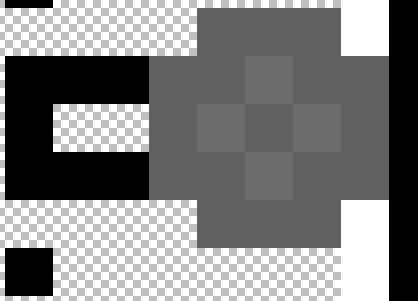
- Anti Aliasing: Basically speaking, it’s blurring at the edges. A more technical definition would be: Anti-aliasing makes an image less sharp by lowering the value (hardness) of color at the edges of an object.
NO ANTIALIASING:

ANTIALIASING:

See? It’s sMoOtH!
We will now go over the basic gist of the tools and their options.
RECTANGLE SELECT

Selects portions of the screen when drawn with the mouse.
HOTKEYS: Holding CTRL will add on top of your selection. Holding ALT will delete drawn portions of your selection. Hold SHIFT to scale on a 1:1 ratio.
MOVE SELECTED PIXELS

Drags the selected portion of the screen.
LASSO SELECT

Draws a freeform shape when drawn. This shape is selected.
HOTKEYS: Same as “RECTANGLE SELECT”, without the scaling part.
MOVE SELECTION

Similar to “MOVE SELECTED PIXELS”, but includes some more rotation options.
ELLIPSES SELECT
![]()
Similar to “RECTANGLE SELECT”, but with circles.
HOTKEYS: Exact same as “RECTANGLE SELECT”.
ZOOM TOOL

Click to zoom. I never use it. Just use the slider.
NOTE ON SELECTION TOOLS
![]()
Most if not all of the selection tools have selection options. You can play with them, but the most important in terms of ROBLOX textures is the Anti-aliasing option (last option). Anti-aliasing can screw up some of the smaller designs, since ROBLOX’s texture default is 585x559.
MAGIC WAND TOOL

This is an advanced selection tool.
FLOOD MODE:

Contiguous - Selects every tolerant color locally. (area)
Global - Selects every tolerant color globally. (full image)
TOLERANCE:
The tolerance slider is a scale from 0% to 100%. It decides what colors should be allowed when selected. This tool is very powerful. 0% tolerance means that only pixels of the EXACT color and value are allowed. 100% means that any color of any value are allowed.
SAMPLING:

Layer - Only applies the algorithm on the selected layer.
Image - Applies the algorithm as if the image was flattened.
ANTI-ALIASING
obvious
HAND TOOL

Don’t use it. Please. Just use the middle mouse button.
FILL TOOL
![]()
Don’t use it. Has some of the same settings as “MAGIC WAND TOOL”. Just use BACKSPACE to fill selection with primary color.
GRADIENT TOOL

Generates a gradient. I only ever use it for the illusion of shininess, which is more advanced and will not be covered here. You can play with it though.
PAINTBRUSH TOOL
![]()
Circular pencil tool. Has anti-aliasing options.
ERASER TOOL

Erases pixels. Has anti-aliasing options. I would not recommend using it on a consistent basis; just CTRL+Z if you mess up.
PENCIL TOOL

Color me impressed (haha i am funny man comedy king)! Colors one pixel with the selected color. Anti-aliasing options are available as well as blending mode (which i never really use).
EYEDROPPER TOOL

Selects the designated amount of pixels of color. Can be held to get the sweet spot.
STAMP TOOL

why
RECOLOR TOOL
![]()
Recolors pixels. In practice, it’s not very useful; but it can color over anti-aliased objects? That’s kinda’ useful.
TEXT TOOL

Type text in the selected font. Options are fairly basic.
LINE TOOL

Hey, don’t hate on this. It’s very useful. It’s one of the most common tools that I use. Draws a regular or scalene (bendy boy) line.
HOTKEYS: Hold SHIFT to snap to a 15 degree grid. Very cool.
SHAPE TOOL

Basic options. It’s basic. Basic basic basic. I like using that word.
I will not be covering the color wheel, as it’s pretty self explanatory. Keep in mind that HSV and RGB are two different color “identifiers”; they’re not the same but they do the same thing. For example, RGB value (33,0,127) produces the same color as HSV (255,100,49). I personally use RGB because it’s more straight forward in my opinion.
I will not be covering the history window, as it’s pretty self explanatory. However, I will cover layers.
LAYERS

You can have as many layers as you want, but I usually only have what’s necessary.
The first button makes a new layer, the second deletes one. The third button duplicates a layer and the fourth one combines them downward. Fifth and sixth just adjust the position on the layer menu, but you can just drag them. Last button activates the “layer properties” window, but you can just double click the layer you want to edit.
LAYER PROPERTIES

Some of these options are self explanatory, but I’ll list them anyway.
NAME - Self explanatory.
VISIBLE - Bool value. Displays or makes the layer invisible. Same thing can be accomplished by pressing the check box on the layers window.
OPACITY - The visibleness of the layer. The lower the value, the ghostlier and spookier the layer. It is spooptober after all.
BLENDING MODES
This earns its own category.

I don’t use most of them and I cannot provide a technical explanation for any of them, but you can google them if you want.
NORMAL - No fancy options. Just displays the layer as is.
MULTIPLY - Tries to match up with the layers below it.
ADDITIVE - I don’t use it. I have no clue.
COLOR BURN - Reactive to the layers below it. Don’t know what it does specifically.
COLOR DODGE - Reverse of “COLOR BURN”.
REFLECT - Reactive and has some weird properties. Produces some lightness.
GLOW - Reactive and produces lightness. Use on glowing objects.
OVERLAY - Tries to make the layer look like it’s “overlaying” another.
DIFFERENCE - idk
NEGATION - idk
LIGHTEN - Reactive and takes the lighter colors.
DARKEN - Reactive and takes the darker colors.
SCREEN - idk
XOR - Basically just inverts the layer.
I use overlay, multiply, and glow the most.
We will not do a full analysis of all the effects and adjustments because we would be here for a million years. I will bring up relevant effects and such when it comes up in the clothing tutorial section.
This will conclude Chapter One. The speed and efficiency of a clothing designer is completely dependent on the familiarity of the tools that are given to you. Adjust and familiarize yourself with your tools; it makes stuff so much easier.
Have questions? Shoot me a PM, DM, or comment and I will reply as soon as possible. Feedback on this guide is always appreciated.
CHAPTER TWO
This chapter won’t be as long as the others.
Designing clothing or graphics isn’t always easy and it isn’t always quick. This line of work, like the majority of them on the ROBLOX platform, can be very time consuming. This plays into styles.
STYLES OF DESIGN
There are loads and loads of styles out there, and some of them are combination of others. Here’s a short summary of everything I’ve learned about this community.
Everything is based on line and composition; of these, there are two line types. Hard-line and Soft-line.
SOFT-LINE:

HARD-LINE:

In these two images, you can see that hard-lining is full black and soft-lining is more color based. Both of these styles are completely up to preference; not one of them is better than the other. A majority and my personal favorite is soft-line.
A popular category for soft-line is “aesthetic” clothing. This type of clothing is very blended and soft, which makes it appealing to a specific type of people. I personally am from the military/clan genre. I rarely make “civilian” or regular clothing like jeans.
A popular modern style involves interlacing lines; line, trim, and stitching.

DESIGN PROCESS
When designing clothes, you’ll most likely follow these steps; not necessarily in order.
- What do I want to make?
- What is my target audience? (if selling)
- What style do I want to use for this piece of work?
- Okay, I have all my ideas down. Where do I start?
- I have the basic lines down. How can I add depth to this?
- This looks pretty good. I think I am done.
The first, third, and fifth steps are the most important in my opinion. If you don’t know what you’re making, you can’t make it. If you don’t know what style will appease your target, you won’t profit. If you don’t have a solid base, the product will come out terribly.
This chapter is rather unfinished. For time’s sake, I will be cutting it short.
Have questions? Shoot me a PM, DM, or comment and I will reply as soon as possible. Feedback on this guide is always appreciated.
CHAPTER THREE
For this section of the guide, we will be using a the line, trim, and stitch style. You may apply your own twists and turns onto this guide; you don’t even have to follow my instructions at all. This is all for the design process.
Before we begin, make sure you have the ROBLOX official clothing template. It is exactly the same for pants and shirt. (https://static.rbxcdn.com/images/Template-Shirts-R15_07262019.png) The template should explain where things go. If you are unfamiliar with textures, it goes a little something like this:
Every area that’s not grayed out is called a “face”. ROBLOX characters are designed blocky; so each face folds onto the part of the body you want to texture. The top portion of the texture is the torso. The long red arrow goes Front, Left-side Torso, and Back. The ones on the top and bottom fold onto the neck and pants area. The remainder wraps around to meet up with the back. Arms function similarly.
IF AN AREA DOES NOT HAVE ANY COLOR AND SHOWS THE CHECKERBOARD PATTERN, IT WILL SHOW SKIN COLOR! (SAME WITH OPACITY)
I will be using a custom template for this tutorial; it’s exactly the same, without the ROBLOX officialness.
STEP ONE: What do I want to make?
For this tutorial we will be making a very simple dress shirt.
Step two is skipped.
STEP THREE: What style do I want to use for this piece of work?
For this tutorial we will be using a basic modern design (line, trim, stitch).
STEP FOUR: Okay, I have all my ideas down. Where do I start?
Let’s build a basic form.
I am going to start by drawing the generic outline for everything.
For those unfamiliar with the style and asking “Why are you using black lines?”, the lines will blend onto the shirt using opacity.
Since this is a dress shirt, it’s fairly straight forward. I made these lines by holding SHIFT and drawing a line.
We can add some extra details onto one arm and then reflect them across. If we move it 4 pixels off, it’ll align perfectly.

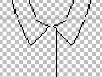
Since the arm part of the lines are basically done, we can move onto the collar (the most difficult part IMO).
If you’re ever concerned about the top face of the torso and the top face of the arms lining up (like in this example), you can literally just copy one and paste it onto the other part since they have the same height.
In this example, I copied the lines from the top of the torso and moved them onto the top arm. Same can be applied to the sides of the arm.
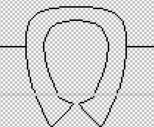
Now my collar is complete. Time to reflect them.
Select the collar piece. Get the magic wand tool and hold ALT. Click anywhere that isn’t the collar. You will now have the collar piece solely selected. Copy and paste that onto another layer.
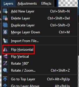
Now, go to the Layers option on the main menu and hit “Flip Horizontal”

Move it 4 pixels to the right (because reflection offset by the oddly shaped texture) and then merge layer down.

We have a collar!
Do the same thing to the arm.
Now we have this. Our next step is to add an actual button-up. I chose this area because I like it.

Now we have our lines done. Let’s do the trim parts.
The trim parts are fairly easy; it’s like an echo for the line parts. Make sure you use white as your trim color, and make sure it’s on a new layer.
I finished the trim on one half of my collar; time to reflect.

I did all the trimming for the dress shirt. Make sure it makes physical sense.
Now all we have to do is add stitching. The simplest way to do this is to edit your line type.

You may have seen this area. If you select the middle part, you can change the style. I usually use Dotted or Dashes, but you can use pretty much anything.
Make sure your color is set back to black and you make a new layer. I’ll be using dotted stitching.
Make sure it makes physical sense. I will be reflecting this.
I did all the stitching.
Buttons are fairly easy to make, it’s just a circle with some filling.

After filling out the chest with some buttons, we’re basically done. You may be asking right now “This doesn’t look anything like a shirt! How is this a shirt?”
Time for the final part.
Coloring. I’ll be doing a simple thing to color. For this tutorial I will make this shirt gray.
Step by step:
- Make a color layer. Select all and color it whatever you want.
- Take the magic wand tool and select the background of the template. Make sure your magic wand is on global and the tolerance is low.
- Now, select the the areas where skin is supposed to show while holding CTRL (to add to your selection), and change the flood mode to local. Then, delete.
After some cleaning up and removing the color, this is what you should have.
Now, set the layer opacity for the main black lines to “40”, the layer opacity for the stitching to “20”, and the layer opacity for the trim to “10”.
This is what you should end up with. You may be asking “Where is the texture?”. You can solve this problem in 2 ways.
The first option is the most simple. Select the color in the color layer and head over to the effects tab on the main menu.
“Noise” is an algorithm that generates difference in color. Press “Add Noise”

You may notice that it now looks like clown vomit. I usually put the color saturation ALL the way down and then the intensity somewhere between 10 and 20.

This was done with Noise at 10.
The second way is similar, just make a second layer and fill it with one color. Then, noise it up and multiply it. Cut off the pieces that aren’t colored (just select the emptiness on the color layer with global magic wand and delete).
Shading? No problem. Outline the object you want to shade in full black, like so:

Then, go to “Effects” and find “Blurs”. Hit Gaussian Blur.

Set the “Radius” to whatever seems the best for the situation. You can clean up.

Blurred with 7 Radius
You can apply any of this to any project you wish.
Have questions? Shoot me a PM, DM, or comment and I will reply as soon as possible. Feedback on this guide is always appreciated.
This thread will be updated consistently. If you would like to contribute, send me a PM.
Stay safe and mask up, DevForum.
~ ChainsOfWoe
the elite drawing guy


