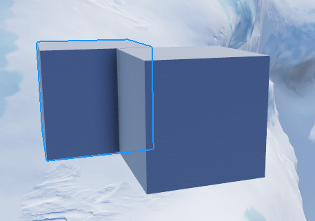
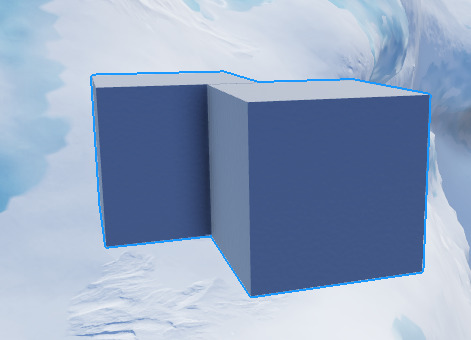
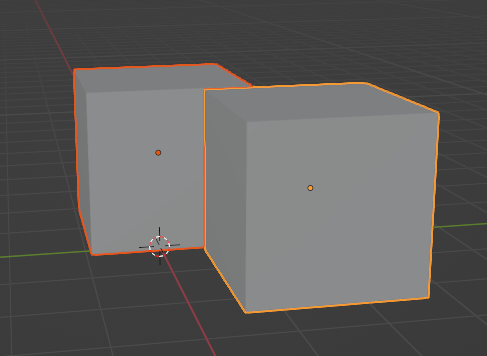
PLEASE add this, this would make it so much easier to see models in a huge world.
FINALLY, I have had me selection box set to be such a small number for so long to avoid this issue. Roblox back at it again adding an actual useful feature instead of removing them!
Alt-clicking also lets one select a part within a model instead of the entire model.
As long as that feature is compatible with selection cycling, I support it.
Otherwise, I feel a different key than “alt” should be used for either one so we don’t lose the former.
Also, after a while of using this, I find it slightly annoying - due to the selection outline showing on top of everything. Couple this with parts being made transparent when moving them, and it becomes extremely difficult to judge distances between the object you’re editing and everything behind it. Please change the DepthMode to Occluded, or give us an option to!
You can disable the beta, but I also think there’s a setting for it in the Studio Settings.
Hello,
For those who want to still see old bounding boxes on top of the new highlights there is a new setting that you can enable in the View tab that toggles them on.
Hello @OKevinO and @YasuYoshida and @SaturnianNightmare,
Thanks for the reports we will look into this as soon as possible.
Can there be an option to have itmas, both, selection box, or highlight, because there are a few cases, like models, where highlights get in the way more than actually help.
That’s super cool, more precise selection, thanls!
Once released, can the selection outline be opt out (a setting to return it to the current system)? The current selection system is very useful for measuring bounding boxes. Selecting a cylinder rn makes it rlly hard to scale appropriately.
Credit:
Is this feature affected by the 31 active highlight limit?
I like the update, but theres a few things that I dislike.
you cant use the alt selection to cycle your selection if the object has CanQuery set to false.
the highlight has no anti aliasing.
the highlight doesnt become less visible when behind other objects, which makes it a little hard to understand whats selected and what isnt, and where the object is.

in blender, if the highlight is behind another object, you can clearly tell.

when selecting multiple objects, the highlight merges, which is slightly confusing, and i would prefer it to be like in blender.


Highligts, huh? What if I select more Instances than the Highlight limit?
This might be helpful to your question about the limits regarding the highlights since I was curious about this as well.
slightly unrelated to the reply:
Although since they share the same characteristics with highlights and they do work with invisible / transparent parts above* .05 transparency, I’m curious if highlights will also gain that addition?
THANK YOU. This has been a nightmare when working with meshes overlapping each other in the past…
WWWW
Goated update to start the new year with
I don’t know in detail whether it was created with this update or not, but it is predicted that it is a way to select parts in a group using raycasting when Alt+Click is clicked. Therefore, if disable CanCollide and CanQuery of the part want to select in the group and click Alt+Click, the part behind will be selected. Is this intended?
Hello, is this also possible with selection box?
I love this change, but it can do with some improvements.
Finally some good updates. I do not have any questions about this update, It seems clear to me.
I only have one question, When will Local Currency And Other Console updates coming?
Absolutely amazing, now we’ll easily be able to see what we have selected when working with parts that are close together/over lapping.
