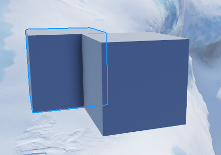
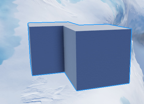
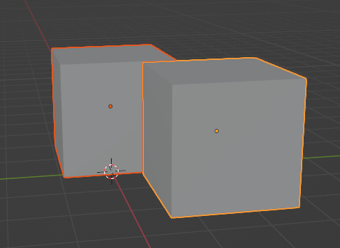
Hello @OKevinO and @YasuYoshida and @SaturnianNightmare,
Thanks for the reports we will look into this as soon as possible.
Can there be an option to have itmas, both, selection box, or highlight, because there are a few cases, like models, where highlights get in the way more than actually help.
That’s super cool, more precise selection, thanls!
Once released, can the selection outline be opt out (a setting to return it to the current system)? The current selection system is very useful for measuring bounding boxes. Selecting a cylinder rn makes it rlly hard to scale appropriately.
Credit:
Is this feature affected by the 31 active highlight limit?
I like the update, but theres a few things that I dislike.
you cant use the alt selection to cycle your selection if the object has CanQuery set to false.
the highlight has no anti aliasing.
the highlight doesnt become less visible when behind other objects, which makes it a little hard to understand whats selected and what isnt, and where the object is.

in blender, if the highlight is behind another object, you can clearly tell.

when selecting multiple objects, the highlight merges, which is slightly confusing, and i would prefer it to be like in blender.


Highligts, huh? What if I select more Instances than the Highlight limit?
This might be helpful to your question about the limits regarding the highlights since I was curious about this as well.
slightly unrelated to the reply:
Although since they share the same characteristics with highlights and they do work with invisible / transparent parts above* .05 transparency, I’m curious if highlights will also gain that addition?
THANK YOU. This has been a nightmare when working with meshes overlapping each other in the past…
WWWW
Goated update to start the new year with
I don’t know in detail whether it was created with this update or not, but it is predicted that it is a way to select parts in a group using raycasting when Alt+Click is clicked. Therefore, if disable CanCollide and CanQuery of the part want to select in the group and click Alt+Click, the part behind will be selected. Is this intended?
Hello, is this also possible with selection box?
I love this change, but it can do with some improvements.
Finally some good updates. I do not have any questions about this update, It seems clear to me.
I only have one question, When will Local Currency And Other Console updates coming?
Absolutely amazing, now we’ll easily be able to see what we have selected when working with parts that are close together/over lapping.
It would be much better if the hitbox wasnt box because if i want to select something behind it i get tricked since i clicked on something behind but the selection box is on the tree and not the hitbox.
Also it should be a setting to enable it to be box or not.
Yeah, its affected by the 31 limit
but finally they fixed transparent parts bug
This 100%. It gets confusing very easily, especially when you’re used to the old highlights disappearing as they get behind a part. For example, I can’t easily tell the position of the seat I’m moving relative to the floor here
Also this
I would definitely prefer the old way to select textures (First alt-click selects the part. Alt-clicking a texture on a selected part will select the texture)
Otherwise, I really like this update!
I love this new selector, I prefer Highlights than selectionboxes because it looks fancier
I have a question though: Why can Highlight go over transparent parts whereas the instance behavior doesn’t?
I mean, I wanna use the highlight in the exact same way you are using it, but can’t because it doesn’t handle transparent parts.
What you could do is add a behavior that makes the highlight:
- Highlight transparent parts (from transparency between [0;1] ) if the Adornee is a part alone
- Not highlight a fully transparent part if the Adornee is a model
Here is the current rendering in ROBLOX studio
Model with an invisible collide part
Partially & totally transparent part
As you can see, every parts are highlighted at all time. It’s good for the SpawnLocation as we want to select it, but it can be avoided in the model don’t you think so (for that said collider part)
Here is the current rendering using Highlight instance
Model with an invisible collide part

Partially and totally transparent part
As you can see, the model looks nice but the part alone doesn’t since the highlight instance doesn’t cover partially transparent parts, nor totally transparent ones
I’ve made a topic about changing the whole behavior of the Highlight instance a while ago (here), and I made a poll about what behavior people would like to have, here is the result:
I think you should consider making us able to replicate this behavior, and even maybe use what I said to make the selection.
The highlight part is a really good instance & provides such a good and fancy way to show things, hence why you are replacing the current selectionbox with it !
Please let us do the same in-game, I want to make a game in which you would also be able to select partially to totally transparent instances, and the behavior I mentioned earlier is far better than the current one.
Thanks
Overall, a great update although I’d like to see an option to set whether the outline is always on top or is occluded (just like it is now). The always-on-top selection is pretty disturbing when doing some precise building.


