There are some flaws I have found around while using this new selection:
Pivot point is hidden if you have bounding boxes off (i assume this is unintended feature)
I think new highlight should be an optional feature once this goes out of beta, because some people might prefer old highlight still.
Make Alt + Click to select a decal/texture a toggleable feature, working on a game that utilizes lots of textures on faces becomes infuriating, as instead you would select a decal/texture everytime you click (and you can’t do anything about it!)
Add additional settings to adjust new highlight, for example if it would overlay on top of everything always for your highlight or user’s highlight in teamcreate, adjust it’s thickness in pixels, opacity, etc.
Simply said, the update gave some advantages and disadvantages, and I’m looking forward for these flaws to be fixed and hopefully to make new selection better.
It feels like a downgrade to be honest, I’m used to the now OLD selection box for 13 years and this upgrade feels like it is going to a pain to be a builder now.
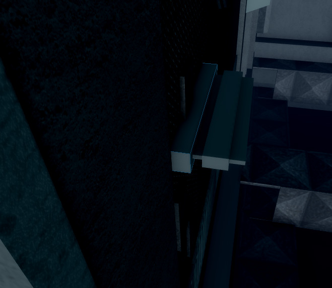
It is hard to alt select as its grabbing parts bellow the one you are overing. I experienced it on small parts aswell. Example here:
It is super hard to read which object are grouped together, or which parts are selected as the outline isn’t making the difference between all the parts.
On the old one, each parts has its own selection box, so we know exacly which one are selected. The new one blends all the outlines instead, this need to be changed through settings for example.
The line is too thick I used to work with 0.01 thickness and we can go even smaller. Now 2 is the minimum, please unlock it !
I can’t toggle off the new version it is always ON, but the old can be toggled ON/OFF ?
We should be able to activate both together like the current mecanics, or individualy so you can choose which method to use (bounding box or outlines).
The new one definitely has its place now that we have complex meshes to deal with.
But building with the common parts, placing prop models (even made with meshes) feels awfull and out of place, so I would switch to the old bounding box for this.
The builders need the readability of the old selection box to place objects precisely, it includes invisible walls, triggers and common building process.
So please, don’t throw something that is working since the roblox studio is a thing (more than 15 years for sure), so hear us and give everyone the choice to keep it and switch how we select the objects on the fly instead (between new and old, or both selections).
main issue is because the selection is less visible and turns into an outline, so if you select two objects really closely together it’ll blend into one outline which can be quite confusing at times. it honestly feels harder to determine what’s selected and what isnt because i can’t see the complete outline for other objects
this is not mentioning the tons of bugs popping up, whenever a team create member selects something there’s a chance it’ll stay there, permanently, and you could see their color and outline through all other objects and terrain.
it’d be nice if there was an option to opt out, not turn both on at the same time
Grouping a folder and then ungrouping it causes the selection outline to remain even when nothing is selected. This only disappears when either reselecting every individual part and unselecting them again or by hovering over each part.
Honestly there should be an setting to not show clipped parts of the selection. It can get confusing when to know if an object is clipping. I am a person with ADHD, since I have short attention spans and my processing is delayed a bit. I tend to make way to much misalignments, and mess my workspace., When the when it selection gets unmissable when it clips has helped to better align what i made. If you could get that working I think it would help me and probably others have a better time building! Overall love the update and I like the mesh improvements but please work on that issue!
Due to 504 Issue I couldn’t update it but here is what the edited version:
Honestly there should be an setting to not show clipped parts of the selection. It can get confusing when to know if an object is clipping. I am a person with ADHD, since I have short attention spans and my processing is delayed a bit. I tend to make way to much misalignments, and mess my workspace., When the when a part clips the selection becomes invisible it has helps what I made. If you could get that working I think it would help me and probably others have a better time building! Overall love the update and I like the mesh improvements but please work on that issue! Also Imo line customization like thickness, colour, etc should be a thing.
I personally do not like the update for highlighting parts or models because it just messes with my head. The highlighting selection or whatever hides the edges of parts which makes it hard for me to scale and move around. The highlighting lines also appear inside walls or other parts. It doesn’t allow me to know when I have hit a block and when to stop scaling or moving a part around.
Hey I want to suggest something, possibility to change the Depth mode, that’s something that was usefull for building with the old to allign, because actually the depth mode draw every line on top of everything
We do, the issue is that we should be able to opt out of these new features, make them toggleable in settings, but I don’t see that possibility here, which is why we suggest to add settings to change selection behavior.
Selection update is certainly visually appealing and i don’t have any issues with it being here, but it’s seemed to have affected the performance of studio.
When sizing parts incrementally it doesn’t feel as smooth as it did yesterday
Selecting around 500 parts caused studio to freeze momentarily something that hasn’t happened in over 2 years since my 1000 BC Laptop was on the scene. Slightly disappointed as it’s hindered development for an upcoming project. If i can turn this feature off that’d be great, could quite easily just add a highlight to a part if i wanted this effect so i see the update to be unnecessary.
I do really think this is a nice update but as other has mentioned it’s confusing that the borders show over other parts, and I can’t tell if something is on the ground or not.