its so good id literally pay for this (im broke right now)
Wait the soundtrack is from ab too?
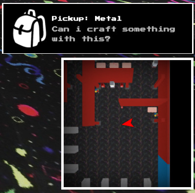
“TORMENT” is a horror game I’m making, I just hope I don’t get burnt out with this project.
Main Menu Interface:

I renamed my group to “VeilHorror Games”, previously was called The False Theorem, basically this horror game will have a cards pack system where if players wanna buy cards instead of clothes from shop, then yeah. think of it like FIFA’s card pack system!

- From Top to Bottom is the rarity chances per card:
Bronze
Silver
Gold
Ruby
Diamond
Emerald
12 Likes
Description: Some small elements I may use in a project or something. Kinda inspired by Microsoft Windows.
Style: Modern
Programme used to create your UI: Roblox Studio
Fonts Used: Prompt
Pictures
Text Box

Buttons

Window

Nothing too amazing, but I wanted to post it anyway. ![]()
3 Likes


This ui design is based off the Samsung Galaxy S23

Here is how i did the blurring:
20 Likes
The previous menu UI for my flight sim looked okay, but definitely did not work okay. Here’s my new (and hopefully final) menu UI for the game:

Would love a bit of constructive feedback if anyone has any, cheers ![]()
10 Likes
I love that OneUI like blured UI ![]()
1 Like

This looks fire ![]() Are you on talent HUB?
Are you on talent HUB?
Looks great, but I think something that’d make it better is more equal padding: the distance between the sides of the command bar and the edge of the frame are way too small compared to its distance between the bottom
i think the white and blue match the airport vibe really well and i really like the rectangle plane select frames and the plane inside them just fits really well with the ui. the wigets on the left could use a little more character imo. maybe the weather one for example could look a little bit like this one i found on google. you could probably just use a round frame for the sun. it could be more simple than this example and that would probably look better

6 Likes
How did you made the border animation around the button this looks sexy
This was actually answered in another topic.
I hope this helps!
2 Likes
Rate this ui library (should i continue making it)

13 Likes
Ooh I like it. It kinda looks like WPF UI
2 Likes
Yeah, looks nice. You should totally continue it.
2 Likes


Looks like WinUI3. i hope it has fluent tweening animations ![]()
2 Likes