Show off your UI designs

NPC dialogue

A NPC dialogue for my game “the parallel universes” is now in alpha but we hopefully in beta in December (if you now play it didn’t save anything and systems not all working or a prototype)

What find you from this ui (color use and things)
  • Yes
  • No
  • Can better (let me know)

0 voters

I’d recommend using a different font (i.e. Montserrat, Quicksand), adding UICorners (use scale instead of offset unless your UI uses offset), and different colors (i.e. #171820 for the background, #31385c for the buttons, #84899f for the UI stroke, and #dbdeec for the text).

don’t wanna use ScreenGui cuz of how boring it is

10 Likes

Sorry for the late reply, I suggest making it only slightly brighter because it is too dark to see the details. Otherwise, the icons are pretty good but its quite big and the empty space seems like it would be used for a profile icon but that might be a bit too big. Also, is the search used for the players or the options you can use on each player? I dont think the search icon should be open if your not in the playerlist tab.

Use UI Corner on the outside frame itself, thats all.

I’ve made a flightkit UI for sailplanes/gliders!

Any feedback?

6 Likes

RobloxStudioBeta_OqKq91cfJ7

I am currently making a game and found out how to do scrolling backgrounds, so I went ham and made it the main style for my UI. A lot of stuff is still under a lot of work but I couldn’t help but to share it with you guys.

Here is the Google Drive folder because all my gifs are above 10MB

If you want to know how to do it, I’ll link a dev forum post here Scripting a moving background screen - #4 by Rare_tendo

2 Likes

New ui for my game new color palette


Building system ui and inventory made by @0Shank

Also here the new ui for the menus on diverent devices tiny and big


Ignore the blue palette it will be replaced for the leaderboard will be new ui soon

The menu ui


paralelogramui © the parallel universums

Feedback pls

What find you from this new ui
  • Good
  • Bad
  • Can be improved (pls react) tell me

0 voters

1 Like

it looks off. its too streched.

Very pixelated and their’s like a blue color through the orange and yellow and its really weird looking, and I would really fix that, otherwise it looks pretty good.

1 Like

the finally ui and party system

The party system ui it will also be the ui for all menus

Also the menu ui is made by me and @0Shank

Have I good use the buttons for the confirm or can I improve it

  • Good
  • Can be improved (tell me)

0 voters

Also this is the ui for the building system by @0Shank

Also on different devices it looks so

What find you from the finally ui
  • Good
  • Bad
  • Can be improved (you know pls tell me)

0 voters

I will made a NPC dialogue ui and leaderboard in this style that come later

2 Likes


New NPC dialogue

Have I used good different fonts I’m also have some new ui for it

2 Likes

the buttons on the top bar
image
am not a big fan of it, but other than this
HOLY SMOKES 10/10 MENU

general ui im making for my game amateurly made brain game. idk whether the animation is too much but idk

11 Likes

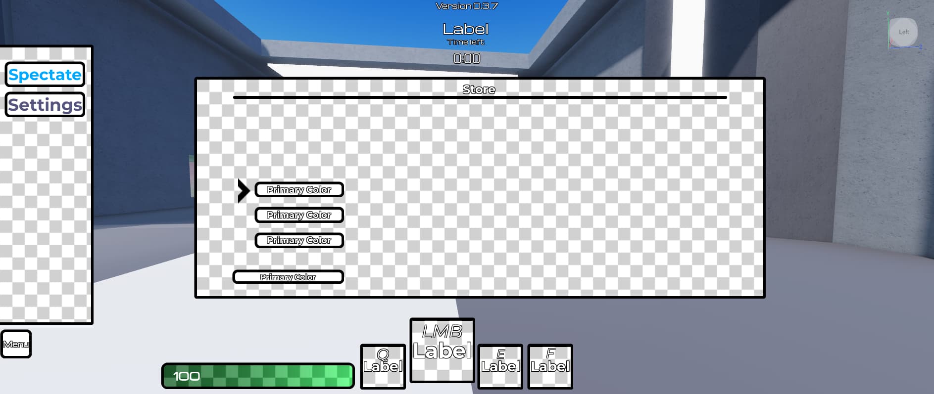
My simple shop popup. Hoping to remake this with viewport frames… When I’ll figure out how to make them properly :slight_smile: Also, need a better way to display tabs, because some people miss them.

1 Like

Looks better. Using the same font and fixing the padding/UI element positions so they’re aligned perfectly would make it better. Also, you can add UI corners and set the CornerRadius to (0.5, 0), (0.25, 0), etc. Here’s an example. (material design 3 style btw)

4 Likes

Looks really good, what are you making I feel I might play it when it’s done

I made really smooth ui animation again :flushed:


previous post: Show off your UI designs - #1901 by pon_dgon

37 Likes

level menu

settings

shop

party system (more screens here) and leaderboard

The NPC dialogue will I make better

What find you from this
  • Good
  • Bad
  • Can be improved if you click this pls tell me what can be improved

0 voters

for viewport frames Place a camera in the viewport then the model you will use then place a model in it and set position to 0.0.0 from here sall you can see the model and move it to a good position

It would be nice to have a consistent font size. Also, some of the designs seemed a little too redundant… (decorations in the lower right corner of the window,The scoreboard is slanted down to the left, etc.)