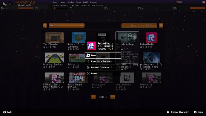
Hmmmm, it seems to be working with the gradient selection for me. I’ll try updating and checking it out
Or use fastflags {"FFlagEnableInGameMenuChrome": "True"} on Bloxstrap
While I would really like to have the option to pick which side that it appears on too, consider that keeping it on one side makes it appear consistently across games. Players need to be able to locate these controls and access them the exact same way across every game. Consistency and appearance is very important, otherwise it creates a bad user experience and causes confusion.
Maybe this is a bit nitpicky, but why is the “experience controls” icon a cube? To me, a cube doesn’t signal “controls”, it signals “something related to 3D space”. This sort of UI button already has a fairly universal symbol (three lines aka the hamburger menu icon). Is there any reason for cube over hamburger?
People will be disable the controls but what if Roblox remove the menu button and place the controls there then in the controls there 2 extra buttons menu and leave like menu on the side from report or better replace report for menu and 2 aouto selected buttons leave button and chat this fully cleanup space and you don’t have to disable the controls fully @JuiceBoxYoda
Edit: and the icons from the controls can be the Roblox logo then and can be here a way to detect when experience controls open or not to disable Gui you made
I forgot to mention it, but why is the second line in the “X” icon larger than the first one?

you still cant disable the seperate controls button. let us finally disable it.
Wow you did a nice job coding it! (better than Roblox lol) Why do all the icons look like a four-year-old drew them with a dull crayon?
@0Shank have coding it I only have it a bit customized that it toggle the icon fill grow massage counter etc
Cuz I’m bad in painting with a computer I’m currently trying to paint it manually and fill the lines with a Marker and make it some smoother with a PC maybe it will beter
nice launch btw guys :3333


pls make sure the hp bar is on the right side of things :3
Ik this was made while back but the fact you ignore our concerns is just sick
I very much hate it that Roblox just keeps making changes developers don’t want and we just have to adapt to it while trying to avoid Rthro as much as possible. This is what is making me consider leaving and starting a career on Steam or Google Play (even if it’s paid to upload games on them, I don’t care, they are a better service)
It seems that this new topbar has now offset some UI elements in my game (IgnoreGUIInset = true, screeninset is DeviceSafeInsets), for instance, a frame that’s supposed to follow the mouse’s position is now offset, and I can’t get rid of it without having to manually change a y-axis offset by a specific number (which I do not want to do in the case of future changes to the topbar pixel size).

For reference, it is supposed to look like this:

I suggest an option to change pixel size of the top bar, or to simply keep it the same size to avoid unnecessary disruptions (I am one of the users who has this rolled out, and certain games have offset UI elements as well, which is annoying). If the reason for the increase is for accessibility purposes, make it an option as an accessibility setting. Not everybody needs larger UI, and sometimes it makes for limiting use of space.
Easy fix: instead of subtracting exactly 36 pixels, subtract GuiService.TopbarInset.Height.
I’ve seen some of the players getting the new UI but some don’t, is there a way of detecting the new UI so that we can adapt our own UI depending on wether they’re using the new top bar or the old one?
You could do something like this:
local inset, _ = guiService:GetGuiInset()
if (inset.Y > 36) then
    --new UI
end
The only way that you can decipher the different topbar version is by looking at the height value from the TopbarInset Property.
If the height is equal to 36 pixels, then it’s the current topbar. If it’s any different, it’s the new topbar.
So I tinkered around, with what @xyrafrost has said earlier, so the workaround for offset UI is to use this as the new y-position:
ExistingYCoordinate+(GuiService.TopbarInset.Height-36)), where ExistingYCoordinate is the offset aspect of the UI element’s y-component of its position, and 36 is the current pixel height. Use if the UI’s height is greater than 36. Assuming Roblox goes through with this change with no further amendments, this should be a sufficient workaround to update existing UI in which positioning is important.

