Is anyone else experiencing major FPS drops when having windows docked? Currently when I have something such as the explorer on the right side of my screen FPS drops by ~20
2 Likes
This really ruins my user experience, and I can’t do a whole lot without being able to see my explorer. Here’s some footage:

EDIT: Also, it appears these FPS drops come from the Explorer page specifically
9 Likes
There are a few more bugs that I also absolutely hate. One being less major than the other. The first bug has to do with the screen transitioning from script editor to nothing back to script editor and then transitioning to the actual workspace viewport when test running the game in studio. The other bug has to do with the cursor flickering whenever i move it. It keeps on transitioning between the selecting state and cursor move state and is really annoying to look at. Here are both videos in the correct order:
Please fix these issues.
 The cursor flickering happens to me literally every time I just run the game, then stop while keeping open the script editor and is really easy to replicate. I’m using a macbook on version 12.5 and studio version 540. I use a second monitor as a main monitor using a HDMI cable. I started getting these bugs today when I recieved the new refresh. These are pretty annoying visual bugs.
3 Likes
So I got this update and I need to share my thoughts with it.
-
Studio is so much laggier now.
It takes 10-30 seconds for the application to even register that I am hovering over any button. Ironically enough, I found that tabbing out to a different window makes studio more responsive than actively using it… -
The new docking feature is so much slower compared to the old one.
Before you’d just need to hover over the corner that you wanted the window to be docked at. Now, on top of it being slow to even register that I am doing anything, I have to navigate some extra UI to dock. -
Studio layout doesn’t save 80% of the time.
Am I really supposed to redo my entire set up each time I want to work on something for like 30 minutes and close studio for testing? -
The UI visibility button placement is affecting us much worse than before.
This is made worse with the lag-fest that studio has become. Now on top of needing to completely drop what I am working on, I have to endure moving UI for at least a minute because of the lag caused by this update. -
Plugins take up much more space than before.
Before, all of my plugins would fit in one page, now with this update, I need to press an extra button to expand to the rest… really?
It is really embarrassing that a billion dollar company that wants everyone to take it more seriously than “we’re a kids game” can’t properly test and ship out updates that badly affect people who make money on their platform. It also doesn’t help that there are also engineers here who come up non-problems and force this onto everyone for no reason. I really wish that this was properly tested before it went out to the masses.
It honestly makes me happy that my job is more focused on running a team of developers than doing work in studio itself…
17 Likes
I absolutely agree with this, Just look at how bad the quality has become on just the simplest of things.
The top bar being ungodly big is so annoying meanwhile workspace and etc are super small, it hurts my eyes. Thanks Roblox for the ‘amazing’ UI change.

2 Likes
Strangely enough, my icons look perfectly fine and the changes to basically everything looks amazing. The only real problems is the FPS drops and usability of docking, maybe it has something to do with computer resolution.
1 Like
Because of this update, at least for me Roblox Studio kinda messes up my layout and it lags as heck.
A good idea would be to let us switch between the old and new design.
5 Likes
In the end I’d love to see this have a full roll-out and be a forced feature, but for now I think it needs to be a optional beta feature until all the performance issues and layout issues have been fixed.
For the most part, it appears this wasn’t tested enough and was released far too early.
7 Likes
When I got the update, it didnt take a while for me to notice some oddities…
Not only that, but I physically cannot click any of the ribbon bar buttons for a while after starting the game.
Both of these fix after a while, though.
In addition, plugin icons are big. Much bigger than before.

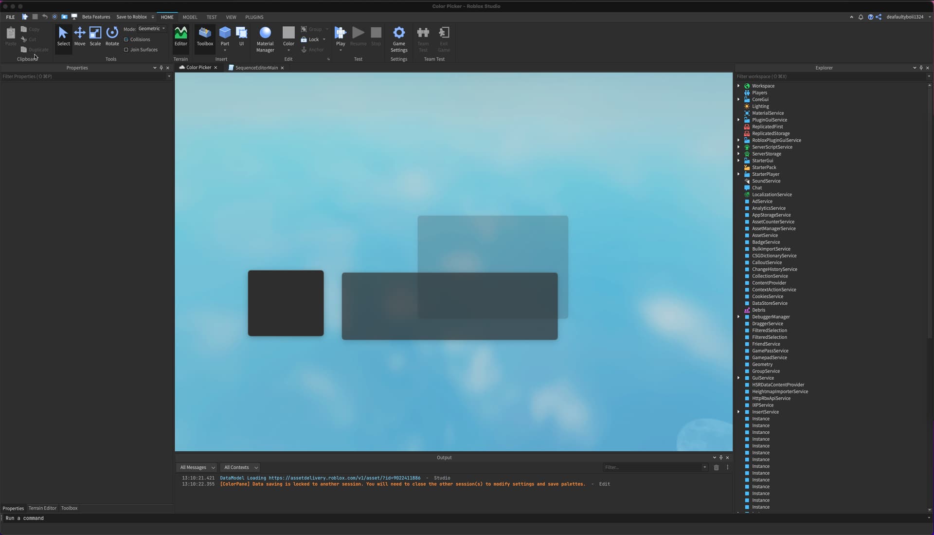
When I first started studio, I was greeted by this weird sizing.

Not only is the sizing weird, the triangle doesnt look good at all.

This new checkbox is honestly hard to look at.

Multi script editor or whatever its called works okay. Will be extremely helpful.
Why does selecting an object makes its icon sort of grey out? Someone might mistake this for a disabled script.
Why does FILE not match up with the rest of the ribbon bar text colors?
What happened to the blue outline when testing? I dont think this was mentioned in the post.

Same goes for server view. No green outline.

What happened to the view tab? The cluster of icons on the left would probably confuse a new user. Especially since 3 of them are the exact same icon. Though it does highlight what it is when you hover over it, but it might affect someones workflow.

Fortunately, I can still use studio as it was before becayse the RobloxStudioModManager doesnt install this specific version of the update.
10 Likes
Also this is unrelated but could we possibly have the blue collaborate button replaced by a icon? The same thing was done for the updates button and I prefer it being an icon instead.
In addition, on my screen (1366 x 768) the Collaborate button is on the very top.

3 Likes
It seems like ever since this has been released the position for the “Save” and “Cancel” buttons when adding attributes have been reversed. Could this be looked into? It’s really strange to have this one specific menu have the save button sit on the right side rather than the left.
Additionally, it seems like the tick box properties design has been changed and it makes it rather difficult to see whether something is ticked or not when using the dark theme
6 Likes
I’d like to add onto my original post as it only contained my first impressions of the new update. I’m also glad that more people are experiencing issues here so, hopefully, Roblox will take fixing it to a higher priority.
Roblox Studio appears to be a bit faster in terms of opening and closing place files and the application itself but this may be all in my head.
I’ve been starting to notice little things that have been changed that throw me off now because i’m not used to them, and these aren’t things that needed to be changed like the buttons on the save file prompt that appears when you attempt to close a place file without saving your work.

Whenever I close a place file or Roblox Studio, these windows flash briefly on the screen no matter if I am in Roblox Studio or another application.
It looks the the way the widgets get constructed are by creating a blank window through some kind of API MacOS has and putting a title, that, to remind you again, still does not span the entire length of the window. Recently I noticed that the title of the widget is centered between the end of the own arrow and the end of the window and not between either ends of the window which just looks plain bad.
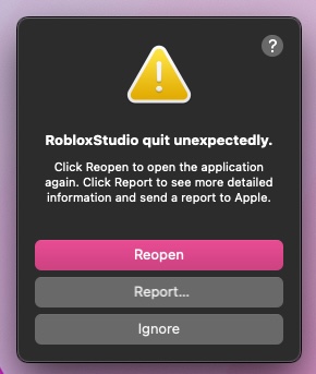
Roblox Studio still crashes when I interact with plugin widgets for an extended period of time or when those widgets contain many GUI elements. The frequency of these crashes has decreased but it is still annoying to deal with as someone who primarily develops plugins.
3 Likes
This also happens on Windows too. Also happens when you play test or change from server view to client view when playtesting.
3 Likes

Is there a way to not make the output buttons etc just an icon? Its weird how they are all clustered together now with most of them having similar icons…
5 Likes
I hate how the new studio looks, But i can’t do anything about it sadly.
5 Likes
Same except it’s all of my widgets doing this.
I absolutely agree that this should change, IMO, i feel like we’ve downgraded rather than upgrading the studio.
4 Likes
Yeah, I’m very frustrated right now, when I switch into a different place under the same game/universe I cannot dock widgets at all. This is pestering me
Something else that frustrates me quite a bit is how whenever you press right-click on one of your scripting windows, the context menu doesn’t immediately appear (even though it makes the window appear).
The old functionality was like so:
When right-clicking on a scripting window, the context menu would immediately appear, and if you kept holding down right click and moved your mouse to one of the actions, it would do that action.
Although this saves me one right click and one left mouse click, I frequently apply edits (so that Roblox Studio saves what I’m doing before randomly crashing on me). It just doesn’t feel the best when a new update aiming to improve DX removes QoL.
1 Like
Hello All,
I was surprised, upset and really upset by the new docking system while I tried to figure it out during 2 hours by myself, and I am kind of sure that I am not that stupid.
So I had no other choice to search for an explanation, which I found here, by a Roblox staff. Instead of taking time to post it here, they should have put that as a first run tutorial instead of making everybody loose time on this.
Btw, the Roblox Studio Reset Parameters doesn’t really reset everything since the update. Maybe they forgot about it while making their new docking system.
Stay Creative
2 Likes