The new CoreGui is a downgrade

While I do agree it is useless at its currents state but it is a good concept; I believe it should be used strictly for useful shortcuts for example: reset character, invite friends.

They should also add a feature to allow developers to add their own shortcuts (add a limit so there is no spam) this can be applied to simulators for rebirths and building games like bloxburg where someone can quickly bulldoze their property!

If implemented well it should make using the client a lot easier and more intuitive.

But they should also add an option in the setting to use the old ui style.

1 Like

There was an announcement for this? Is it old? cause I can’t seem a recent announcement on this at all

1 Like

I fully agree on this. That new top right corner button is pretty, poor. Even if I could disable it with CoreGui, it wouldn’t be so bad, but I cannot, which is really annoying because I have many games and projects that rely on a nice clean empty space on the corner for buttons and information.

2 Likes

100% agree, should at least be able to revert to the old style with some sort of method, should also be included as part of the CoreGUIType.All option.

This is yet another example of engineers making unnecessary changes with zero concern for developers, do better ROBLOX.

3 Likes

Unfortunately, those keys do not function for me so I am ultimately remained stuck to this ugly CoreGUI Top Bar that we cannot disable. I have never used the top bar icons even for the mobile player since I am more comfortable using the back arrow on my android device thanks to it having OneUI.

Currently I have to take screenshots inside Roblox Studio where I do not see the top bar visible but I am limited to what I can do until I have to use the Play button such as capturing UI working and more. This is the worst watermark I’ve seen in my entire life.

Emerging problems with Top Bars is that your phone will eventually BURN the top bar into your OLED Display thus turning your phone a pink-ish colour tone that is difficult to get rid of without a screen repair. I can testify from experience because I still have tiktok burnt into my old phone to the point I can see the icons clearly stand out more than anything else.

3 Likes

It’s here.

1 Like

why is it so UGLY? the older coregui were better looking than this


image

2 Likes

Anything on earth with consistent UI is prone to burn-in (see: any mobile game). Genuinely, the icons on that screenshot do not stand out at all. If you’re looking to take screenshots too, I recall there being a hotkey combo that will hide coregui for developers.

@Crimsonisms ??? The first one is hideous. The second one is pretty minimalistic I guess, but I don’t see what you’re calling ugly with the new design. I find it pretty slick. People will make up anything to justify why they hate change. If it’s the positioning you hate, focus on that.

6 Likes

its distracting & takes up so much useful space

2 Likes

There is a theme for TopBarPlus already for the new top bar. Here’s the link: NewUI [updated] - Roblox

1 Like

Although I barely read much of the post, I agree with it being a downgrade, I think it looks awful and is in the way for your own UIs.

Roblox releases both good and bad updates, however for a hot minute or years, it has been a lot of bad updates (in my opinion), especially for the community/player part of the game, not that much on the developer part :stuck_out_tongue:

Yeah yeah, I am just complaining however I wish that roblox would be more similar to the way it was a few years back, let’s say around 2019, when robux still was R$ and buildersclub was buildersclub and not freaking “premium” (like any other website) :sob:

Even though I am relatively new to the platform (been here since february 2017), I still very much dislike what the platform has become, sure, roblox is getting more young people onto the platform, I am not saying that it is bad or anything, however, the platform is not safe for small children (<13), you know that.

I could accept UGC as it was in the beginning, however it has gone too far, the UGC market is freaked, the economics are freaked (just like where I live irl), collectables should never have been a thing, dynamic heads looks bad and are scary and should not be replacing our beloved 2D faces, when using 3D clothing you do not put 3D clothing onto your avatar, you become the 3D clothing as it takes up so much space.

Please roblox, don’t call the og clothes “classic clothing”, just call them clothing (like it used to) and call 3D clothes “3D clothing”.

I know that they would never reverse any of their bigger updates, however only to reverse the robux icon back to R$ and premium back to buildersclub (also stopping the creation of any new ugc collectables) would make such a huge different, at least for me.

this will most likely be removed for off-topic however roblox really are digging a grave for themself and their players who been on the platform for at least a couple of years (~4+)

Personally, I’d much prefer if Roblox would just resize the game-view, and create a proper topbar; as it’s my belief that developers should own the entirety of their game’s screenspace, without having to worry about future Core UI updates clashing with their existing designs.

If Roblox intends to preserve their strict stance against 3rd party clients, it would be in everyone’s best interest to ensure that the official interface remains unintrusive. This whole approach of trying to seamlessly force Core UI elements into developers’ games, while simultaneously upholding those menus as immutably sacred, has been flawed from its inception, and does not work. Ideally, Core UI (the subset of Roblox UI which cannot be altered) should be entirely distinctive from developer UI–the two scarcely in interference.

3 Likes

Don’t know about you, but the NEW icons are super visible and they will burn into my OLED display guaranteed, although there is a purpose for mobile devices to have these UI Buttons that lead to the menu, why not just add a white Roblox icon with a drop shadow top left that is tiny but visible so you can still see your screen.

Now for PC this is a different story, there is no purpose served for these buttons are people already use ESC and Tab keys because let’s be real here, we all have keyboards. I would also like to note that all the games I PLAY lock my mouse in the middle so I can’t even click them. Purpose is laughable there, I want to stress the fact I don’t want this removed for developers who still want the top bar for their game but mainly allow some developers to hide it if they please to.


Especially since the padding is also UNEVEN WHICH ANNOYS ME TO A WHOLE NEW LEVEL!

If you have other points to add, please DM me first before hitting reply so we can debate there :slight_smile:

1 Like

Personally I do enjoy this new UI, looks clean and modern and I like the little live view of your avatar.

BUT

This UI is very buggy. The inset system is really messed up which does mess with custom topbar ui. And some button placements don’t make sense.

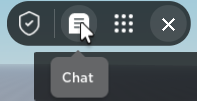
A personal gripe of mine is that the chat toggle is so far away from the chat window, and having a wide-screen monitor makes it worse.

Adding on to my critism with the absolutely cumbersome menu, I hate how you have to click alot just to get through some stuff like showing and hiding the leaderboard.

The UI is also odd with the padding but that’s a small issue I really don’t notice too much.

Since this is a beta after all, I do hope the final product fixes the weird inconsistencies with the inset stuff.

I already developed a module that replicates behavior like tooltips and menus 1:1, not sure if forever hd plans to support those

I completely agree. I honestly think it looks much worse than the previous CoreGUI, or even the one used before that. It seems that yet again, Roblox is letting mobile hold them back.

ForeverHD went inactive a while ago, not sure when will he come back again but the probability of TB+ getting updated is not high.

2 Likes

this is what i hate the most about new CoreGui, the chat toggle is placed in THE LEAST CONVINIENT PLACE A HUMAN COULD EVER IMAGINE.
изображение

4 Likes
2 Likes

The new roblox ui should be revoked, you can disable it in beta features.