This might be leftover from a “show/hide” deprecated members toggle
I’m ok with giving up styling for functionality. I’m there to use the wiki, not appreciate the UI.
Also am I alone in thinking that all of this text is intimidating? Maybe having “Hide Content” be selected by default could be a lot friendlier to newer users.
Take a look at how much more naturally you look down the page when you don’t have 3 columns of text.


O one more thing:
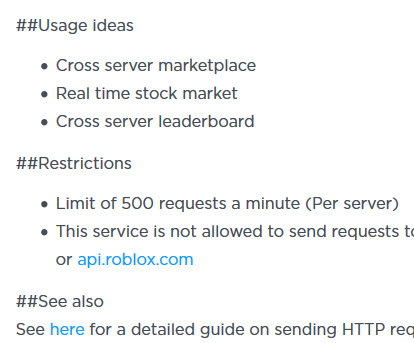
Not sure how easy it is to do this, but if the wiki could account for ultrawides that would actually be amazing. I know of quite a few devs (in fact entire roblox studios) that use ultrawides. My main beef is that to see the ‘CONTENT’ column (as pictured in picture #1 above) is squishing the interior stuff and extending the page length. If instead of pushing in it pushed out from the center text, that would be great.

16 Likes
I’d like to make a few suggestions to the dev portal:
Everything is too vertical. I liked the wiki’s layout where all the functions are listed nice and tightly and I only have to scroll down a little bit to view them all. That’s impossible with some items on the new portal. It took me 10 scrolls to get down to the events portion of the BasePart whereas it only took me one scroll on the wiki. As someone who browses the wiki a lot, this is a bit of a downgrade for me. 
The “notreplicated” tag seems a little ambiguous and all over the place without much meaning from a first glance. Maybe we should hover over them and other tags to get more info?

4 Likes
The pages still feel really hard to read. Y’all need to find some way to better differentiate different kinds of information being displayed to make it easier to find what I’m looking for.
For instance, the spacing feels really uniform which despite the slightly darker background makes it really hard to distinguish between different items

Another thing that might help is to make the fonts not so similar between the description and technical information. The font size and shape appears to be the same, and the only difference is a few very subtle color changes. I would rather y’all make one more prominent (semi-bold / larger font size) than the other to create more obvious lines where one item begins and the other ends.
Also, finding a way better divide the technical information. The return value is basically equally prominent to the function/property/event name which is also basically equally prominent to the tags like [yields] which again makes the pages very hard to sort through.
The way I use these pages is I go through and read the names of the properties/functions/events in order to find something that has a name that sounds like what I want. Secondly, I read the description to then confirm whether it is useful to me or not, THEN I look for the parameters and the return value, and then the last thing I look for, if I even look for it, is information about whether it yields or is notreplicated.
I feel like just a little bit of typography would help organize this information to make it better work in a way that flows well with a human brain
2 Likes
I think it’d be useful to have flags next to properties/functions that are serveronly/pluginsecurity/etc… Especially when it comes to security, it is important to know that it’s there, but we can’t use it.
Wiki:
![]()
Developer Hub:

Especially people new to scripting just won’t understand why their script isn’t working, since most people won’t click the link to go to the actual property/function’s page and the Lua error isn’t that newb-friendly:

EDIT: As I just noticed from the screenshots, it’d be good for it to show the default values like the Wiki did (in this case, 4) - although that’s not that much of a priority for me personally.
3 Likes

This page seems to have dropped the description that said it can only run from a LocalScript. It’s important to have that documentation
https://www.robloxdev.com/api-reference/function/Humanoid/ChangeState
Have other pages dropped their descriptions too? -_-
I want to be able to click the green types to go to their page (currently does nothing. wiki had this feature)
Example, clicking HumanoidStateType https://www.robloxdev.com/api-reference/class/Humanoid

9 Likes
Good catch - it seems that the most up-to-date version of that API member’s page wasn’t published. Do a hard refresh (CTRL+F5) and you should see the content. Let me know if you see a batch of pages that are the same way.
1 Like
We’re aware that enum-type cross references aren’t properly linked.
2 Likes
Ok so I’m running into an issue with the new Developer Hub that had previously been fixed with the wiki reenabling. On the wiki page MarketplaceService:GetProductInfo() there used to be a table listing what was returned in the dictionary, ie Name, Description, ImageId, etc, but now I’ve looked around on the page and there is no place where that information is listed. Without this information the function is basically useless and I think it’s important that it be added back.
3 Likes
Are you sure it took you only one scroll to get to the events section for BasePart on the old wiki?
BasePart’s a bit of a bad example for the “I have to scroll” argument considering the sheer number of API members there are, plus the class itself now has a description that pushes the list of members “below the fold”. There’s a sidebar that lets you jump to the members you’re concerned with, so I’m not sure what to make of this feedback.
This seems to be the same problem as what @Maelstronomer was having. Let me check with the team regarding page publishes, because I definitely wrote that page and it’s definitely not showing up ![]()
1 Like
A lot of the text colors fail color contrast accessibility checks. Even with good eyes, a lot of the light pastel colors and grays are way too light.
Edit: I’m using the WebAIM site to check this. I use that site almost every week for work.
3 Likes
Yes I am definitely sure it only takes one scroll. I have a high density monitor too.

While this gif is here, this is what I’m talking about. Looking at this, I can see many many many more components of a single object at once. I browse the wiki a lot and something that gets added to make it take any longer makes it really annoying.
BasePart is not a bad example because the layout affects all of the items. Yes I gave a dramatic page but that doesn’t deter from the fact that the layout is extremely vertical for every single item. It’s also hard to read key elements like function names and such. Maybe bold them to make them stand out more.
Your side bar doesn’t help either. It’s garbled and messy because it’s wrapping the text down a few lines. Yes I do know it’s a shorter path to scroll on but when you make it harder to read from a first glance, it’s almost as annoying as the first issue.
7 Likes
I see your point now, I agree. It looks like the wiki used about 22px for a single-line member item and the new devhub uses about 70px. I think the biggest thing that helps with readability is that the member names are aligned to the left, which should help the issue that @ScriptOn pointed out. We’re talking about further style improvements internally, thank-you for bringing these things up (we’re especially aware of how the right navbar/TOC isn’t as useful as it should be, especially for long pages).
1 Like

Found another issue with the header.
This is probably an issue with the html generation. The type display needs to opt into my type-linking template. I’m no longer on IX so unfortunately I can’t address this.
On the mobile version of the roadmap you need to scroll in each section to see more. It should be expanded so we don’t need to scroll. If you don’t think to scroll on them you would not see every feature listed.
If I recall correctly, we took a middle ground between having this extreme compression on the wiki and the previous spacing that it had, with the compromise being the navigation sidebar.
We can’t make everyone happy, but we want to make sure that everyone can distinguish the individual members regardless of their experience with the platform. Sure, an experienced developer can look at a crunched up page with no spacing and get a general idea of what each member does, but a new developer might be overwhelmed with the information density.
You should utilize the sidebar to quickly navigate to what you’re looking for. Adjustments can likely be made if others are having issues with it as well (like you mentioned). In the mean time, you can feel free to use a CSS styler plugin to adjust the pages to your needs.
1 Like
This is a side effect of how the new JSON API Dump is handling security information. Security is no longer defined by a generic tag, it’s a separate field. It can probably get fixed though, but I personally believe we could be presenting the security information better than just using a tag.