[FREE] Theme Manager - A Roblox Script Theme Editor!

Introduction

Hey there DevForum! I have gone ahead and made a new (albeit more niche) plugin for y’all to mess around with: the Theme Manager!

I’m sure that most programmers don’t really tend to change their script editor colors often, but I wanted to make a tool that made it easier to share your themes and edit them in a fairly fancy UI!

Here’s a preview of it here:

Features

  • A very polished up UI to see all your themes in!
  • Export, import, and save your script editor colors easily!
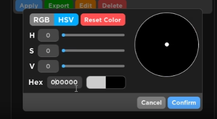
  • A fully-featured color picker system!
  • A searchbar to easily find a theme!

What’s Next? (:warning:Subject to change!:warning:)

  • Ability to set favorites
  • Ability to export multiple themes at the same time, both for JSON and ModuleScript formats
  • Ability to rearrange the order of your themes
  • Preview in the “Add” and “Edit” menus (This one will take a bit)

Beyond this, I’m not 100% sure! If any of you guys have suggestions on what I should implement next, let me know!

Where do I get this?

You can get this plugin on the marketplace here!

What else do ya got?

I have also created the API Viewer! Feel free to check it out!

Updates

Version 1.1

New Features

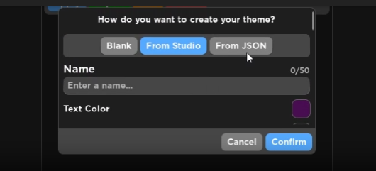
  • Implemented an option to import from a ModuleScript
  • Implemented an option to export to a ModuleScript

Tweaks

  • Prompts now have a darker background to bring more focus to the prompts themselves
  • Made it so the “Add” menu now extends to the height of the plugin window
  • The “Add” menu’s import mode UI has been redesigned a bit to better fit the design language
  • The “Add” button is separated from the search bar
  • The top bar is now separated more from the themes
  • Made some positional adjustments to the color picker UI
  • Made it so the “Apply” button is now on the far right, separating it from the other options
18 Likes

Another cash grab plugin? Expectable.

Polished??? That does not look polished at all!

I am sure that there are many other plugins that do the same thing and heck this can still be done manually. No need to pay 200 robux for thing that can easily be done automatically and takes almost to no time!

I suppose good job on making this. But I wont not recommend buying this as well its not a good use of robux.

2 Likes

I’m not gonna complain about criticism, but this isn’t constructive in the slightest. If you want to criticize my work, at least give me some solutions or tweaks that you believe would improve the final product.

True, but the main point here is to be able to swap to other themes easily, and be able to share them with others far easier than before. I already specified at the top that this was a more niche plugin, but I wanted to make it anyway.

Truthfully, I was considering whether or not I should lower the price. I think I’ll at least reduce it down to 175, maybe 150. However, I don’t make plugins for the sole purpose of earning money.

7 Likes

You want me to tell you how to fix it. Sure! Lets go over the things:

1

image
Too cluttered gui. Add difference between the colorscheme and the search bar by adding a seperator. Remove the gray gradient you added because that looks simply bad. The buttons do not look quite appetizing. The search bar’s add button should be the same color as the search bar and also instead of add should be an icon.
The Apply/Export/Edit/Delete buttons can be icons rather than text buttons. The Delete/Edit/Export buttons can be made into a menu that can be opened by clicking 3 dots on the top right corner of the item. The apply button can be on the bottom right or left depends how you want it. There can be a subtle gradient in the background for the sake of glossiness and matte finish.

2

image
Unevenly spaces between each corner i.e. The RGB and HSV selection can be move to the bottom left. The color wheel has a stroke that I think is not too good but is decent? I don’t know about that part. Anyways, The title for each the sliders can be improved by making it in the box where the text boxes are. The sliders point should be the same as the color wheels point. The cancel confirm button can also be made into icons with a background similar to the textboxes but with corresponding color.

3

image
Spacing for the black,fromstudio,fromjson etc is not even from all sides. The title should be more prominent. Those buttons can be put lower to the name. The colors can also be improved. Again the cancel confirm buttons should be made similar to the above one I stated. There are more things to fix but I can not explain them.

Still would be considered as a cash grab. I am not saying its expensive. Quite cheap honestly but I am talking about usage/cost ratio. And that says something like free. Unless you plan on adding more things to this. Like premade themes? That could maybe make it still a bit more worth it

6 Likes

Cool resource, sad to see it’s paid though. Loses the whole purpose in my opinion due to that.

What’s the point of having a way to easily export and import themes from others if there is a paywall in between it? And you probably already know how Developers tend to hate on paid plugins for any reason they can come up with.

Besides that, I liked the UI, as @NoxhazeI mentioned it can be improved indeed, but overall is quite nice compared to many others that pop up here in the Forum.

Lmk if it ever becomes free or gets some other features that can make up for the price tag.

2 Likes

Huh, I like the GUI design actually much.

4 Likes

if i had some robux i might actually pay for this, the UI is pretty good in my opinion, one thing i would suggest is adding a theme preview, sometimes i don’t know what text I’m actually changing the color of.

1 Like

Well thats your opinion. Everyone has their own opinions and everyone should learn to accept and respect each others opinions.

3 Likes
(Please take this reply as an opinion, not as criticism)

I like the thinking you have there. The plugin is simple, quick and pretty handy to use. Though, I don’t think it’s worth the robux. Anybody can make this plugin with the basic idea.


  1. Declare the variables
  2. Save the properties of each part of the theme when user presses Save
  3. Set the properties of theme in studio when user presses Load
  • And extra delete, colour setting and stuff

I do have to agree with others though. I’m not much of a fan of the UI, it feels like you tried to make it minimal but cartoony at the same time. You should try and adapt to a specific style. Mixing up 2 styles isn’t the best way to make your UI, it is a nuisance to the eyes.

Furthermore, I’m just giving my own opinion, I hope you’ll understand. And the price? Not trying to look like the cheap boys but I don’t think it’s worth 175R$

Huh, that’s very argumentative, did I ever say I think your opinion is stupid? I just meant I disagree with you. The acceptance thing applies to you too.

2 Likes

I will admit that the UI is beautiful. But, why did you make this? We can already change the theme of scripting and of studio in Studio Settings. Pretty sure we also have profiles/layouts for themes too.

1 Like

The issue I was mainly with the sharing; trying to share a script theme with other developers is difficult, so I wanted to find a way to make it easier to do so, while adding in a few more features to make it worth it. Though, looking at the other replies, I think I’ll just make it a free resource. It’s not something that has much value, given how niche of a use it has.

1 Like

Based on other replies, I just made it free! And yeah, there are definitely some things that can be improved on as far as the UI goes.

1 Like

Just made it free! Though, I can see what you mean by it looking a bit cartoony. If I were to try to remove the “cartooniness” of it, I think I’d just need to remove the lighter color at the bottom of the buttons.

I can definitely see what you mean by it being cluttered. It definitely is.

I’m not too sold on this idea, but I do want to give it some space. Alternatively, If the design language was more squared, I’d probably not give the search bar any padding, and have the bottom of the search bar become a seperator itself.

The gradient at the top is meant to separate the foreground from the background, but I can see how it can look unappealing.

I wanted to keep the visual separation between the search bar and the Add button by using some contrasting colors, so I don’t believe that making them match would be a good idea. However, I think moving the Add button to the bottom, or making it so the search bar doesn’t stretch all the way behind the Add button, would be a better solution.

I tend to use text rather than icons for more clarity. I’m not a great icon designer, and I’m not tempted to steal other’s icons, so unless I design them myself, and unless they convey their purpose perfectly, I won’t add icons.

For a plugin, UI like this is difficult to make function well (at least, going by the methods I’ve gone about making stuff similar to that, it has been). In live experiences, this wouldn’t be too much of a problem.

I’m not in disagreement about this.

I can give this a shot, but yeah, this would need to be subtle.

By bottom left, do you mean in the same section as the Cancel and Confirm buttons? And yeah, it does seem like the padding is off on the RGB / HSV selection. It needs to stretch a little further to the left.

It does look a bit odd, but going without it honestly is not much better. It’s more of an indicator to show that you can interact with it. Putting text somewhere that says “you can use the color wheel” or something similar is both too clunky and fails in UX, since you’d have to explain something that wasn’t clear to the user.

No. I wanted to a clear distinction between something you can type into, and something you can read. Typeable elements have a more transparent look to them, while interactable elements are colored and have a strong contrast against the background.

Not against this.

Again, I’m not against placing in icons where I can, given that I can make them, and make sure they make sense. However, saying that they should have a background similar to the textboxes but have a corresponding color… that is literally what they are.

Fair. But I’m unsure what design would fit that better than that.

Given that that is not a title, no. It’s a question. If there was a title, It would be “Create a Theme” or something along those lines.

Why would I move the buttons close to the name? Especially since each item should be separated? Truthfully, I would add a bit more space between the selector and the next input, and add more space above the “How do you want to create your theme?” text, and reduce the space below that text.

What colors are you referring to?

Same response from me as before.

It’s free now, given how niche the use of this is. Premade themes are good if I can get a few, but I’m not a “theme designer”, or whatever you’d wanna call it. Aside from that, I’m unsure about what else I could offer, and I made it clear in the original post that I was unsure about what to include already.

All of this being said, I appreciate your feedback.

2 Likes

Honestly, I love it and I’ve been using it! Though some improvements could be:

  • Spacing with “Add” GUI. Honestly, it feels so cramped and turns me away from the plugin;
  • Ability to export all of the themes for ease of use of giving it to your friends;
  • Ability to import all of the themes into the plugin;

If I were you, instead of using json, I would use Luau Modulescripts and you could do something like this for multiple themes:

return {
	--// Name would be your theme name
	Name = {
 		--// These would be all of the studio settings 
		BackgroundColor = Color3.fromRGB(0, 0, 0), 
		StudioSetting = Color3.fromRGB(0, 0, 0), 
	}, 
	
	--// Name would be your theme name
	ThemeName = {
		--// These would be all of the studio settings 
		BackgroundColor = Color3.fromRGB(0, 0, 0), 
		StudioSetting = Color3.fromRGB(0, 0, 0), 
	}
}

I’ll be making some tweaks for the UI soon!

Not a bad idea!

Doable!

I could do this, but it may be a bit unpredictable to import back, given that a module script can be modified after creation. Not a bad idea, though. (May still do it anyway.)

Actually, for some clarification, what parts specifically feel cramped in the “Add” prompt?

Well theres alot of plugins where you can share your script editor themes.
You can check my plugin if you wanna share themes through scripts
Or you can check @tyridge77’s script editor plugin
https://devforum.roblox.com/t/script-editor-themes-plugin-browse-or-create-script-themes-or-share-them-with-others/

Even tho, great resource.

Oh for sure! I mean, I found one way to do it (JSON Encoding) but doing it through module scripts shouldn’t be too difficult either.

1 Like