The font looks pretty nice, although the I and l are still confusable, so I would probably consider designing the capital I to look something along the lines of “Ɪ”.
Although, I have a question: What would happen to any Arabic language text in experiences after the Arial font is removed off the platform, considering that Roblox does have Arabic in the language selector?
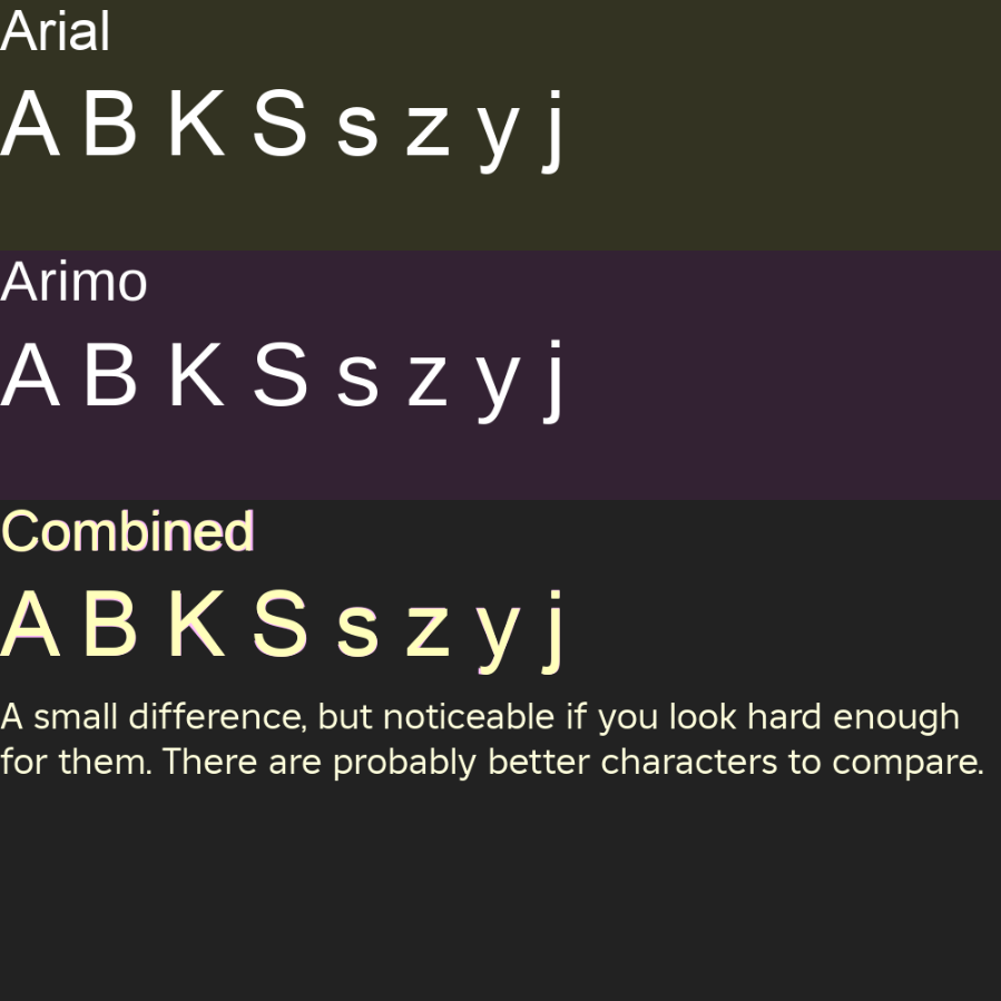
Also, I noticed that the .notdef mark is the Roblox logo.
Also, I wonder if Lentariso could also be added to the list of fonts?
Whats the point of getting rid of gotham and arial? They are both good fonts and are highly used for fps games with tons of big games using gotham and arial. I tested the builder font and, in my opinion the spacing between texts are too close and does not look good for my game.
There should be no reason to remove Gotham and Arial, unless there is a valid reason to, which Roblox failed to state as to why the fonts are being removed. However I could see why as I dug research into the font to find that Arial is proprietary (though I’m not sure about Gotham as there is sort of insufficient information on licensing). I’m not saying it’s because of licensing issues (since there could be a number amount if reasons to remove the fonts), but a main possibility as to why.
It definitely seems like some sort of licensing issue, otherwise there really isn’t a point to removing Arial & Gotham. I wouldn’t say for sure until we know for sure, though. I was pretty comfortable with Gotham tbh.
On the topic of fonts though, can we please have more options in the marketplace? Specifically for me, I’d really like to use a DIN-style font for my game.
is bloxy news violating the license terms? they are using the builder extended font in their trailer and on their lnk.bio thing
edit: did roblox give bloxy news permission to use this off-platform
Yeah, I don’t believe there’s any legitimate reasons to deprecate Arial and Gotham, so maybe, don’t? There are plenty of legacy games that will not be updated, this update will really mess things up for those games considering that the replacing fonts look somewhat different.
Here’s some examples:
Look how the “G” looks like in the Montserrat font, its horrible and doesnt fit to replace the Gotham font, please use something like Gontserrat instead, or at least try harder to find other public domain fonts that are similar to this. If you have to remove the fonts, at least find a good replacement.
Why can’t the engine just do it by itself? I understand assigning fonts through Font but for static texts, can’t the engine just automatically switch to those, without having somebody do it through every object?
This font is okay. My personal opinion: It looks like if Helvetica had a severe birth defect
Why deprecate other fonts like Gotham and Arial, though? Those are basically my two favorite fonts installed by default. (also why can’t I view custom fonts in Enum.Font yet??) Sure, change the font, whatever, no big deal. But please, please, please do not remove fonts that are so widely used throughout the platform.
Another day, another breathtakingly-stupid decision by a megacorporation. What a surprise.
Arial is one of the most universal fonts across the entirety of the internet (even on here!!!). Why are you removing it? Who asked for this? (Hint: it’s a nice, round number)
Gotham is a modern font which is, again, one of the most universal fonts across the Internet and design space, both on and off-platform. Why are you removing it? Again, who on earth asked for this?
Once again, decisions are being taken unilaterally without any consultation by a corporation that does not care in the slightest about its developers.
Nobody asked for this. Stop deciding to randomly remove features without asking your developers.
This is a cool update, but it would be even cooler if you hadn’t felt the need to replace two fonts without real context or reason. Additionally, you’re not open-sourcing this font or linking to a font page like Adobe Fonts, where you can actually use the font.
so on that note it kinda makes this update sorta worthless you gaining little and losing more ?
After a while of usage, I’ve started to notice some odd inaccuracies in Builder Sans.
Circled in red are concave corners that are quite rounded and look very off, especially when in bold. There are also a few small things that I would say are mistakes:
You should submit a bug report or look for one, this doesn’t seem like intended behaviour. If you don’t have perms to post message @Bug-Support in the format of a bug report and they’ll repost it for you!