List Mode for Studio - Beta Release

Hi developers,

We are excited to announce the beta release of List Mode for the Studio start page! List mode makes it easier to view and manage your experiences, showing additional details such as their description and creation date.

To enable this beta feature, go to File > Beta Features, and select “Start Page List Display”, then click Save, and restart Studio.

Toggle Between Grid View and List View

Click on the icon in the top-right corner of Studio’s start page to switch between view modes.

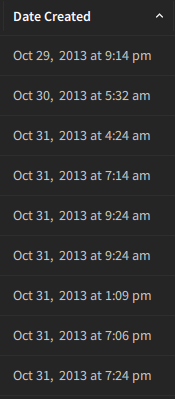
In the list view, you will now see columns containing additional information about your experience:

  • Type - Indicates whether the place is saved to a local file or saved to Roblox
  • Description - Presents the game description set in Game Settings
  • Playability - Displays the playability of the experience set in Game Settings
  • Owner - Shows who owns the experience (user or a group)

To start editing an experience, simply double-click on a row. As with the grid view, right-clicking on a row will open a dropdown menu with options for managing the experience.

List Mode Features

Sort your experiences by any column. Click on any of the column headers to sort your experiences by that field in ascending order. Click again to switch to descending order.

Additional info on mouseover. For a closer look at your experiences’ thumbnails, hover your mouse over the image for an expanded view. You can also hover over truncated fields to view the full text.

Resize and reorder columns. To customize the widths of columns, click and drag the vertical dividers between headers. You can also rearrange columns by clicking and dragging the headers. Please note that column customizations will not persist between different instances of Studio. An update improving this will be released soon!

We will continue to make additional information available in list mode, so please keep an eye out for future updates. Many thanks to @Kresselia1, @Brouhahaha, @RacquetBaller, @GeneralTso58, @robDR, @jowoyce, @desserts_yumyum, and @yipiokay for making this possible!

As always, we would love to hear your ideas and feedback! Feel free to let us know what improvements you’d like to see in the thread below.

262 Likes

This topic was automatically opened after 10 minutes.

Look man, I’m usually salty. But, this is an absolute W. We needed this and have been asking for years. Thanks to everyone that made this change possible.

+1 User Experience Improvements

60 Likes

Love to see UX improvements in Studio, these kinds of improvements are exactly what we’ve been asking for for eons.

24 Likes

Something about grids makes it harder to find things, especially when you got a lot of those… things. Glad list mode is added!

6 Likes

Please add an option to view all the places within a game in-studio so we don’t have to use the develop website page or the Asset Manager to open individual places :pray:

38 Likes

This is going to be so much nicer for me than searching icons all the time.

All it needs is a favorites button/sort, per list, and it’d be even more perfect.

5 Likes

A benefit of any list format is that you can have sub-levels / a hierarchy by indenting items in the list. This sounds doable? Sub places could go below a game’s primary place in the list view.

Given that there are columns though, perhaps simply drawing a line down the left margin to group/connect sub-places to the primary place is good enough.

21 Likes

This is a very welcomed feature as someone who loves compact information!

Would it be possible to have the following metadata shown as well?

  • Date updated (Useful when you have a lot of games & want to edit the most recent one you worked on by sorting by this)
  • Place version number (Useful for quickly getting place version info if your workflow involves studio a lot)
  • Datamodel size in MB (useful for debugging place file sizes pre-upload and post-upload, this is handy to have in a workflow that uses a lot of external tooling & local place files)
15 Likes

This is a wonderful update! I would like to have a column for “Date Modified.” I don’t find sorting by “Date Created” to be all that useful.

Another thing that would be useful is to have an option to make the rows larger. I find that the rows are too compact and there is a lot of empty space below unless you have at least 20-25 games in your group/account.

9 Likes

Something else I’d like to see for this page in Studio is for it to remember my last sort option. Right now it defaults to date created which makes it annoying to find my staging game, and changing it every time takes longer than just hunting for it.

Also I notice when changing the sorting option in list mode, and switching back to grid mode, the grid sorting order changes, but the option in the dropdown box does not.

4 Likes

Why does the creation date not work for games created before November 2013? For those games, the creation date is just always anywhere from 10/29/2013 to 11/1/2013.

imageimage

4 Likes

Probably because that is when universes were introduced and the date shown is actually the universe creation date.

7 Likes

I definitely agree, something like a “Pin” button would be very useful so you can have the places you edit all the time at the top! Then when you move on from those places you can just unpin them to be forgotten in the ever expanding abyss of half finished projects.

11 Likes

This still completely misses the use case of trying to open a place that isn’t the starting place for a game, without having to open the starting place first.

6 Likes

Studio UX changes are always welcomed :pray:

2 Likes

Really good UX improvement, however, UI wise not so much.

image

I don’t get why you change the color of the background and as of result you create this odd box. I just don’t see a reason to change the color of the frame, or whatever this grid box is called.

Perhaps rework the home view a bit so that you don’t have to change the background color?

Here is how Unity Hub designed their’s.

As you can see, they don’t have a weird box in the middle of the screen, they put it on the same background as the rest part of the UI.

3 Likes

A simple Beta with a big impact! Glad that Roblox still is keeping in mind the UX of Studio, even from the very beginning when you open up a fresh Studio session.

I very much like the feature of being able to see the owner of the place a bit more clearly, especially with the different icons for places made by us and for a group. The separated columns make finding the exact place you want so much better! Goodbye bunched-up information at the bottom of the place tile!!! The ability to sort based on those columns is also very very helpful with quickly finding the place that you want to edit.

Overall fantastic beta. Can’t wait to see what else will come in the future!

3 Likes

Finally It’s compact. What a life saver! Now I can see my group and private games much easier.


(These are private games that I don’t work on, you get the point)

7 Likes

A lot of us wanted this for so long. Glad it finally came out!

2 Likes