As a Roblox developer, it is currently too hard to set my game’s settings using the Game Settings menu.
Over the past two days I had the displeasure of finalizing my game’s settings and the whole experience was an infuriating mess. There are so many missing features, oversights, poor UX choices and bugs that the whole menu has become a confusing mess.
Missing features
Developer product images
There is no way to set the image of a developer product. You simply can’t. When you open the details of a developer product you can only set its name and price as seen below.
If you want to set an image you have to go to the game’s dashboard, go to the Associated Items tab, select Developer Products and then click on a product. I’m flabbergasted that this feature is missing given that Developer Products are the main source of income for many developers. I would expect these features to have more attention paid to them.
Group access
For group games, there seems to be no way to select whether a game can only be played by group members or by everyone.
Private Server settings & Paid access
There is no way to enable private servers or paid access from the Game Settings menu, which is weird because those are features that can make developers money. You would expect such features to have low friction, but you will have to go through the game’s dashboard and then go to the Access Settings tab to enable private servers and/or paid access.
Gear settings
Gears are an old feature that have mostly been irrelevant for a decade now, but given that they still exist I would expect the Game Settings menu to have options to allow/disallow gear.
Poor Usability
Avatar scaling
The Game Settings menu includes a tab to customize avatars in your experience. This menu is a completely unreadable mess. Scaling is described as percentages, but those percentage do not have any meaning behind them. What is 90% height? What is 100% body type? There are no explanations for what an outer box or inner box collision is. Do those set any properties of any of the game’s services?
The Game Settings menu tries to illustrate what the options mean by placing a dummy model of your character in the game’s viewport. However, you won’t notice this dummy exists. The simple reason is that the Game Settings menu by default is placed over your dummy. The menu also has a very large minimum size, so I can only move my menu enough out of the way without it going off-screen to uncover half of the dummy avatar as seen in the image below.
When I first saw this avatar pop up I thought this was a bug, but this seems to be a feature. This avatar shows up when you click on the Avatar tab, but when you select a different tab the dummy avatar remains visible. I expect that clicking the Avatar tab again will create a second avatar, but there is no way to verify this because the avatar is removed upon closing the Game Settings menu.
Alt text
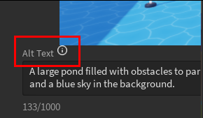
In the Basic Info tab when you scroll down, you can upload and reorder your game’s thumbnails. You can also click on the ‘zoom’ button to open a new widget in which you can edit the alt text. Although it is cool that we can change the alt text here, there is nothing telling us that zooming in on a picture lets us edit the alt text. The visual language for it is non-existent.
The label for the alt text is also slightly overlapping the thumbnail.

World settings
This tab should not exist at all. There shouldn’t be random settings for random properties or certain services hidden in this menu. It is feature bloat for a menu that will rarely be used. If developers are confused by how they change a character’s WalkSpeed or the world’s Gravity, then there should instead be better resources for learning how to make these changes. Adding them in this menu sets the wrong expectations that ‘anything world-related’ can be found there.
The options don’t even explain themselves either. If this menu is focused on inexperienced developers, then they aren’t going to know what the ‘Max Slope Angle’ setting means.
While I was editing my game’s settings I constantly found myself confused trying to search for settings that could instead only be changed through the dashboard. I had to go back and forth the whole time and had to ask my colleagues multiple questions because I couldn’t figure out where and how to change things.
It was an awful experience and I hope improvements can be made so that other developers do not have to experience similar headaches.

