PlayerList Updates

While I do somewhat like the look of it, I much prefer the old leaderboard.

This new one has an obnoxious amount of space between names, and it just feels too big and too bulky. I liked how the previous design could show large amounts of players at once without having to scroll every time you want to see who’s in your game.

Another thing is that you aren’t able to view long usernames on the new leaderboard due to them being truncated after a certain length.

The old design was really compact, and I feel like it was overall a much better design.

New Leaderboard


It just feels too bulky with unnecessary space between each name.

11 Likes

Indeed it’s better than the old one, I’m still not a big fan of it, I’d prefer the previous one instead. The major reason is it being too big and it just doesn’t fit the style overall.

Let’s take a look at the player list at Survive The Disaster 2, I’ll say something similar like that will be perfect.

9 Likes

I’d still love a feature where you can toggle between the new UI and old UI. I prefer the old UI better as it just looks better in general. I do hate now on how we cannot see our own stats at the top of the leaderboard, plus in games with tabs like Kills, Rank, Level, etc makes it too big.

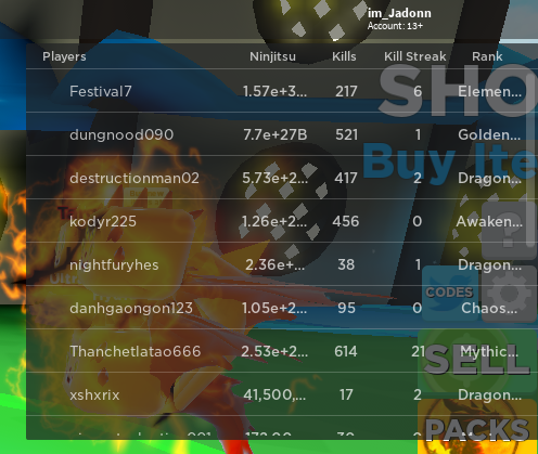
For example, here is Ninja Legends. You cannot see your own stats in the top bar to the right of your username, resulting in you scrolling through the leaderboard and possibly losing yourself as other players sell stuff or something.

image

In general, I believe that many other players would either love:

A. Experimental Roblox client to test the new UIs, instead of pushing them out to everyone and ruining things.
B. A setting to toggle between the old UI and the new UI (for whenever the new UIs come in you can toggle between old and new)

In general, I dislike the overall design and prefer the old UI.

Here’s some feedback you can take from the majority of us.

A. Make it so if games have tabs like Kills we can see them by our username like the old UI.
B. Ability to change size of the UI by dragging the corners of it.

I dislike how we have to find ourselves to see what we have set on tabs. Like if I had 3059 kills on the Kills tab and I wanted to see it and there were people with 4000-10000 kills we’d have to scroll to find ourselves exactly instead of having the old ability to see it like we could by our username in the very top bar.

Plus, do you expect us to scroll around tabs in any game to find ourselves? I don’t know if you plan on adding it in to the right of our username where we can see it in the top bar, but if you aren’t. That is your plan.

image

Make sidebar go through the leaderboard so it is in front of it, instead of behind.

I hope in the future we can see Roblox fixing this, most likely this player list will only be out for 3-4 days so I would love that if it was only out for a time while they accepted feedback on it. I just overall dislike the design and agree many other do.

I do love and dislike it at the same time.

My only issue is…can you make it so that our leaderboard statistics show to the right of our name on the top bar like it was before? That’d make it so much easier for people trying to find their money in Jailbreak, or other games when they have their tab closed, thanks.

Pretty sure 90% of the community can agree with that. ^

21 Likes

Everything is great it’s just that the usernames don’t fit in properly anymore

2 Likes

Overall, whiles my rant last time when the first generation of the 2019/2020 revamped player-;list was well-received by many members of the community and even some influences such as Koneko who used my response in one of his videos, It is without a doubt better than the first version we were given in December of 2019, however this doesn’t mean I support the implementation of the new player-lists, Yes, while it is something I can live with (as opposed to the other one where I literally did not play until it was fixed) It isn’t as much as an eyesore.

What Roblox did was changed the design of the list but not some of the major problems used discussed, eg) Style, Offset, and size which btw while is a lot better, when clicking on a players name a near-large portion of my screen still gets taken up, I’m hoping that Roblox will do something about the offset and work on the large and possibly make it more matched with the current UI’s, in my eyes this is an un-necessary and should focus on working on other features to overall improve the gaming experience of it’s player base :smiley:

3 Likes

I just need to know how to disable this and bring the old one back.

12 Likes

The new player list bar is slightly better than what you changed it to before, but it’s still pretty bad. It takes more effort to scroll down it, which is annoying, and then the player names in the boxes take up a lot of unnecessary space. The colour difference and the overall shape is very noticeable too, why do the boxes have to have rounded edges? Overall, it takes up so much space and is extremely displeasing to the eye. It would be good if you could make a feature where you can switch between the old/new player lists.

2 Likes

The new playerlist is not appealing at all. The old playerlist’s transparency and colour made it less obstructive, allowing players to see whats behind the playerlist without much hassle. The new playerlist, however, is far more obstructive. It feels like more of an annoyance than anything else. Another thing I want to mention is that the new playerlist cannot show as many characters as the old one. image
The image provided shows my stats on the game Miner’s Haven. The only way a player can see their life is on the player list or in the Settings menu. My current life is S+18410, but the playerlist only shows “S+1841”. With the new playerlist, only I can view my life. Nobody else is able to access my Settings menu. My cash amount is also cut off. The real cash value is 1.68qGNTL, but it only shows 1.86q. The old leaderboard displayed everything without any issues, but the new one cannot even display my life count in this game.

The playerlist is still far too big. The old playerlist displayed player names in a readable font size. The GUI was not obstructive at all, only taking up a small portion of the screen. The new playerlist is far bigger, covering a much larger portion of the screen in comparison.

20 Likes

Are we able to make custom icons in this PlayerList update?

No.

2 Likes

Really not a fan of this update, I will be disabling the playerlist in all of my games until there’s a workaround to use the previous (2015-20) version.

EDIT: I plan to fork the old PlayerList and make it publicly available, this afternoon/evening (in GMT). Keep an eye on this post.

9 Likes

I have been thinking if it would be possible to add a button to distinguish where to click to open up the PlayerList, for new players, and maybe a tip to use the keyboard key instead of clicking on it. This button could be placed next to the user’s name & account age, or anywhere else near the area of the PlayerList.

1 Like

One thing I feel the old leaderboard had over this new one is in certain games that have a point system, even if you hid the playerlist with Tab, you’d still see your points next to your name. Not so with this new one.

This was the old one when hidden away.
image
This is the new one.
image
Often when playing a game, I’ll hide the leaderboard away, as it gets distracting, but I could still keep track of my stats. I can’t with this one, and I feel it’s a step back, instead of a step forward.

26 Likes

I really don’t like this, if I’m being honest. I like the modern look of the UI, but it seems way too bulky. It takes up too much screen space and shows too little information for how big it is. Yeah, the old UI took up a lot of space too depending on how many leaderstats you had, but this new UI is unneedingly bigger. The awkward cutting off of numbers and removing the ability to see your full stats up in the topbar by your name is what really bothers me.

I feel like I’d be much more willing to use this player list if it were easy to modify and open-sourced like the chat window.

8 Likes

Honestly, I think this is indeed a step forward, but two steps back. The modern design itself really fits the approach Roblox is going for, but this new player list is just impractical and sacrifices user-friendliness in favor of cosmetic improvements.

From my point of view, it is rather inefficient considering the space it compromises on the screen and the relatively low amount of information it really shows to the player. In addition, viewing your own stats was much easier on the old player list, as they were shown on top of it even when it was disabled. That amount of practicality and overall friendliness is something I really would like to see come back.

14 Likes

i can not fathom the scaling issues with the new ui’s, it is in theory a nice idea, but the ui just
A: doesnt fit
and
B: still takes up WAY too much space on the screen, if you so desperately want a ui overhaul for the playerlist, make it like in almost all other games where you get a popup if you hold tab, (oh also, the playerlist is above the performance stats)

2 Likes

This removal is so painful, in a large server (like 50 players +) it is so hard find your stats

4 Likes

Its still a title bit glitchy. I can’t see my lvl and kills. @TheGamer101 Screen Shot 2020-01-24 at 7.51.29 AM Screen Shot 2020-01-24 at 7.51.36 AM

7 Likes

Nice, but I still like the old one.

1 Like

Maybe roblox should put a client-side tab configuration for nostalgic players, where you can configure your tab to the old one instead of this one. For example I don’t like this update (It also has some issues as players are saying above this comment) so maybe players can configure it to the one that was before?

4 Likes