We’re excited to announce the beta release of our Studio Notification Tray Overhaul. This is our first step in making it easier to receive updates about your creations from inside your workflow. In this beta, you’ll be able to:
Sample our new Studio Notifications UI
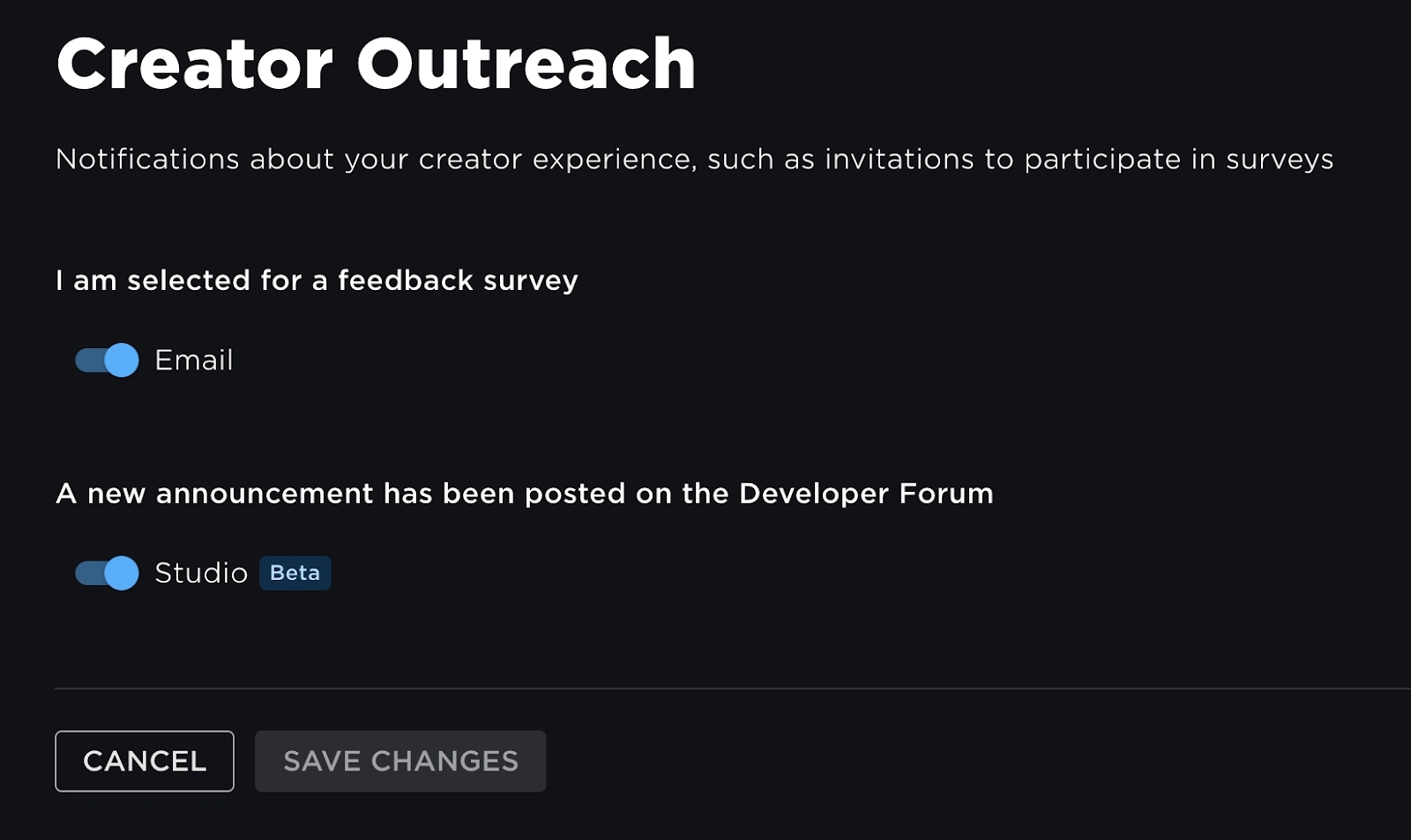
Receive notifications about Developer Forum announcements
Get access to new notification types as soon as they’re released
This update also allows you to customize your notification stream in your settings on Creator Hub, allowing you to opt out of notifications you’re not finding helpful.
To try out the new Notification Tray, you must be enrolled in the Beta Channel. We’ll be gradually rolling the tray out to all Beta Channel users by default, but you can manually opt-in or opt-out anytime. To enroll in the Beta Channel:
Enable Enroll in Beta Channel, enable“Notification Tray Overhaul”(if it isn’t already), then press Save.
Known Issues
Notifications may not be received in real-time (A fix has been prepared for this and will be released soon)
The Notification Tray may not properly retry when in an error state (A fix has also been prepared for this issue)
The Notification Tray does not adjust correctly when the display DPI is changed
Adding the Notification Tray to the Quick Access Bar in Studio will cause Studio Notifications to be disabled after reopening Roblox Studio
Windows only: Moving Roblox Studio between two screens with different DPI settings while the notification tray is open causes Studio to hang
Mac only: The Notification Tray stays on screen whenever Roblox Studio is minimized while the tray is open
Mac only: The Notification Tray is hidden when the Roblox Studio window is unfocused
Let us know your feedback in the comments section! We’ll gradually add new notification types like Team Create invites, asset moderation, and Memory Stores usage alerts, so please let us know what you’d like to see added.
Thank you.
FAQ
How is this different from the previous Studio notifications?
Other than the UI changes, this update enables additional notifications beyond announcements to be added to Studio Notifications. While only Developer Forum announcements are available at this time, we have additional notification types currently under development that will be added soon.
What about Creator Hub?
We know that Creator Hub is also a major part of many creators workflows, so rest assured that we’re working to bring notifications into Creator Hub in early 2024!
The new UI doesn’t match with the current studio UI, but at least it’s better, Maybe this needs some tweaks to make it more fitting with the current UI
though overall I Like the new UI, but it doesn’t seem to fit the studio current UI
The UI for the tray is really inconsistent with the current studio UI lol
Are ya’ll making new User Interface fit with the concept studio overhaul from RDC
Looks nice though i do have to say that its style is completely different than the rest of studio. I’m guessing this is UI straight out of the new UI overhaul, right?
Bad take, you don’t break user muscle memory in one fell swoop in a development IDE. This is a catastrophic idea. Not to mention, some things in design you just don’t know if they’ll perform well or not. Changing everything and getting users going “this sucks” is remarkably useless in comparison to “this specific change sucks”.
Not to mention, every time Studio has radically changed a fundamental part of the application, there has been several months of sporadic work-disrupting problems. Keeping this incremental and controlled is the best approach, even if the UI styles are a little disparate.
When is the update stream going to stop?
7 updates in a day, what?
Anyways, I really like the notifications UI, but it’s inconsistent with the rest of Studio’s UI.
Also, would be better to be able to customize notification settings directly in studio.
This is good stuff! I’d love to see a notification for when something I make gets moderated.
Also, please ignore the people asking for a full design overhaul. Not only would that break developer muscle memory as Caz said, but megaprojects like that tend to leave the original product languishing for a long period. They also tend to be rushed and kicked out the door in a worse state than the original product. A Studio overhaul would make far more sense to do one component at a time, taking feedback from developers to make sure nobody’s workflow is worsened.
I think it would benefit the engine if they kept the UX the same but changed the UI. You can’t keep the design forever, it’ll eventually become outdated and make people unhappy. Studio is aging more and still is stuck in he Aero/early Metro era (the new icons are bad but a step in the right direction) and is more than due for a new look. Everybody naturally hates change but eventually they have to just rip off the bandaid and refresh it.
Alright, that’s an improvement!
I hope that the rest of studio will get this treatment. It looks more like the Roblox website in 2018 than a modern IDE.
This is a nice change but has a moderate issue that isn’t listed in the OP. Notifications will still show in the hovered state if you move your mouse off of the notifications tab reasonably quickly. @BetterHashbrowns
Also, is the different mouse icon intended behavior?
I went to ask a Roblox staff if this is the beginning, and here’s what he have to say
Not exactly! Different team did that feature (with our support) and they did to incorporate some newer styling so it will fit nicely with the next gen UI overhaul we are working on.
But it shouldn’t be considered the official start of new UI rollout — we want to give the community time to try those out and let us know we are on the right track before they become the new default UI later next year.
So he’s basically saying that it’s not exactly the phase one of the new UI rollout, but the style is changed to prepare for the upcoming UI they’re working on, and they want to give the community time to test it and offer feedback before the full UI comes
Though the new UI looks really good, as others have mentioned, it looks pretty out of place with Studio’s current UI, hopefully this may be a glimpse at a Overhaul for the whole of Studio itself!