That’s a great idea. Unfortunately it looks like this box is not an easily accessible instance in CoreGui so it’s not simple to change, but I will add it to the to-do list as an extension of the selection box hack. Maybe this weekend I’ll look at it.
Gorgeous done of yours, well done.
This is an amazing plugin; thank you so much for creating this.
I do have a couple of suggestions, however, it’s most likely not possible to change the behavior of the explorer via a Plugin, but I’ll put them out here anyway:
It’s a bit frustrating that you can easily rearrange items in the explorer. This drives me crazy, especially because it actually seems like it would:

(It puts a line under the instance I want the other instant to go under in the explorer, which usually represents putting something under it, but it still doesn’t do that.)
If it could somehow be possible to make it so you can easily rearrange, that would be great.
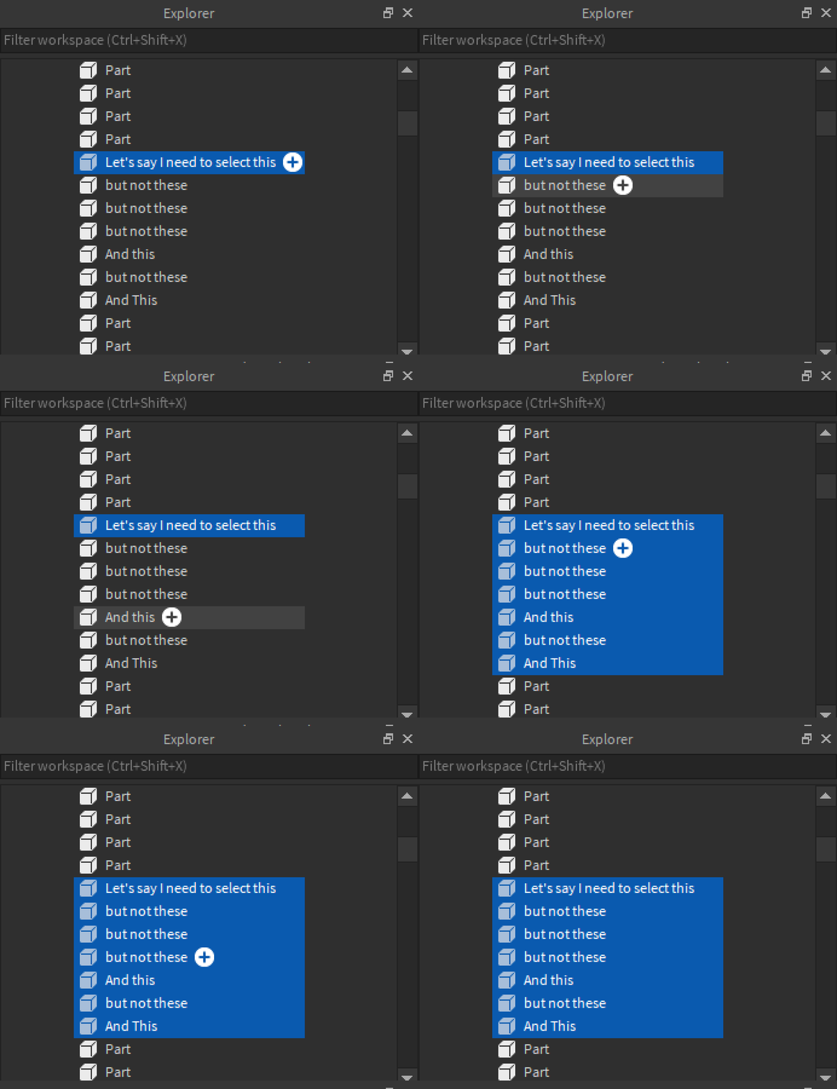
Another annoying feature of studio that I wish could be turned off is the behavior when holding shift to select multiple items at once. Because I cannot rearrange, it’s really hard to select multiple different children of a folder that aren’t right next to each other:

Like I said, I have no idea if these could be done or not, but if so, that would be amazing! Thanks! 
When selecting multiple items in explorer that aren’t next to each other you hold CTRL instead of SHIFT.
I cannot modify the UI of the explorer. The best I might be able to do is add a context menu control or hotkey for shifting items up or down, but this is likely to be incredibly hacky, slow, and may not save in the order you end up creating. Overall I think it’s very out of reach, and not useful enough to invest the effort. The ordering is an aesthetic choice and any organizational ordering you can accomplish using folders in most cases.
See the reply above addressing the multiselect.
Thanks, and thanks for the suggestions though!
I’ve updated Studio Tweaks with a large rewrite of architecture. Please update and let me know ASAP if anything is broken.
This also includes a fix for selecting hidden services throwing errors.
Every time I select a part, something prints “false”
Yep, just fixed.
Also added a quick link to this topic to the context menu.
![]()
Made the selection box now have a dynamic thickness depending on camera distance (thanks @Fractality for point-to-part distance algorithm).
Also added a selection box replacement for FaceInstances (Decals / Textures), connected to the same selection box setting.
Due to how stupidly massive the selection box for decals is, this replacement is very far off the surface of the part, but it still does the job, and allows you to comfortably align textures with adjacent textures using UV offset properties. Please support this feature request: Make texture/decal selection box thinner / transparent

Let me know if anything is broken, as usual.

These happen whenever I press play.
Oversight, fixed now.
And no errors other than that.
Love this plugin! Absolutely recommend it to anyone that asks
I’ve added an option to anchor new default property parts added to the workspace.
TODO: Make this work when inserting Parts with different Shape property set (i.e. spheres)
but now i cant see the edges of the part, they stay really big when getting closer to the part, cant use it now.
they stay really big when getting closer to the part
Clarify? This is the opposite of what that setting should do. Can you use an image?
It is a random bug, ill get a picture when it happens.This started on the most recent update
Adding certain parts through the menu on Studio will be unanchored even if you have the “Anchor new parts in workspace” setting on.
Known issue, will fix soon
Just a small bug, for me the face indicator is not working when I select parts, I’ve tried turning it off and on again, its been like that for a while but I didn’t notice it until now when I need it