is that a brave trait level description thing
bring back old days when i was kid ![]() Temple Rush
Temple Rush
Close. It’s for difficulty settings.
the propz shop [the logo wasn’t made by me but I had permission from kernelvox to use the logo]
the reference picture is this:
- looks cool
- needs some improvements [private message me instead of replying so we don’t clutter the thread]
0 voters
- 1
- 2
- 3
- 4
- 5
- 6
- 7
- 8
- 9
- 10
0 voters
got bored, found an old project, and decided to port NDS to it
NDS on roblox in roblox
(i dont own NDS obviously and i just used an uncopylocked game)
First time zooming out to see the map in its entirety. Been working on it on and off for a few months; me and my friend both agree this is the most definitive project we’ve ever produced.
Still working on the basics of Chapter I so expect the building quality to improve in the future when we’re polishing.
A Zombie Tsunami / Zombie Carnaval like game
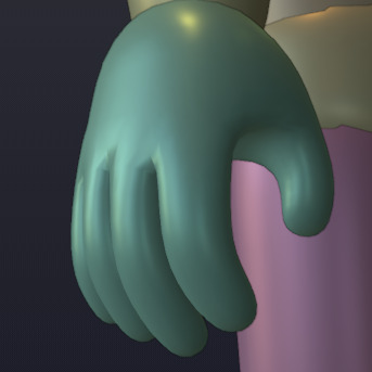
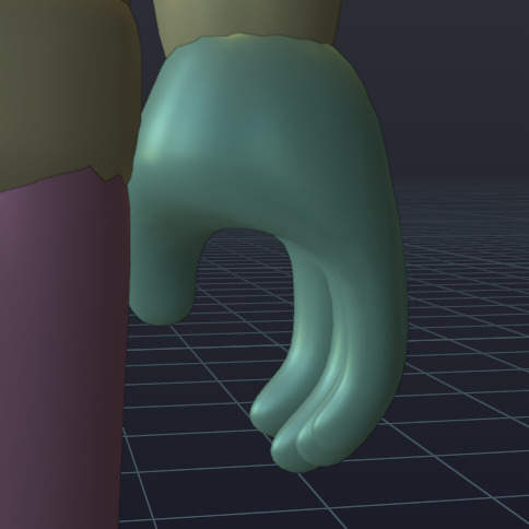
Y’know, I’ve been looking at the custom character model I made late last October and I’m realizing I should’ve made more adjustments to its hands and feet/shoes before exporting them.

I originally made its feet very thin near their ends because I wanted to layer larger shoe meshes over these eventually. By themselves, these meshes just look weird, though. I’m going to make them taller and shape them more like packed snow rather than a vague “foot” shape. This will make it impossible to represent bare feet, but I could always do what Royale High does and hide these foot meshes if I needed to add uncanny-looking, out of place toes for specific shoes, anyways… (I think that looks weird in that game anyways, so I don’t really care about adding feet to my experience anyways.)
As for the hands, they’re also weird, but you only really notice their strange shape when you look closely at them (especially in VR when they’re in front of your eyes)! One of the main strange things about these hand meshes is how “fanned out” the fingers are. If you tried to imitate this “hand pose” in real life, your fingers would curve more towards the middle horizontally, so I’ve slightly adjusted their angling.
(Their proportions are still incorrect, though; Your pinky finger isn’t the length of your index finger, and each finger’s a different width…)
I was also considering trying to edit the torso parts, so the lower torso would affect more of that part of the body and look “smoother” instead of the upper torso bending over 75% of the whole torso, but once I looked at my current character model and thought about the R15 textures, I realized I couldn’t actually improve that. (Roblox needs to add an R16 model that splits the torso into three parts; I would probably use that.)
EDIT:
I wish I would’ve waited until now to share screenshots of the “improved hand”. I’ve adjusted the fingers’ lengths/widths and added more divisions to give the hands a better shape.


Started working on new sprites. Development’s gotten to a point where I kind of need them.
![]()
Behold! Boolit!
Making an open world space sandbox game with about 9 other people, development is going great so far and we’ve amassed a community of around 100 users waiting for the game to release. We’ve projected at least 2-3 months before a pre-alpha release.
(Image above is actual footage of gameplay, please note that nothing is final and everything is subject to change.)
This is actually pretty cool! I love the models too!
Well, anyone who’s been checking out my posts in this topic definitely wouldn’t have seen this coming, but Project Magical Mary is now using a new loading screen! It stays during teleports, and has better animations than the older one! The player’s avatar poses on a 3D platform, giving them something to look at while the client generates its local character entry, waits for the server to load the player’s save data, then the client pre-loads some “important” assets.
I tried to make it look as “smooth” as I could; Do you think the new loading screen looks good?
A more general purpose derivative of Tabby, but also makes the syntax easier to grasp.
local cat = Catwork.Fragment {
  Name = "CatGenerator",
  Cats = {}

  Init = function(self)
    while true do
      table.insert(self.Cats, generateNewCat())
      task.wait(1)
    end
  end

  GetNumberOfCats = function(self)
    return #self.Cats
  end
}
I actually started this in December but having a few roadblocks with Luau’s typing system, esp on Fragment generation.
meow ![]()
The character in the loading screen, isn’t moving. You can see the bricks change at 3 seconds. And the blue text could be a bit higher up, not that close to the loading bar. But yes, it looks better than what I could do. Do you actually intend to release this game? Or is it just a project for you to do?
Well 1 month in and my game is actually quite a lot of players.looking to expand the storyline and making it bigger than it is at the current moment


