Before I put robux into this ad, I would like you to tell me if this is effective enough in getting a decent CTR. And if there is anyway I can make it more effective.

2 Likes
In all honesty, not really no.
It probably won’t generate much clicks, however if you put enough rbx into it, it may make up for it.
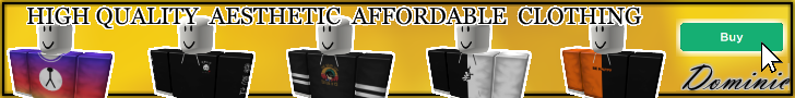
When doing ads, you want to make something original, or follow a set formula to increase clicks. For your example, you’ve made the text “dominie” white, which is a very similar colour to the background yellow. Making it stand out less. Try having a darker colour for the name, since that is one of the most important and must be eye catching.
You’ve used very muted colours which make it less eye catching on a screen filled with interesting games to play. Why would the average user click your ad instead of clicking on a game? If the colours were more vibrant, it would definitely help with this.
Third, your ad lacks text. Though for some really good ads, text isn’t needed. But especially for smaller groups where the value of the brand isn’t strong enough, you really need stand out words that grab the attention of anyone looking at it. They need to know what your group is about, rather than just you telling them to join it. Why should they join it? I think if you removed one of the clothing models, and instead used the space to say eye catching words, it would definitely help with the CTR.
And lastly, this just comes from my experience. But skyscraper ads usually get more clicks than banners at least for me. I’m not sure if this has been proven, but it might be helpful if you used a skyscraper instead.
Hope the above helped!
Summary :
Make Logo stand out. Use brighter colours with contrast. Use more text.
1 Like
As @oggy521 said, there are a few flaws.
Here’s my biggest pet peeve for people placing ads. It doesn’t explain what you are getting when you click on it.
Why should I join a group when I don’t know what it’s for? It looks like it might be a clothing group but I can’t be sure since it doesn’t explain what it’s about.
A simple addition of something like “Dominie Clothing” would really help. Also put a description on the pop up that occurs when you mouse over the ad. A description that just states “Join group” when you’ve already got that in the ad is a waste of the tools provided to you with the ad.
I don’t want to change the yellow as it is part of the brand image, so what do you think would be the best contrast for the yellow instead of white?
Should I just say a few key words? I don’t want the description taking too much room.
“Join Group” and “Buy” buttons are likely to get moderated.
I submitted the original ad and it passed moderation.

Actually I prefer the previous one in yellow with the black border but how did you get the strange white outlines of each image in there? If I’m being honest it looks like very sloppy cut and paste work.
The black/blue/pink is pretty hard on the eyes and I can see lots of extra lines through the character images.
1 Like
Does all (or most) of your clothes cost 5 RS? If so, try mentioning that in your ad.
Depending on the amount of robux you put into it.
Well, how much do you suggest I put?
Whats your budget? You would need a couple thousand to somewhat do good.
I currently have 2000 robux on me
Maybe 1500?? I doubt that would do much though.
If you’re wondering how to launch effective advertisements relevant to your products then I would have a read of these:
Advertising Clothing Groups
Clothing groups are usually advertised by displaying some designs then saying “Everything is 5R$” because the average piece of clothing on Roblox is 5R$. You could do that or you could have a picture of your homestore with people looking around for clothing and then have transparent text over the ads saying “Everything Is 5R$”