Explorer Icons have bad readability

Currently the new icons that are being rolled out have bad UX readability and make it objectively more difficult for users to quickly see which service is which at a glance.

new icons

In contrast to the previous iteration, and even Elttobs Vanilla icons, these explorer icons have much better readability in their shape and color contrast for ease of accessibility.

[Original]
old icons

[Elttobs Vanilla Icons]
vanilla icons

In the most ideal case, just making these icons easily changeable would go a long way to just give users the choice in what they want to see as icons instead of being forced into Icons that look like they came from Windows XP.

113 Likes

I would really love if ServerScriptService and ServerStorage adapted a green color, and ReplicatedStorage/ReplicatedFirst adapted a blue color to match with the server/client switcher.

I got so hasty to post about this that I didn’t even stop to check for existing ones. The icons are far too desaturated, especially because the only visual information which allows identification between them is present in very small details.


I noticed the addition of a new setting called Custom Icon Dir (aka IconOverrideDir). Unfortunately, I can’t figure out how this folder works, and there is no documentation. Additionally, I couldn’t identify a fast flag related to the new icons, so I can’t revert them myself as much as I want to.


I enjoy the design, but, the colors chosen here are impossible to work with on top of there being no visual landmarks at all. At a glance (or even an uncomfortably long stare) everything is a small blue/yellow box with a small white square in the bottom right, with no distinguishing features.

I’ve never once felt so blind about what I’m looking at before, except when I installed Elttobs Vanilla icons with the monochrome variant and immediately switched to the other.

26 Likes

the new icons are horrible, so hard to tell the difference between stuff

16 Likes

Readability on Light Mode has been severely hindered, and the problems with icons in Dark Mode are even more exasperated in Light Mode.

In general, light mode has become a way worse experience for someone like me, who has used it for a long time.
image
(Random image I got off of google)

image
(New light mode)

18 Likes

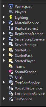
It seems like each category of instance received its own color, which, I have actually found quite helpful. Unfortunately, lots of icons don’t have distinct shape or color, especially more miscellaneous ones, and big groups of icons.

Any sort of miscellaneous icons should definitely get a little bit of color thrown in, otherwise it’s really hard to tell the difference between many instances.

For example, parts and models are unreasonably hard to tell apart. Same with scripts. Color should really be more heavily utilized!


While I don’t recommend it, if you’re desperate enough (like me) to disable these icons because it’s actually hindering your workflow, you can either use Roblox Studio Mod Manager’s fast flag editor, or disable the fast flags for them manually.

I have determined that the two fast flags are StudioQtSVGIcons and SVGLuaIcons.

From what I gathered seems like only some people have these icons right now I guess. I hope that the icons that aren’t in any particular category get more colors and perhaps more identifying features between some of them.


To disable the fast flags for these icons (at your own risk)

With RSMM

Just open the fast flag editor and search for the above two FFlags and disable them.

To do this manually

  1. Find your studio folder in %LocalAppdata%\Roblox\Versions. It’ll have the launcher and studio beta exe files.
  2. Create a new ClientSettings folder.
  3. Create a file called ClientAppSettings.json (Note: If you have known file extensions hidden you will have to do this from notepad or VSCode or similar and save as ClientAppSettings.json… Otherwise, you’ll only be able to create a .txt file and Windows won’t show the .txt extension unless you enable it).
  4. Put the two fast flags set to off like so:
{
  "FFlagStudioQtSVGIcons": false,
  "FFlagSVGLuaIcons": false
}

Just one last note, fast flags are not meant to be user friendly and Roblox removes/changes them all the time, so, this probably won’t work forever. This is not technically an intended way to disable these, but, I find myself really needing to, and I’m betting I’m not alone.

I have my fingers crossed that at least some icons will be improved for visiblity, and I’d really like to see more color on the misc instances. Plus, lastly, this will be less of a big deal when the custom icons directory gets documented or people figure out how it works and you can pick and choose between other people’s icons.

32 Likes

Oh heck no. These are going to be the new Studio icons? Oh no…

8 Likes

To make matters worse, seems that Vanilla Icons don’t even work now, so cant keep my client stylized without having to use an old version.

4 Likes

Agreed. They should have went for updating the previous icons instead of designing entirely new ones.

I had to waste time finding a work-around just to get the old icons back.

4 Likes

I don’t understand what this means, and they’re on 1/3 of the icons shown in the explorer. These don’t seem necessary to me, they’re generating a lot of visual noise.

image

Aside, I don’t think it’s possible to please everyone. Roblox should take the same approach they did with the new materials and add infrastructure to let anyone re-theme studio as they like.

Users have needs that may be unique to them (e.g. dyslexia, poor eyesight, colorblindness) so one universal icon set is totally out of the question for all users. This is something needed by principle, and goes hand in hand with the curb cut phenomenon wherein adding accessibility features streamlines the product for everyone, not just the targeted users.

20 Likes

I have tried this but it didn’t seem to work sadly.
I cant use the mod manager because it makes roblox studio blurry, i cant have both the old icons and roblox not be blurry at the same time without doing this manually.

Is there something that i might be doing wrong or needs to be changed to do this manually?