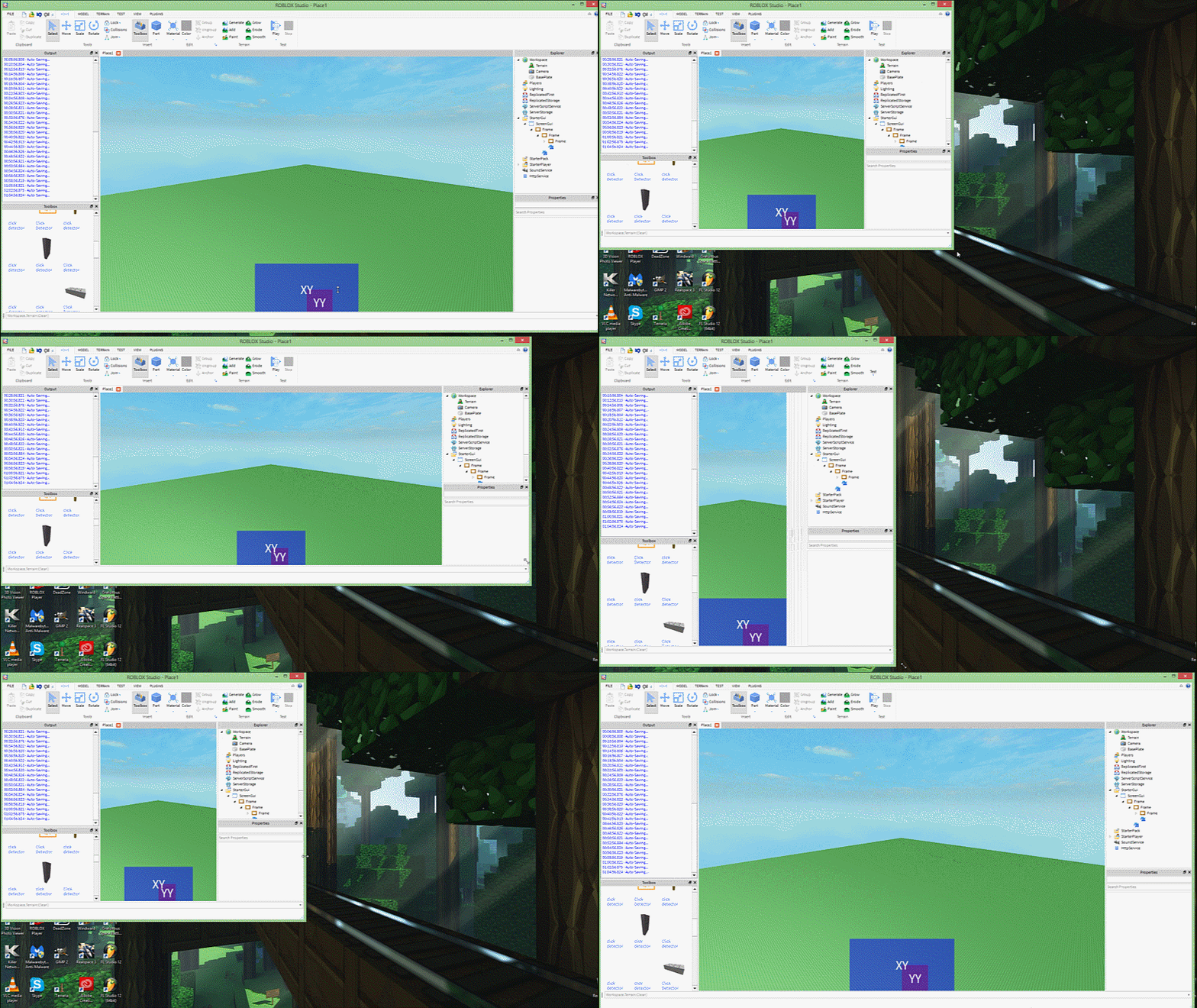
Update: Please note this guide was written before the implementation of UIScaling and Constraints, it is recommended that you use those unless you have specific-use case for this or prefer this method.
a 2am in the morning tutorial, hooray!
I’m putting this out for people who want to know a way to keep the aspect ratio of GUIs the same whenever the Roblox game window is resized. I used to stick with the offset size a ton because in general it looked better and scaling usually has those blurry text or images, etc. But the downsides with the offset is that players with very small resolution or very high resolution end up having tiny GUIs or large GUIs covering up the screen. This can be especially useful for mobile users and devs who plan to utilize GUIs on console!
So we want to achieve here is this:

The turtles above have the same aspect ratio, but when used in a scaling GUI resized, it may end up not keeping the same dimensions:

The XY, YY, XY frames. The XY’s resemble the SizeConstraints of the Frame. The above example is the a centered aspect ratio. (Of course the frame sizes can be resized to your preference (must be scaled though!)
The property that you want to configure is the SizeConstraint Property!


Now, from looking at this it resizes only vertically, well it’s preferred that way since monitors are typically landscape and playing portrait is probably not done (possibly with multiple monitors to create one extended monitor, which still works) If you want the same aspect ratio but on the side of the window, it can be done as well!


Scaled text, images, other frames, whatever you want can be placed within the blue frame that has their sizes by scale. (The colors and XY’s are for visuals, you can have it transparent or whatever) Just wanted to put this out if you wanted a way to keep your GUIs looking like an offset but able to scale.
It can be done as to something like this:

Some size samples:
Bottom-center:
XY- Size:{1, 0},{0.1, 0}, Position: {0, 0},{1, 0}
->YY- Size:{1, 0},{1, 0}, Position: {0.5, 0},{-1, 0}
–>XY- Size:{4, 0},{2, 0}, Position: {-2, 0},{-1, 0}
Center:
XY- Size:{1, 0},{0.1, 0}, Position: {0, 0},{0, 0}
->YY- Size:{1, 0},{1, 0}, Position: {0.5, 0},{0, 0}
–>XY- Size:{8, 0},{8, 0}, Position: {-4, 0},{1, 0}
Top-left corner:
XY- Size:{1, 0},{0.1, 0}, Position: {0, 0},{0, 0}
->YY- Size:{1, 0},{1, 0}, Position: {0, 0},{0, 0}
–>XY- Size:{1, 0},{4, 0}, Position: {0, 0},{0, 0}
Just remember that you aren’t limited to these values and that you can change it to suit your needs. Also mind when using ClipsDescendants on the first 2 frames! Dragging the frame is also do-able. ![]() btw if you’re making a menu, plz try not to use only offset. cough apoc rising menu*
btw if you’re making a menu, plz try not to use only offset. cough apoc rising menu*
Hope to see more of this, and less offsets! ![]()
If you have any other questions about it or know of an alternative, feel free to respond! ![]()


